Transforming Tableau Crosstab Charts into Pixel-Perfect Reports
Creating Professional Reports from Tableau Crosstab Charts
Pixel-Perfect Formatting: Turning Tableau Data into Insightful Reports
For users who are responsible for generating reports from Tableau, they can understand how important it is to ensure these reports are visually appealing and readily available for stakeholders to access.
As a user – visually dynamic data made available from within Tableau isn’t enough – the need of the hour has pushed the envelope, creating an environment where businesses need more from their BI tools.
Users need to be able to export Tableau reports as and when required. However, this can be a time consuming process especially when crosstabs are involved – they have highly unique reporting requirements, from business stakeholders such as Risk, Compliance, Regulatory, Finance, and even Audit Teams.
Crosstabs charts are beneficial when undergoing comparative analysis and are an easy way to showcase key insights to end-users within a Tableau dashboard ( A Primer on Tables ). But users want a way to export these crosstabs into a fixed report, displaying data in a consistent way that makes their final deliverables (Excel File or CSV File) high quality, pixel perfect, and print-ready to be presented to management and utilized for key decision making (Howson, 2007). Achieving this however requires, Tableau users to:
1. Showcase relevant information in paginated forms with custom branding and layout straight from a Tableau dashboard
2. Output clean cross tabular reports directly that are pixel perfect and print-ready
3. Export and Distribute reports on a self-service mode and in a time-efficient manner
Let’s explore how Pixel Perfect complements Tableau and can help you address the above three business requirements.
Introduction to Structuring Crosstab Charts in Tableau
Step-by-Step Guide to Creating Formatted Reports from Tableau Data
Best Practices for Pixel-Perfect Reporting in Tableau
Enhancing Data Visualization with Pixel-Perfect Precision
Increasing efficiency with Tableau and Pixel Perfect
The Global State of Enterprise Analytics Report found that 56% of organizations who leverage data analytics experience faster insights for decision making (Columbus, 2019).
While this kind of business speed can be leveraged by adopting Tableau, it is just as important for this efficiency to be incorporated when generating and distributing fixed formatted reports. A lot of time and resources is often expelled when shaping Tableau crosstabs to fit into documents such as Microsoft Excel, CSV File, PowerPoint, Word, or PDF File.
By leveraging Pixel Perfect, users can export Tableau reports in a print-ready format from within Tableau as and when required, in a matter of seconds.
Crosstabs can be outputted to well-formatted reports based on business requirements without users having to spend additional time and without having to leave their Tableau environment.
The process of outputting visually appealing reports
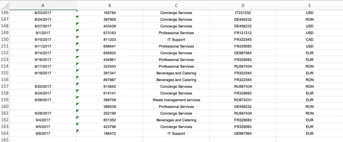
Users still need their reports to come off as appealing as the dashboards themselves. As Table 1 shows, after just clicking on the Pixel Perfect Excel icon at the top of the User’s Dashboard, an Excel report was generated that incorporated both visualizations and crosstabs from the dashboard into the User’s Report. The format of the dashboard was maintained within the final fixed report, and no data was cut off from the crosstab into the Excel table. The User’s Report Part 2 within Table 1 showcases the ability of Pixel Perfect to support any number of rows of data.
Note: This can either be achieved through Tableau Online i.e. hosted online by USEReady and integrated with your Tableau Online Account or through Tableau Server i.e. on-premise hosting alongside your Tableau Server.
Table 1
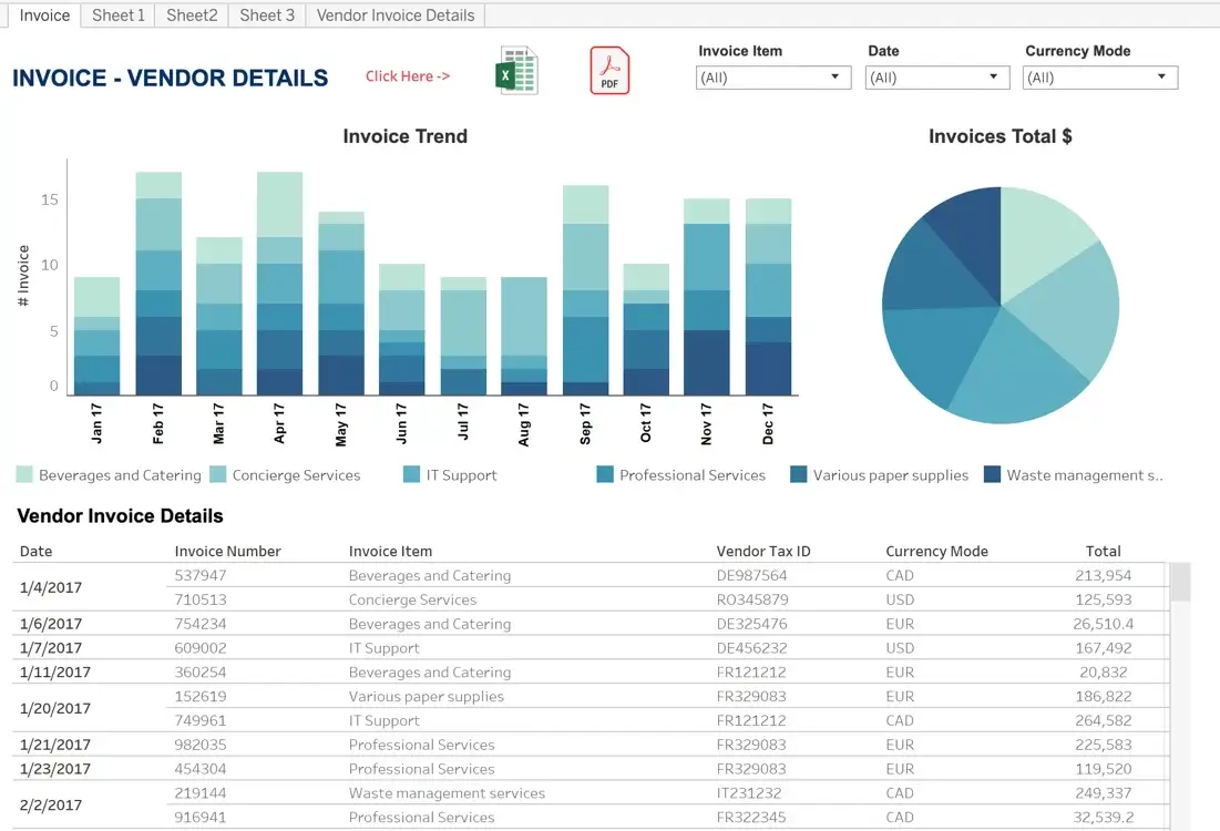
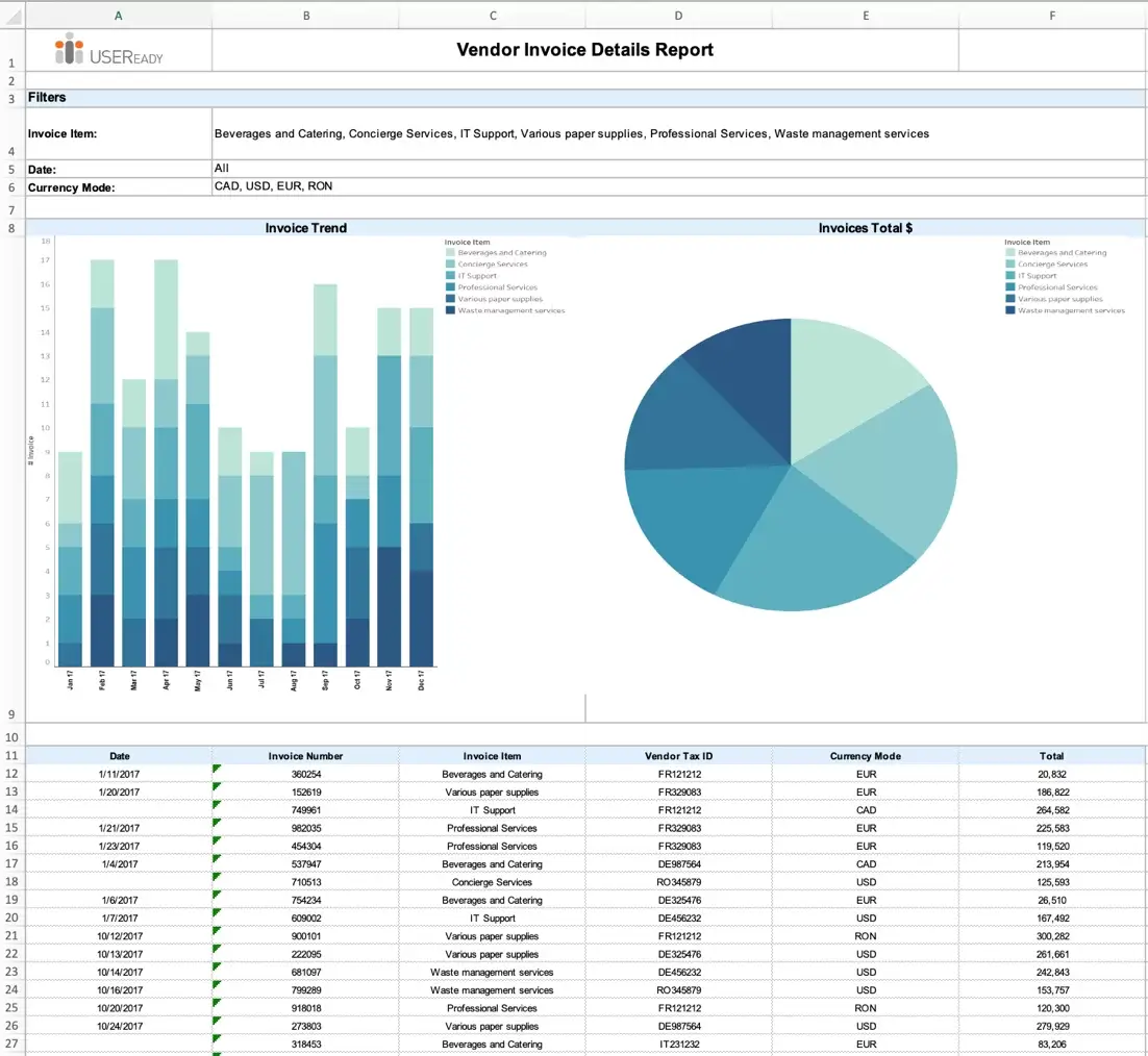
When preparing for regular cadence meetings, Pixel Perfect makes it possible for these Tableau dashboards to be presented as fixed reports to key stakeholders in an easy-to-read structure with a single click. Reports can even incorporate items such as headers, footers, logos, and watermarks. In addition, Pixel Perfect allows you to encrypt the reports while distributing.
See what you need to see when you need to see it
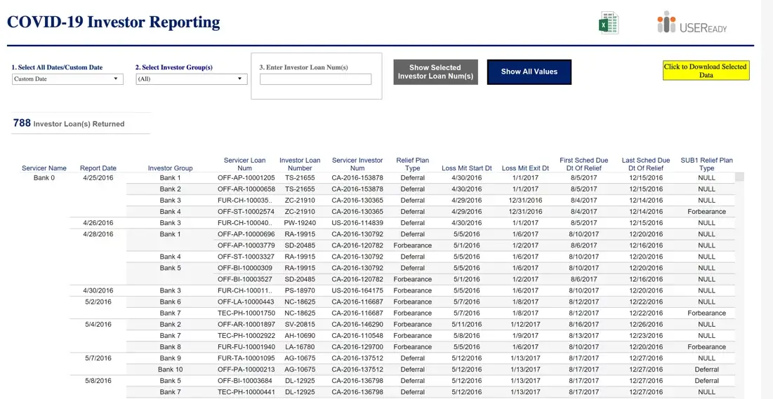
Export data that you need and nothing more! By leveraging Tableau and Pixel Perfect, users do not have to worry about drilling into all their crosstab charts and visualization to pull out what they need to see. Pixel Perfect gives users the ability to output their Tableau visualization in any fixed report they require. For example, Table 2 showcases how the columns in the User’s Report were reorganized from the user’s crosstab to meet specific business requirements, bringing the ‘Loss Mit Start Dt” from column 8 to column 2.
Table 2
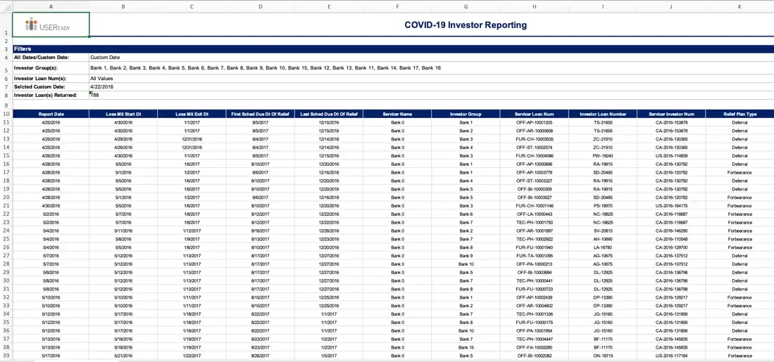
Whether information is contained in multiple dashboards, located in specific columns, or even if the data is not displayed within the dashboard itself, users are still able to generate all their underlying Tableau information into a single report.
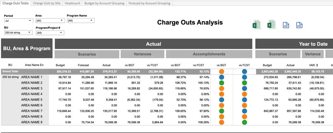
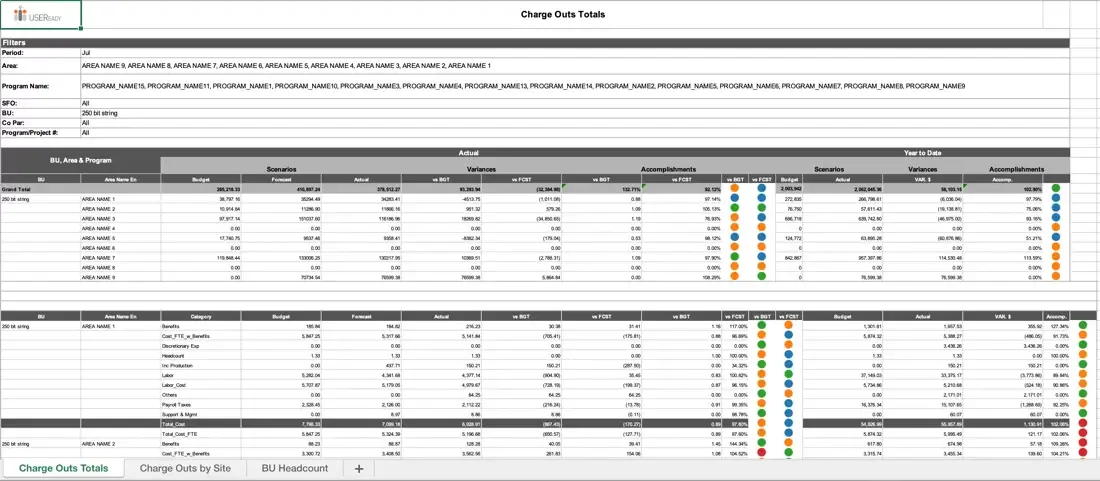
Table 3 showcases Pixel Perfect was able to pull multiple dashboards, “Charge Out By Totals” and “Charge Out By Site”, into multiple Excel sheets. Even conditional highlighting and grand total columns make the User’s Report easier for stakeholders to make sense of the information.
Table 3
Converting Tableau Crosstab Charts into Customized Reports
Tips and Tricks for Perfectly Formatted Tableau Reports
Case Studies: Examples of Pixel-Perfect Reporting with Tableau
Advanced Techniques for Formatting Tableau Data into Reports
As users can see, Pixel Perfect gives Tableau users the flexibility to meet specific, fixed reporting requirements within Tableau, all at the click of a button. Users can shape their Tableau data into any orientation (portrait or landscape) through Pixel Perfect, creating fixed reports in no time at all. When utilized together, Tableau and Pixel Perfect give users access to not only visually appealing dashboards, but visually appealing reports as well, all at their fingertips.
