Optimizing Label Display on Tree Maps: Enhancing Data Visualization in BI Platforms
Mastering Tree Map Labels: Best Practices for Effective Data Presentation in BI Tools
Enhancing Data Insights: Strategies for Optimizing Label Display on Tree Maps in BI Platforms
There are a variety of visualizations available across different BI platforms. Tree map is one of those and requested by end users too. Tableau also offers a nice Tree map feature. The concept is very simple. The entire visualization is made of boxes. The entire collection of boxes id the Tree. The boxes can be segmented into buckets, each bucket representing a branch. Each box within the branch is a node or a leaf. There can be Tree map without branches consisting of only leaves as the most granular level.
Understanding Tree Map Labels: Key Considerations for Effective Data Visualization
Best Practices for Label Display: Enhancing Tree Map Visualizations in BI Platforms
Customizing Label Formats: Strategies for Improving Data Presentation in Tree Maps
Optimizing Label Placement: Techniques for Clear and Informative Data Visualization
Let us look at the advantages of Tree Maps.
- One of the best charts to show Parts of Whole.
- Better than Pie charts. (Show more members; Size of boxes is better than angle etc.)
- Can use 2 Dimensions and 1 Measure.
- Can use 1 Dimension and 2 Measures.
- Always Sorted in Descending order with the highest values on the left top and smallest values on the right bottom which makes it easy to read.
Label Placement Strategies: Enhancing Data Visibility and Clarity in Tree Map Visualizations
Formatting Techniques: Customizing Label Display to Improve Data Interpretation in BI Tools
Customization Tips: Enhancing the Presentation of Hierarchical Data in Tree Maps
Label Display Best Practices: Maximizing the Impact of Tree Map Visualizations in BI Platforms
https://www.useready.com/blog/effective-label-display-on-a-tree-map-bi-platforms
Tree maps have their fair share of disadvantages too. One of the most common complaints from the end users is repetitive labels.
This blog will focus on the one such simple use case. The requirement is to create a Tree Map with 2 Dimensions – One Parent Dimension of less members and one Child Dimension with more members and the size of the box is represented by a positive Measure. With the Branches represented by the Parent Dimension and the Leaves represented by Child Dimension, the Parent Dimension be represented only once for the Branch.
Though the branch is represented by Color legend, in some situations, the color legend is eliminated to make space on the Dashboard for more items.
We will apply different methods to achieve this. We will use Table Calculation called Rank() and use two Helper functions called Index() and First().
To get a better understanding of how Table Calculations and Helper functions work, we can refer to some of these blogs.
https://www.useready.com/blog/nested-ranks-for-multiple-dimensions-in-tableau/
https://www.useready.com/blog/showing-min-max-and-start-end-in-tableau-2-methods/
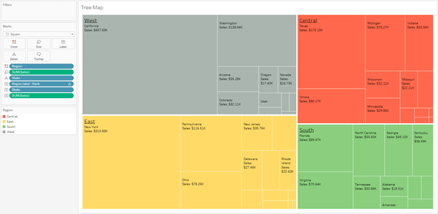
Eventually we want to build this visualization.
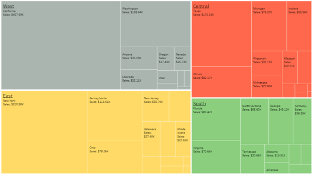
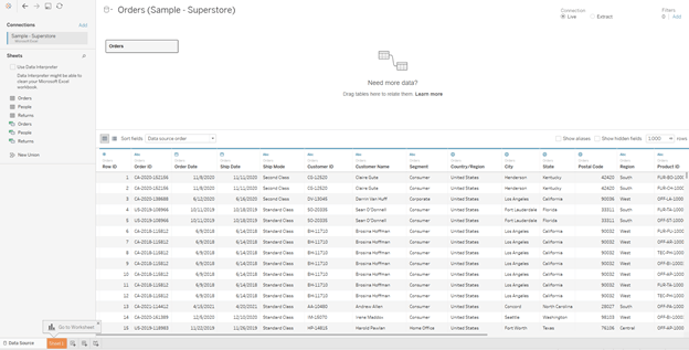
1) Let’s start with Sample Superstore dataset with the Orders table (available in My Tableau Repository)
2) Now, we want to create a Tree Map. Using Region, State and Sales as Sum Aggregation (Color, Detail and Size card)
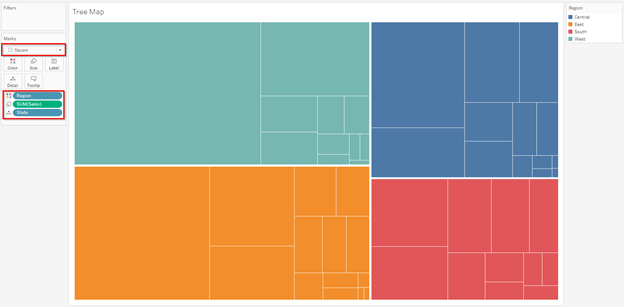
Here Region is the Parent field, State is the child field and the box/square size is controlled by Sales field.
3) We need to add Labels for all the three fields. Using all 3 fields as copy on the Label card.
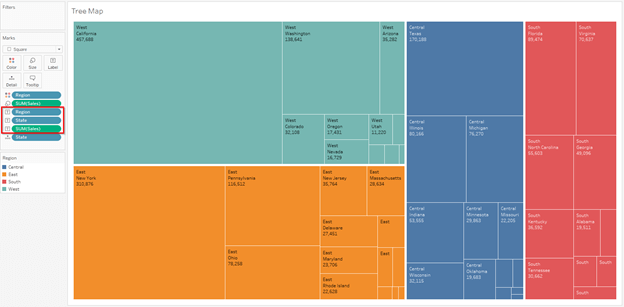
We can see now the Region Labels are repeated in every cell. As per the requirement, the State level labels must be shown on all cells where space is available, but the Region to be shown only in once cell, preferably the first Cell.
4) Now we need a Calculation to satisfy the condition.
Method 1: Using Rank.

Method 2: Using Index.

Method 3: Using First.

All three Calculations use ATTR function for the Dimension because Table Calculations need an aggregated field. MIN and MAX aggregations also work for the Region field.
Here we have not written the ELSE statement, because we need it as Null. Most of the times, we write ELSE ‘’ (empty value within quotes). In this example, we done need it.
** All the 3 Calculations work exactly same. But we need to be cautious while using the Index or the First Calculation. These two depend on the sort order. By default, the sort order internally is alphabetical. We need to change the order to Descending based on the measure. For Rank, it does not affect as it is automatically taking the highest value.
5) Using the new Calculation in the place of existing Region field on the label card.
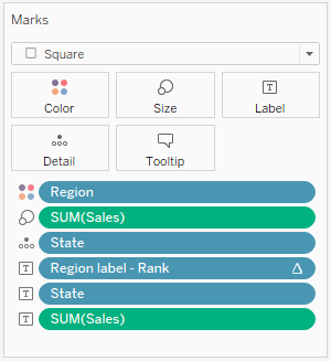
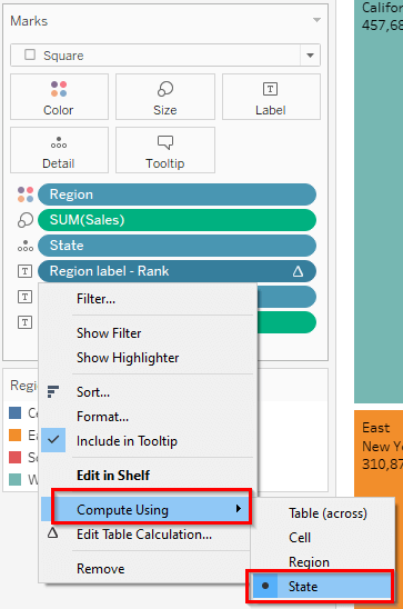
By default, the Table Calculation work on the entire visualization (Table Across). So, we need to change the scope and partition. We need to convert it based on the partition. In this case the Partition (or Pane) is based on State.
Now we can see that the Region name is shown only once for the entire branch.
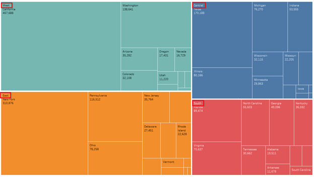
The last step would be to format the labels, color changes, some cosmetic changes etc.
