Mastering Data Visualization: Essential Best Practices (Part One)
Crafting Compelling Visual Narratives: A Deep Dive into Data Visualization
Elevating Insights: Best Practices for Effective Data Visualization
Data visualization is the process of translating data and information into a visual context to make data easier for the human brain to comprehend and gather insight from. With data visualized in a graphical manner, humans can identify patterns, trends, and outliers quickly and easily. The difficult part about data visualization is that there is no one right way to do it. There are so many different stories that you can tell with your data and so many ways you can visualize the same. Additionally, for those coming from a more technical background where the focus is what the data is saying rather than how it is being said, creating a dashboard that is visually enticing, user-friendly, and informative can be an extremely overwhelming task. So, what is the right way?
Choosing the Right Charts: Key Considerations for Effective Data Representation
Harnessing Color: Strategies for Meaningful and Accessible Data Visualization
Designing Engaging Layouts: Principles for Organizing Visual Information
Optimizing for Understanding: Techniques to Enhance Clarity and Impact
This blog is not going to give you that answer. There is no one right way to design a dashboard because each use-case, each data set, each story is unique. What this blog is going to focus on are the design principles to keep in mind when creating your visualizations and designing your dashboard. Following these guidelines will ensure that your dashboard is set for success.
Exploring Chart Types: From Bar Charts to Scatter Plots
Color Psychology in Data Visualization: Leveraging Color for Communication
Layout Design Principles: Arranging Elements for Visual Hierarchy and Flow
Enhancing Readability: Tips for Labeling, Annotations, and Axis Formatting
The three keys to success are:
- Thoughtful Planning
- Informed Design
- Refining of Your Design
Thoughtful Planning
Just like how a contractor has a blueprint before building a house, you must outline various aspects of your dashboard prior to development. Ask yourself the following questions:
- Who is my audience?
- What questions do they have?
- What answers am I finding for them?
- What am I trying to say?
- What other questions will my visualizations inspire or what conversations may result?
After you have gone through the above questions and have some clarity on what story you are trying to tell, next step is to sketch out some ideas. Don’t hesitate to put pen to paper. Figuring out the layout, chart types, filter locations, etc. will help you understand what works and what doesn’t. You are essentially going to be creating your own blueprint so it is easier for when you need to develop in Tableau Desktop.
Designing with intent and with a plan is critical. Put yourself in the shoes of your audience and try to understand why they would be visiting your dashboard and what functionality they might want to see. If you don’t, your dashboard won’t have the impact you intended it to have.

Informed Design
1). Form is a part of function
All dashboards have some type of form whether you realize it or not. Whether it be columnar, row, or grid-based, our eyes follow this form because humans are visual creatures by nature. We naturally seek patterns, and if the layout is random or doesn’t make sense, it’s very difficult to understand what the dashboard and its visualizations are trying to convey.
To capitalize on these human tendencies, make sure the order or format in which you present the data makes sense to viewers. If you’re using multiple graphs, make sure the order and layout is consistent and connections between the data are clear. You don’t want your viewers to get lost as they navigate your dashboard going from one visualization to another.
In the dashboard below by Andy Kriebel, we see that the different metrics are split out into cards. Each card includes the title, subtitle, bar chart with reference line, and line chart. Each card is identical and evenly spaced out. You can imagine being frustrated if some cards were larger than others, charts were in different order from card to card, etc.
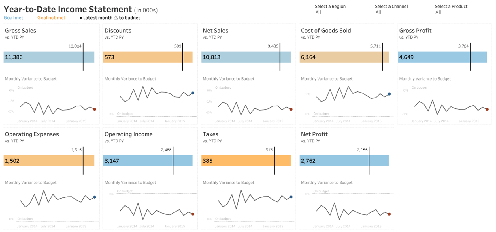
Having this type of layout is predictable and is one less thing your end-user needs to think about when trying to understand the data you are presenting.
Another thing to keep in mind is that end-users will interact with your dashboards in similar ways that they interact with other forms of digital content. Most viewers scan web content starting at the top left of a web page and following the page in a “Z” formation.
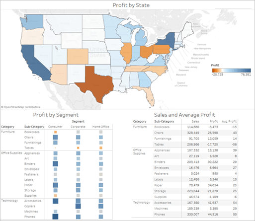
Once you know your dashboard’s main purpose, be sure to place your most important view so that it occupies or spans the upper/ upper-left corner of your dashboard. In the dashboard below, the author decided that the map view holds the key message, and that the end-user can follow the story below.
2). Less is More
It’s easy to get carried away and want to cram your dashboard with every view possible. This would be a good time to go back to step one of thoughtful planning and think about the scope. You want to identify and focus on only the most relevant information.
Take the example of a car dashboard. If a car dashboard was filled with every single indicator and metric possible, you as a driver would probably assume that nothing is really that important. If it was meant to draw my attention, there shouldn’t be dozens of other metrics trying to compete for my attention as well.
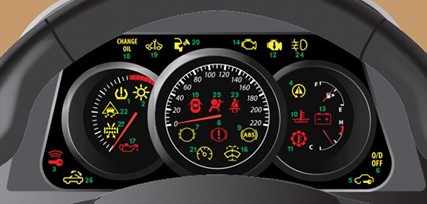
If you find yourself struggling to eliminate visualizations, remember that you are not limited to one dashboard. Design a second or third dashboard, each with a unique scope or purpose.
Developers should remember to follow K.I.S.S (Keep It Simple Stupid).
We don’t want to overwhelm the end-user in any way. This isn’t only related to the number of visualizations but also the use of colors, filters, parameters, etc.
Too much at once can not only interfere with the clarity of the dashboard but can also affect the performance.
3). Color with Purpose & Awareness
Color is one of the most important features of a dashboard. It can convey so much without using words. Color is one of those pre-attentive attributes that the human eye picks up on first.
For those who are unfamiliar, pre-attentive attributes are visual properties that we notice without using conscious effort to do so. Pre-attentive processes take place within 200ms after exposure to a visual stimulus, and do not require sequential search.
Color can also impact our moods, feelings, and behaviors so it is important that we put thought into which colors we choose. While perceptions of color are somewhat subjective, there are some color effects that have universal meaning. Easiest example, if showing “bad” or negative change, you most likely will want to display this in a red color. If I were to color “bad” or negative change in green, it might take the user a little extra time to understand what I am trying to say as we normally associate green with good and red with bad.
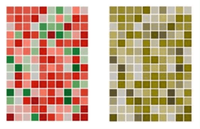
Another thing we need to keep in mind when choosing colors is that some of our audience might have a color vision deficiency. Studies have shown that around 8% of men and 0.5% of women have color vision deficiency (CVD). This is more commonly referred to as colorblindness. The key problem an individual with CVD has is that colors most people see as different will look the same. The two most common types of CVD are commonly referred to as “red weak” and “green weak” or “red-green colorblindness.”
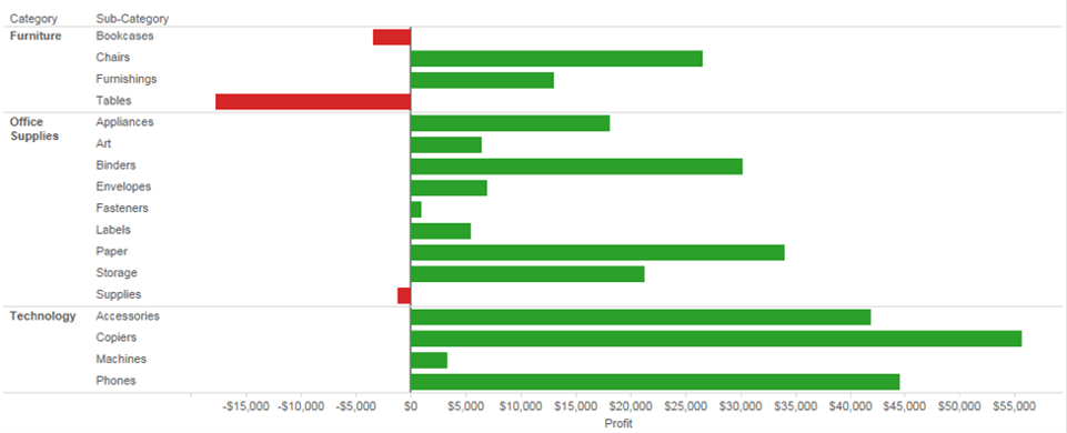
Keep in mind that the ability to tell these colors apart is only an issue if color is the only encoding method used to make a distinct comparison—for example, a good number vs. a bad number in a table, or one line vs. another line in the same chart. For example, in the chart below, we are forced to rely on color to give meaning to each square. There is no secondary encoding method to provide distinction.
The chart below offers an example where it’s easy to see which Sub-Categories have a negative or positive profit based on the direction of the bar from the axis line. This is using positioning/orientation as the primary encoding method while color is a secondary feature. Someone with CVD can still interpret this chart despite the use of non-CVD friendly colors.
It doesn’t just come down to red-vs-green, good vs bad. This color association matters with other things as well. Make sure to use intuitive colors that make sense to the viewer so they process the information faster. An example, if you’re working with temperatures, use red to indicate heat and blue for cold.
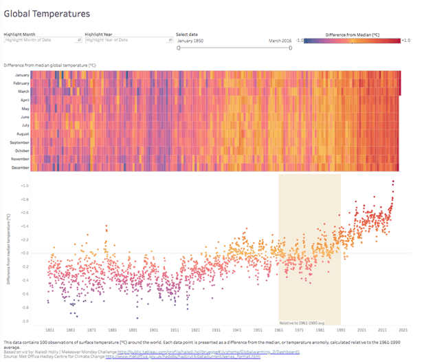
As mentioned earlier, there are numerous studies on color psychology that reveal how colors impact moods, feelings, and behaviors. How you use colors has a serious effect.
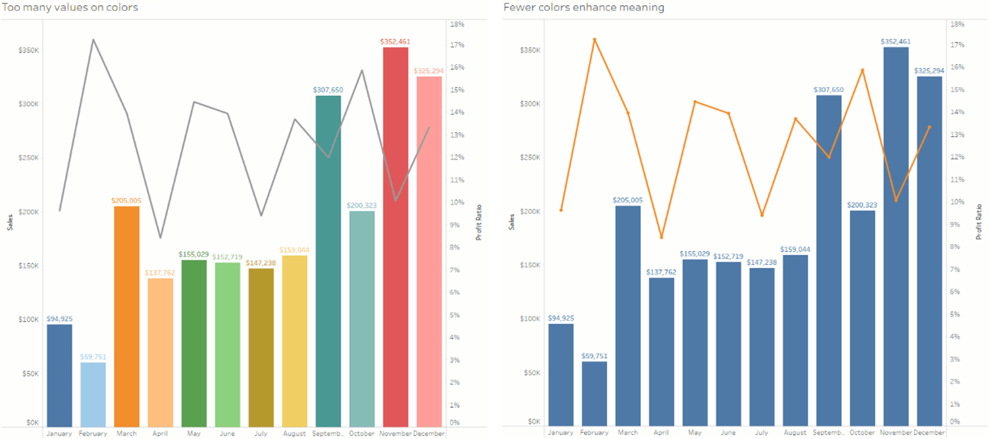
Try to be consistent across values or to highlight contrasts in the data. However, one needs to be careful not to overload the end-user with too much. There’s a delicate balance to using color (K.I.S.S). Use color to highlight and accentuate the important information. Too many colors may create visual overload and impede your user’s analysis while using a single color or too many shades of one color may cause the data to blend.
4). Contextual and Multi-Purpose Cues
Context helps us to begin to decipher information at first glance instead of after prolonged scrutiny. Users will gravitate towards shapes, icons, illustrations, etc. which will help to amplify the story of the dashboard.
It is noted in Colin Ware’s book “Visual Thinking for Design”, that the average human attention span is only 8 seconds, and our brain processes visual images 60,000 times faster than text. Michelle Borkin, an assistant professor in computer science at Northeastern University, also published a study that proves that “human recognizable” objects such as icons, photographs, and logos help people understand and remember a visualization.
We can keep this in mind when designing our dashboards and deciding if we should add illustrations and icons. If the use of shapes, logos, etc. is appropriate, I say add them.
Here are just some examples of adding shapes or icons for providing context:
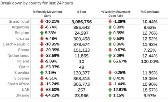
The up/down green and red arrows help to show trending information and anyone with a color deficiency will still be able to decipher between up and down.
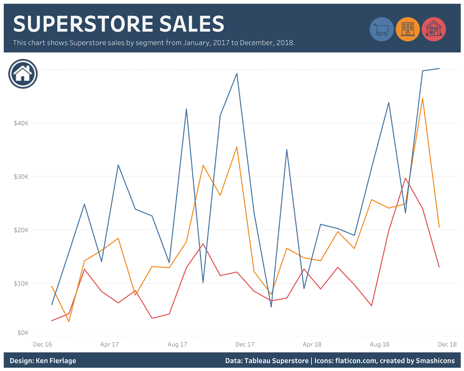
The legend in the Superstore Sales dashboard is depicted as shapes instead of text, allowing the user to decipher consumer, corporate, or home office segments easily.
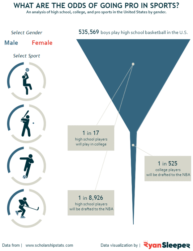
The chart showing sports figures allows you to filter the dashboard based on the sport you select. This is easily recognizable from an end-user perspective, and it draws the user’s attention.
5). BANs
BANs or “Big-Ass Numbers” are an amazing way to draw attention to your most important metrics. These metrics can serve as the summary points of your dashboard and provide context to other visualizations.
Back in 2016 at Tableau Conference, the Tableau Research and Design team hosted the first ever Tableau Labs with the intention of conducting real-time research with conference attendees. One activity was the Dashboards Eye-Tracking Station.
The question posed? Can we predict where people look when exposed to a dashboard they’ve never seen before?
Some examples of where BANs are used are below:
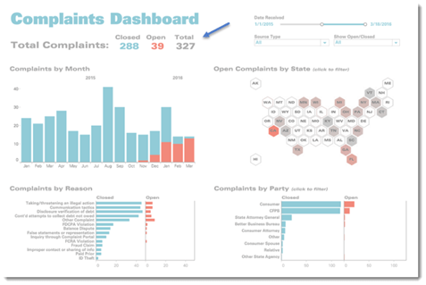
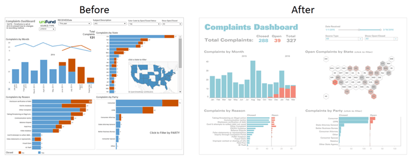
The BANs in the Complaints Dashboard above aren’t just conversation starters/ key takeaways, they are also color legends that clarify the color coding throughout the dashboard.
The BANs indicate that “Closed” is teal and “Open” is red. Armed with this knowledge we know exactly what to make of the charts throughout the rest of the dashboard.
Another great example is the CTT Wireless dashboard. We can see that the developer followed one previous rule of “form is a part of function” because we can see a clear distinction among the three rows of focused goals. What starts off each goal is a BAN indicating what metric we are examining as we proceed from left-to-right on the screen.
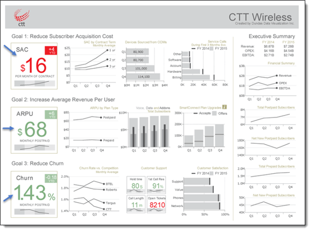
Ideally, when formatting these BANs, you want to maximize the Data to Label ratio. Bring the data to the forefront. We see above in the CTT Wireless dashboard, the numbers ($16, $68, and 1.43%) are all bolded and much larger compared to their respective labels.
6). Encourage Exploration
The power of dashboards lies in the author’s ability to queue up specific views for side-by-side analysis. Having these views interactive allows for even more questions to be answered and encourages the end-user to get creative with their questions as they dive deeper into the details.
To encourage exploration of your dashboard, you can do any or all the following:
- Show filters for end-users to change values
- Enable highlighting so that a selection in one view will highlight related data in others
- Add dashboard actions to encourage users to make selections in the charts themselves
- Prompt users to interact by using specific wording in subtitles, tooltips, and titles of parameters, filters, etc.
- Be cautious of where you are placing filters, legends, etc. You want them to be located near where they will trigger changes or follow a logical flow (ex] all filters that are global are located at the top or left of the dashboard – together and easy to find).
- Be aware of the presentation of the filter. Is it a single select radio button? Multi-select drop down menu? Rule of thumb: If you have a large number of options in the filter, use a drop-down menu so that the list of values does not take up much needed space on the dashboard.

Titles of filters/highlighters above are prompting user to “Select” values. Along with the subtitle of the map, users now know they can “select” a county to see how it compares to other counties in the country. This is informing the user that they can interact with the visualization to dive deeper.
Refining of Your Design
1). Reflect
Reflection is a key step in ensuring that your dashboard is ready to be used by others. This is where we can look back to the blueprints we created and the answers to our “thoughtful planning” questions and compare.
Is the story you want to tell clear? Do the visualizations chosen have the intended effect? Does the layout/placement/flow of this dashboard still work?
After you build out the prototype, ask your audience how they’re using the dashboard and if it helps them answer their pressing questions. Are they digging into certain views and ignoring others?
You can take this information to tweak the existing dashboard or develop new ones.
Good testing is key. Learning how your dashboards are received will help inform future designs and influence how data is leveraged within your organization. This dashboard development journey is never really over. There are always ways that a dashboard can be improved upon or tweaked. Take for example the Complaints dashboard from earlier. There were previous versions of the dashboard that served their purpose, but the developer decided to continue to fine tune. Whether it be with tweaking the colors used, adjusting the layout/placement of visualizations, retiring old visualizations and developing new ones, etc. Be open to adjusting and editing your dashboards.
2). Leverage Tooltips
Once you’re done with the main design work, take a look at your tooltips. Tooltips are a fantastic opportunity to reinforce the story you’re trying to tell with your dashboard. They also add helpful context to your view. Tableau populates a view’s tooltips automatically, but you can easily customize them.
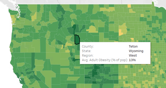
Take the example of the “Is Your County Obese?” Map. The default tooltip doesn’t give me additional information/context that isn’t already present through the coloring of the counties on the map.
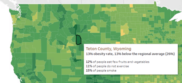
When revised, the tooltip emphasizes the most important elements and also adds information as to where that county falls with respect to the regional average. Adding this type of detail into your tooltips can take your visualizations from good to great with just a few steps.
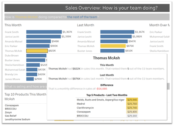
You can also use the Viz in Tooltip feature to augment your dashboards and stories with relevant data without introducing more clutter. With Viz in Tooltip, place visualizations of your own design into tooltips, revealing them on hover or selection of individual marks. The data in the viz is automatically filtered to the mark you hover on or select, giving you and your users precise views of the pertinent data. As always, make sure that the visualization is enhancing, not distracting from the contents of your dashboard. When in doubt, keep the rest of the dashboard simple and inform the user that they will get more context in the tooltip.
3). Eliminate Clutter
One of the last steps I like to take in my dashboard development is to perform a squint test. Take a step back and consider your dashboard from the perspective of new viewer. What stands out? Is there anything that is distracting? Are the colors used appropriate? Does the dashboard have too many objects on it? Is there anything that can be removed or rearranged to add clarity?
Every element should serve a purpose. If a title, legend, axis label, grid line, border, etc. isn’t necessary, consider removing it. If you remove it and can still understand the dashboard and its purpose after a second squint test, was the object necessary in the first place?
If your dashboard needs more white space, consider a floating layout. (If you go this route, give your dashboard a specific, fixed size so that the item that you floated stays put if the window size changes.) Don’t overcrowd the worksheets and objects on the dashboard. Be sure to give some spacing between objects as well as distinctive headers. This gives the dashboard a more organized form and allows the user to flow from one section to the next.
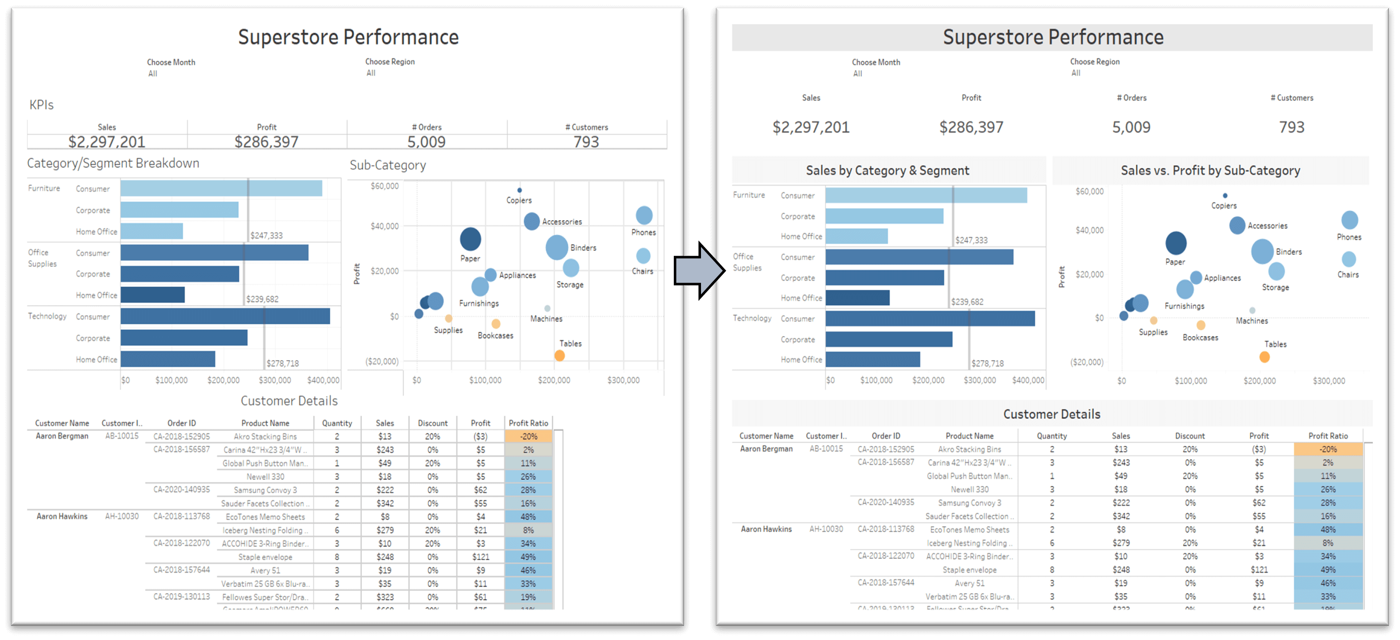
When you eliminate clutter and simplify your colors and layout, it is much easier to find hidden insights because there are fewer individual elements to sift through. Simplifying your dashboard design is often an iterative process, so keep going back to existing dashboards with fresh eyes.
I can understand that all of this can be a bit overwhelming and you might be thinking, “This is a lot to be thinking about when developing a dashboard!”. The good news: not all of these need to be done at once. This is a learning process and the goal of this blog was not to force everyone to do exactly as I am doing. The goal is to make you, as a developer, aware of how small changes can make big differences in your design. Once you start, visual best practices will become habit.
