Calculating Business Age in Power BI: Essential Methods
Unveiling Techniques for Determining Business Age in Power BI
Harnessing Power BI for Accurate Business Age Calculations
There are some very special charts that we can build in Tableau. Yet end users ask for something extra-special. They make Tableau developers think outside the box. Or in many situations, they look at visuals created using some other software like D3, Plotly, Bokeh etc. and ask for the same features in Tableau. One such chart is a Grid Chart which is not an actual chart. This is more like an alternative of the Heat map or a Highlight table or uniform Tree Map built in Tableau. There are many blogs and community posts that have created grid visuals using data densification or the usage of X and Y coordinates (like a Hexbin map or a Tile map) or some trick of a blend to provide the X-Y coordinate system to represent the dimensions and measures.
Understanding the Importance of Business Age in Power BI
Exploring Different Approaches to Calculate Business Age in Power BI
Implementing Advanced Date Calculations for Business Age Analysis in Power BI
Enhancing Insights with Business Age Visualizations in Power BI
In this blog, we will tackle a use case where the end users need a grid structure made of boxes representing the important KPIs (Key Performance Indicators or Key Result Areas or Key Risk Indicators) where each box is colored by the Criticality based on some predefined thresholds. This can be used in multiple situations like tracking inventory by Store, poll status across different States, Finance health across different divisions, Stock performance across time etc.
Leveraging DAX Functions for Business Age Calculation in Power BI
Utilizing Power Query for Dynamic Business Age Calculations in Power BI
Best Practices for Handling Date-based Metrics in Power BI for Business Age Analysis
Optimizing Performance and Accuracy in Business Age Calculations with Power BI
When searching for the appropriate design, the users got inspired from some of these websites.
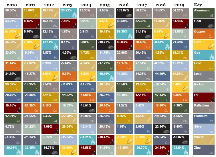
http://www.usfunds.com/interactive/the-periodic-table-of-commodity-returns-2019/#.XoAj4ohKiUk
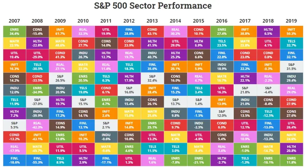
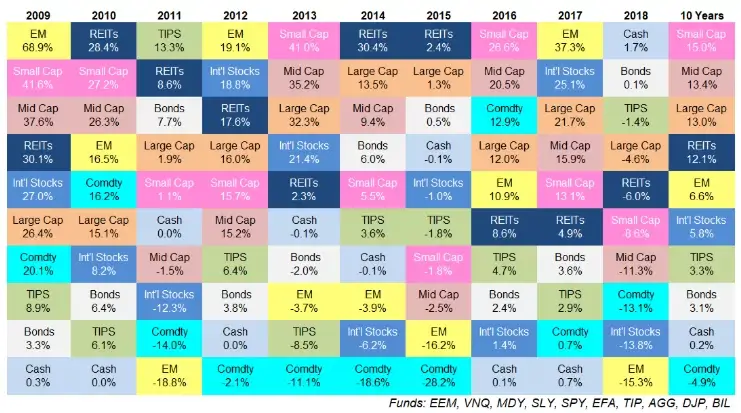
https://awealthofcommonsense.com/2019/01/updating-my-favorite-performance-chart-for-2018/
Though we are not building these charts specifically, we will take some features from these images and use it for our design.
For this example, since we cannot use the actual data, we will use a very simple sample data based on Global Hunger Index (Data available on Wikipedia). The data consists of 116 countries spread across 5 Continents – Africa, Asia, Europe, North America and South America. For each country we have the Hunger Index represented in Percentage and the 2019 population.
- The countries with their Hunger Index (HI) and Population to be represented as labels in the boxes, with one country per box.
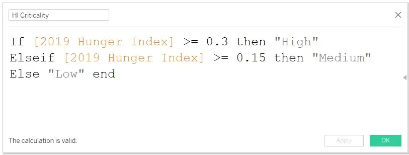
- The box color to be determined by the Hunger Index Criticality where >=30% would be High (Red), >=15% would be Medium (Amber) and rest would be Low (Green).
- The Boxes should be arranged High HI to Low HI.
This blog will require the usage of Table Calculations along with some hacks and tricks to arrive at the required design.
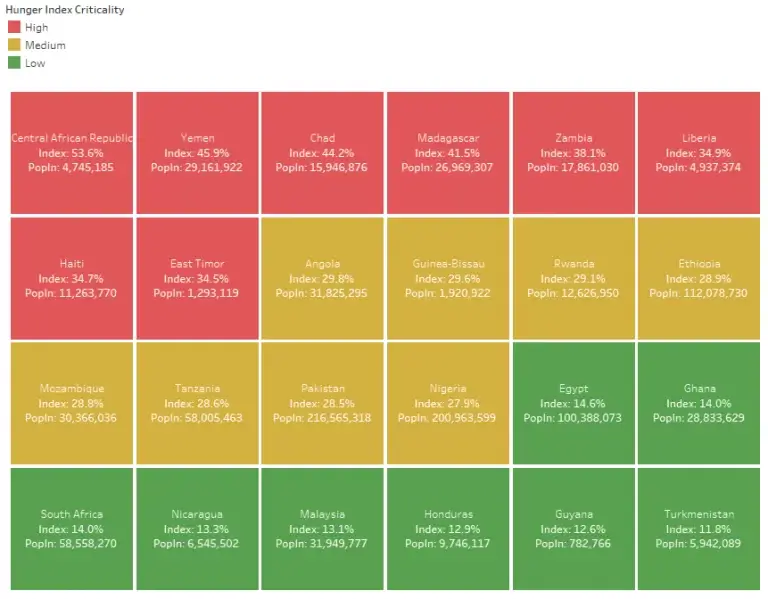
After the initial build, we can go into some enhancements by slicing and dicing by Continent or Criticality varying the number of boxes in each line, provision for a filter to limit the number of boxes across criticality etc.
As mentioned before, we are using a very simple data with 116 countries across 5 continents. Some text values are modified to numbers to suit the datatype.
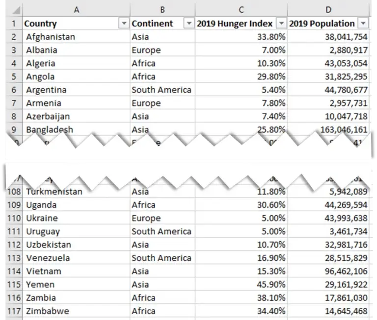
We can calculate the Criticality in the data itself, but we will do in Tableau since it is very a small dataset.
We will bring the data in Tableau.
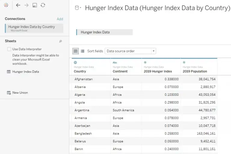
We will convert the Hunger Index to a Percentage. Next, we will create a Criticality flag. We can have multiple buckets to actually make it look like a color gradient. For this example, as mentioned before, we are using 3: High, Medium and Low. Since very row has unique values, we are not using an Aggregate function. Any aggregate function can be used if the data is designed in such a pattern.
PART 1: All Ranks
In this part, we will solve the most of the use case and requirements defined initially. The other parts will have some enhancements.
1) We will start by building the heat map. As per the initial requirements, we need all Countries, their population, the Hunger Index and Criticality. If use any of these fields on Columns or Rows, we will not get a grid structure. So we need to use them on the Marks shelf. County, Population and Hunger Index on Label and Criticality on Color (High as Red, Medium as Yellow or Amber and Low as Green. Though these colors are not ideal when following Best practices. But for this use case, we will go with these colors). The Marks has to be represented as a Square. Circle or any other shape also works.
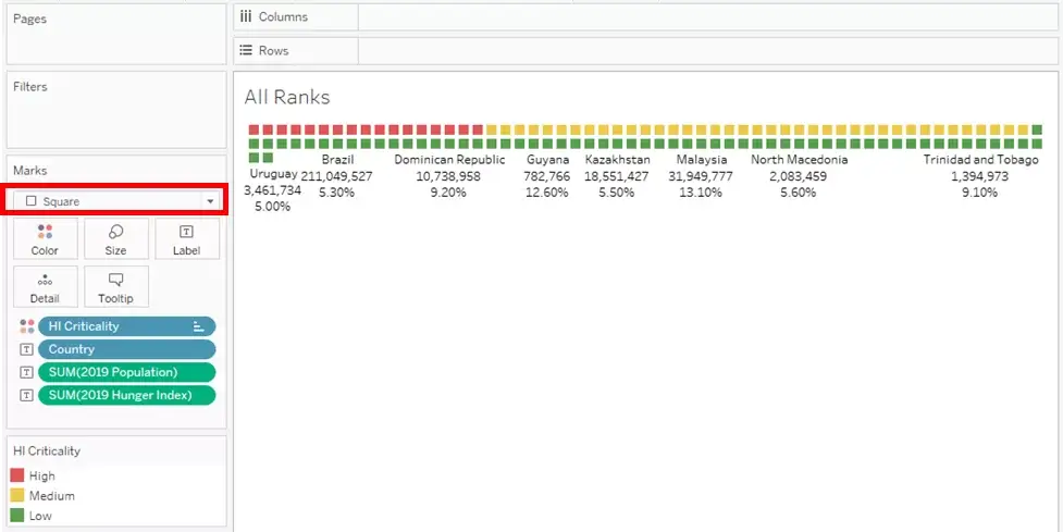
We can see that all the squares are arranged in the available space. As seen in some of the previous images, we need a couple of things displayed.
2) We will increase the size of the boxes and change the label alignment to middle-center.
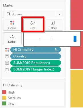
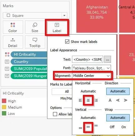
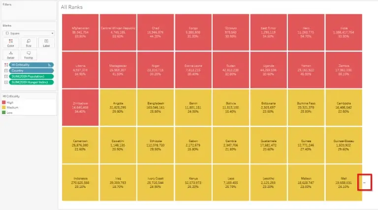
If needed at this point, we can sort the Country by Hunger Index from High to Low.
We can see that the boxes are well defined and the labels are clearly visible. But the problem is that all the boxes are not displayed due to space constraints.
3) To repair this issue, we need a Rank field. For this we are using a Rank_Unique function. This will help if there are multiple countries with the same Rank, they will be ranked alphabetically.
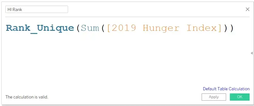
This field is not necessary to be displayed. This field will be used in the next step to split the boxes in buckets for easy visibility.
Be default the Rank will be 1 for every country since there is no Dimension on the Columns or Rows. We need to convert it to every Country and Criticality combination.
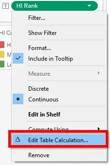
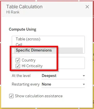
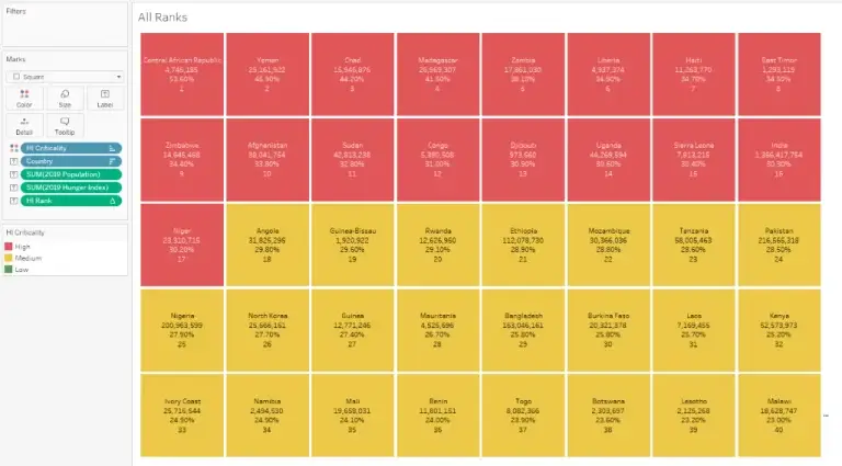
Based on the end users’ recommendation and the dashboard size available, we can display as many boxes in each row. For this example, we will go with 5 boxes per row.
4) To achieve this, we will create a Dimension calculation.
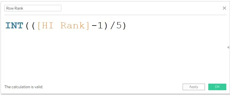
This Calculation is little tricky if using for the first time. This field is built on the concept of Pagination, which is discussed in the Tableau community quite a bit.
There are three parts in the calculation: Starting from the inner most piece – Subtract the Rank by 1, Divide the equation by 5 and the INT() function.
a) Why 5? It is very straight forward because we need 5 Boxes (5 Ranks) in each Row.
b) Why INT()? The Int function here acts as a Floor function (Rounding to the lowest value). Since we are diving by 5, every value will be a decimal. To convert the value to the previous whole Number.
c) Why Subtract by 1? If we don’t subtract by 1, the fifth rank will jump to the next row.
We can also add a +1 at the end to bring it back to starting from 1. Since we don’t display this field anywhere, we don’t have to complicate it.
For example:
| HI Rank | HI Rank/5 | Int(HI Rank/5) | HI Rank – 1 | (HI Rank – 1)/5 | Int((HI Rank – 1)/5) |
| 1 | 0.2 | 0 | 0 | 0 | 0 – First Row |
| 2 | 0.4 | 0 | 1 | 0.2 | 0 – First Row |
| 3 | 0.6 | 0 | 2 | 0.4 | 0 – First Row |
| 4 | 0.8 | 0 | 3 | 0.6 | 0 – First Row |
| 5 | 1 | 1 | 4 | 0.8 | 0 – First Row |
| 6 | 1.2 | 1 | 5 | 1 | 1 – Second Row |
| 7 | 1.4 | 1 | 6 | 1.2 | 1 – Second Row |
| 8 | 1.6 | 1 | 7 | 1.4 | 1 – Second Row |
| 9 | 1.8 | 1 | 8 | 1.6 | 1 – Second Row |
| 10 | 2 | 2 | 9 | 1.8 | 1 – Second Row |
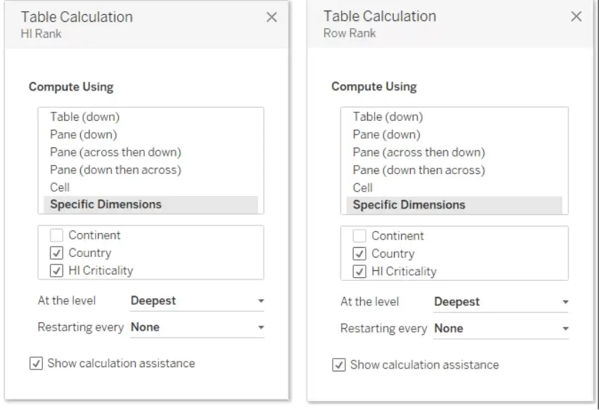
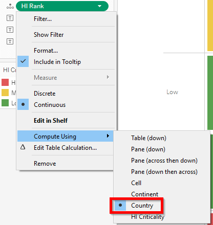
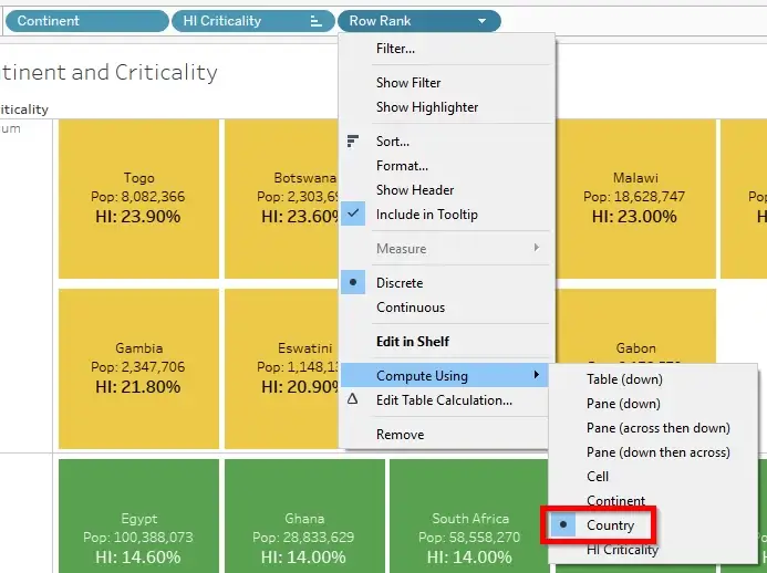
5) Since it is a Rank calculation, it will be a Continuous Measure. We need to use it as a Discrete field. We also need to make sure that the Row Rank is computed using the Country and Criticality combination similar to the HI Rank.
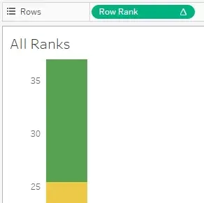
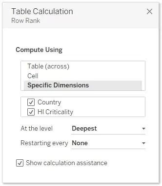
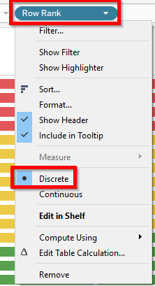
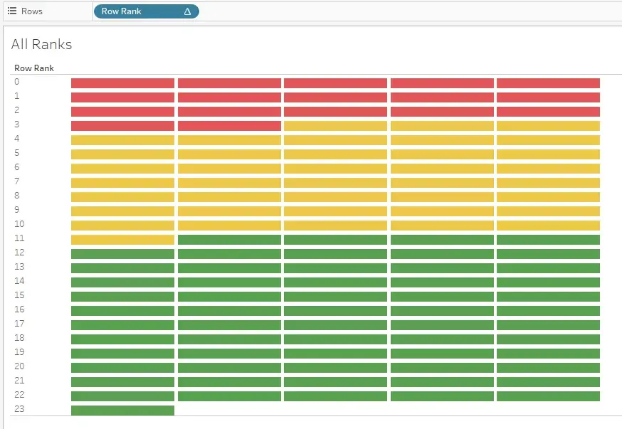
At this point, all the boxes are squished vertically. We just need to set the size by expanding the row borders.
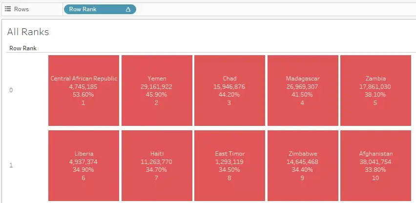
Now, we can hide the header for the Row Rank field, remove the Rank field from label and do some font adjustments if needed and the entire visualization is ready.
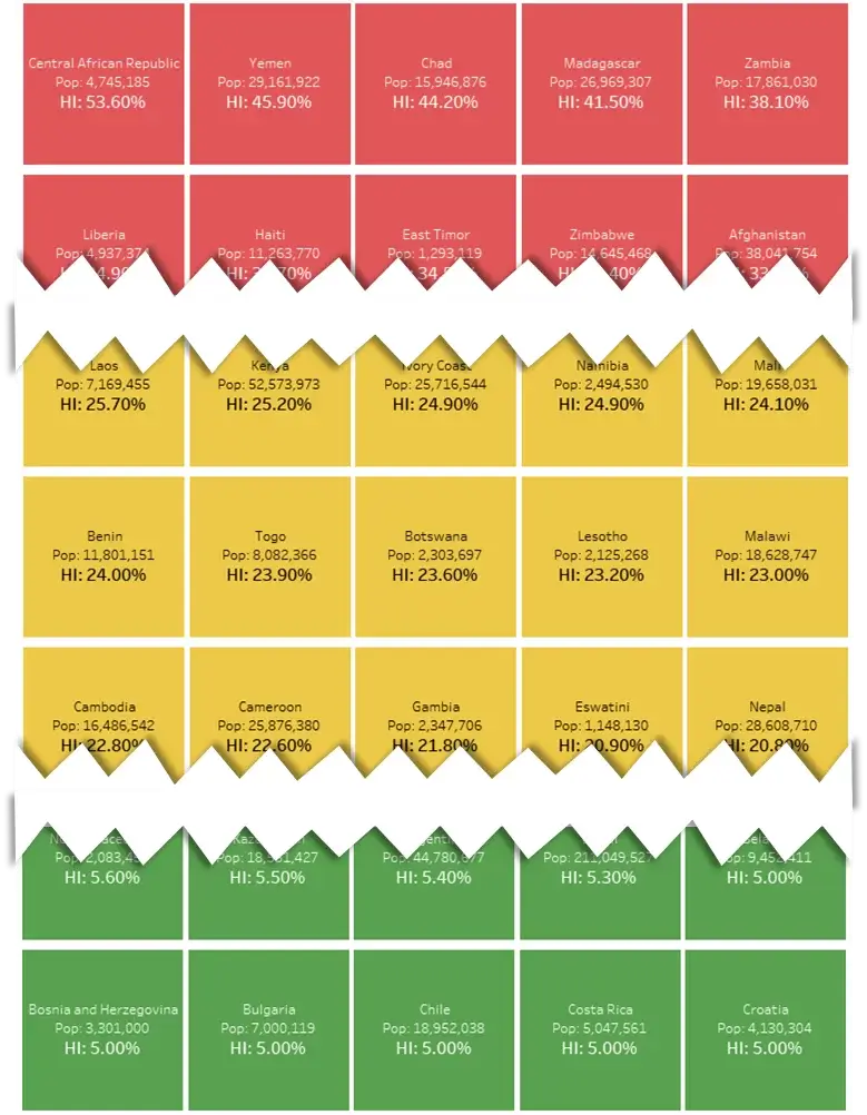
PART 2: Rank by Criticality
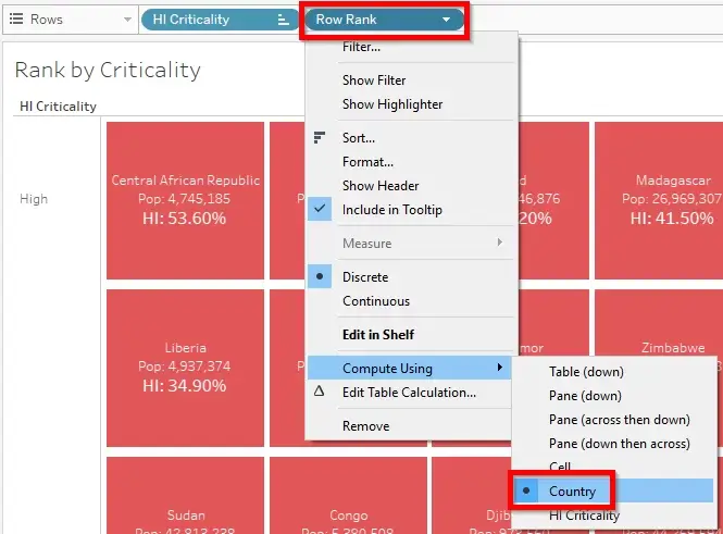
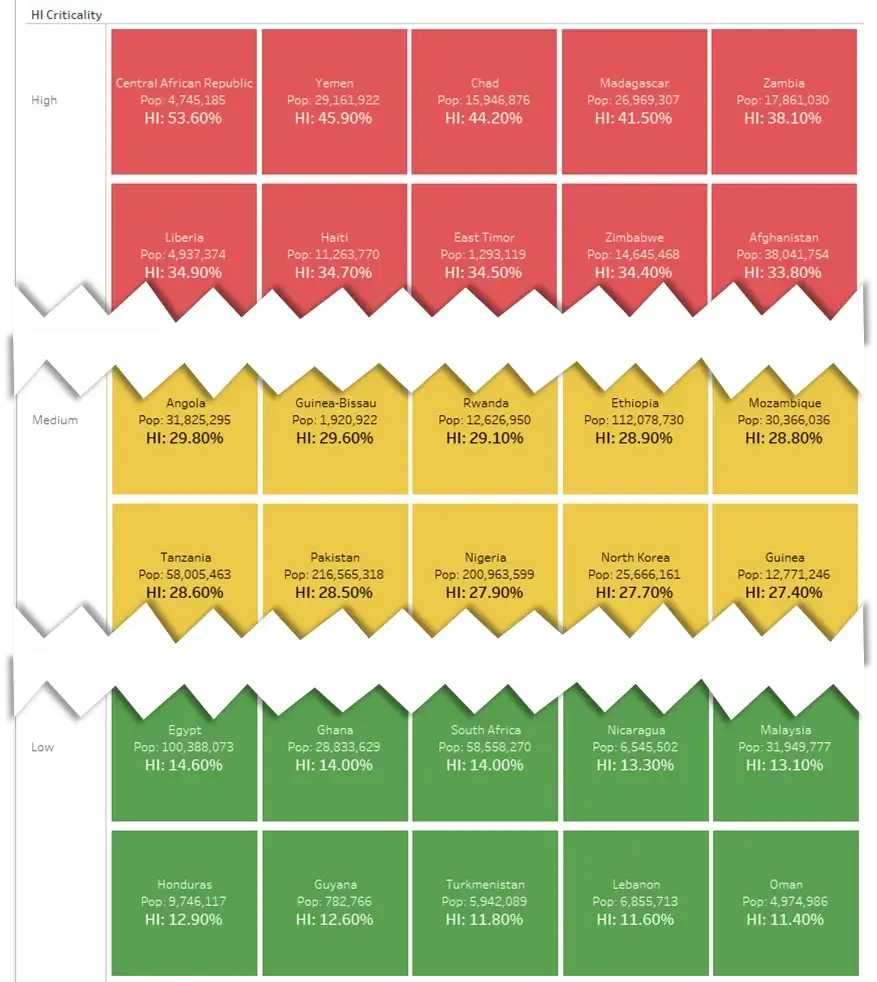
In this part, we will improvise and slice & dice this grid in different ways because end uses ask for different options of the same visualization. It is very simple; we need to introduce a copy of the Criticality field on Rows to the left of the Row Rank field (Since the colors represent Criticality, the header of this field can be hidden later). This way we have all the High separated from the Mediums and Lows.
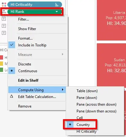
We can create a copy of the first visualization and work on it. But one more thing we need to take into account is the Ranking. In PART 1, the Ranking was for the entire visualization. Here we need to provide rankings within the Criticality buckets. So, the Criticality field is the Partition (or Addressing) and Country field is the Granularity (or Direction of computation).
This has to be applied to both the Rank field and Row Rank field. It is applied to the Rank field because it will help see the Ranking within the Criticality. It is applied to the Row Rank field to reset the 5 boxes within the Criticality.
PART 3: Rank by Continent
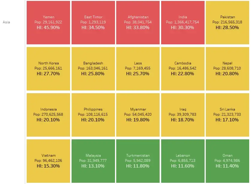
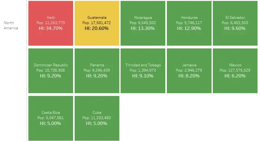
In this part, we will arrange the boxes by Criticality across Countries within each Continent.
Using a copy of the original visualization, we will introduce the Continent field to the left of Row Rank field on the Rows shelf.
Here again, the Rank computation of the Rank field and Row Rank field has to be for the Criticality and Country combination. The Continent field will be the Partition.
PART 4: Rank by Continent and Criticality
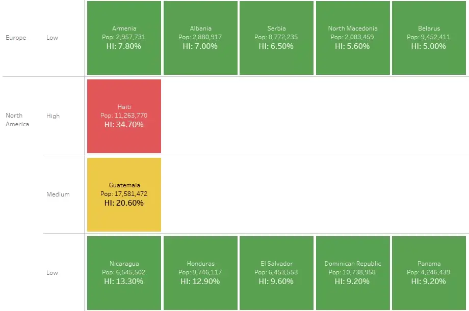
In this part, we will arrange Boxes by their Rank within each Continent and Criticality.
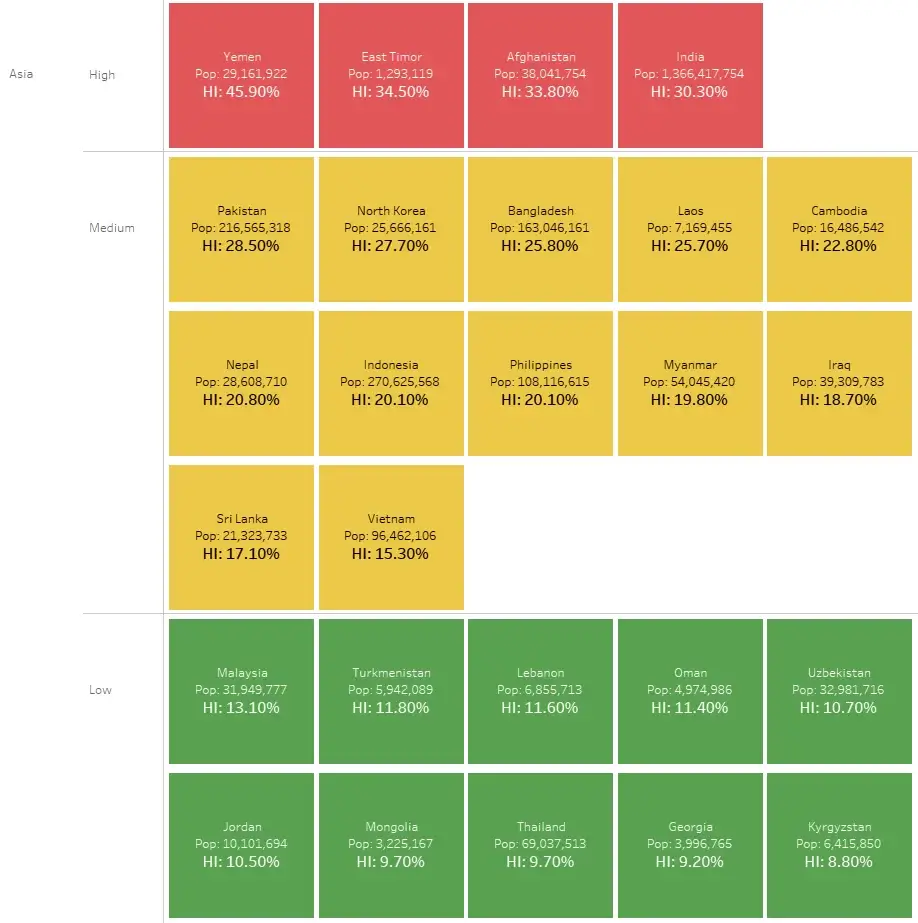
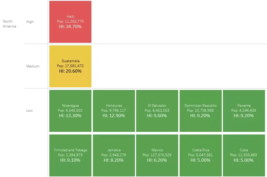
We can use the copy of the previous visualization (Part 3) since it already has Continent in it. Then we will introduce the HI Criticality field in between then Continent field and Row Rank field.
The Rank computation for the Rank field and Row Rank field must be across Countries. Continent and Criticality fields are Partitions and Country field is the Direction.
PART 5: Rank by Continent and Criticality – Top N
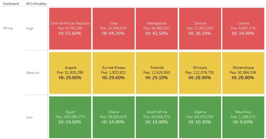
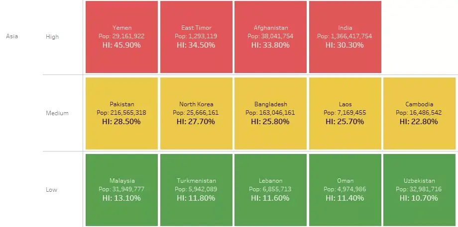
This is the last part we are solving. Since there are many values displayed, we are giving Top N values within each bucket (Top N Countries within each Continent and each Criticality).
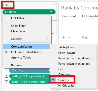
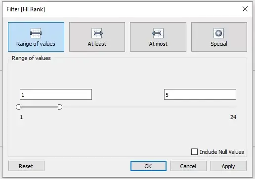
We will use a copy of h previous created visualization (Part 4) and use the Rank field as a filter. If the end user needs a filter control to select the required values, we can either expose the Rank filter as a slider or create a Top N Parameter for the Ranks. For this example, we will go with the Top 5 values. This Top N concept can be applied on any of the parts we have built till now.
The Rank field which is still computed at the Country level.


 Media Coverage
 Press Release
