Creating Skewer Charts or Ball-and-Stick Models in Tableau
Visualizing Data with Advanced Techniques in Tableau
Step-by-Step Guide to Building Skewer Charts and Ball-and-Stick Models
Tableau offers a lot of really good visualizations out of the box. Yet, end users ask for something fancy and colorful. They make Tableau developers think outside the box. Or in many situations, they look at visuals created using some other software like D3, Plotly, Bokeh etc. and ask for the similar features in Tableau.
In this blog, we will tackle a simple use case where the end users need to display multiple values. They need the Minimum, Maximum and Average/Median all in the same visualization. We have discussed some of these features in many of the blogs. Based on the requirements, Bar chart with Reference lines, Dual Axis chart, Crosstab with multiple metrics, Bullet chart, Box plot and combination of some of these on the Dashboard were offered. None of these seemed to drive home the requirements. So, we tried an alternative chart. As mentioned before, this blog is not solving a complicated use case, it is just an alternative colorful chart. The client liked the chart, it was a win because ultimately Customer is the King.
Introduction to Skewer Charts and Ball-and-Stick Models
Step-by-Step Instructions for Creating Skewer Charts in Tableau
Tips and Tricks for Effective Visualization with Ball-and-Stick Models
Enhancing Data Insights with Advanced Visualization Techniques
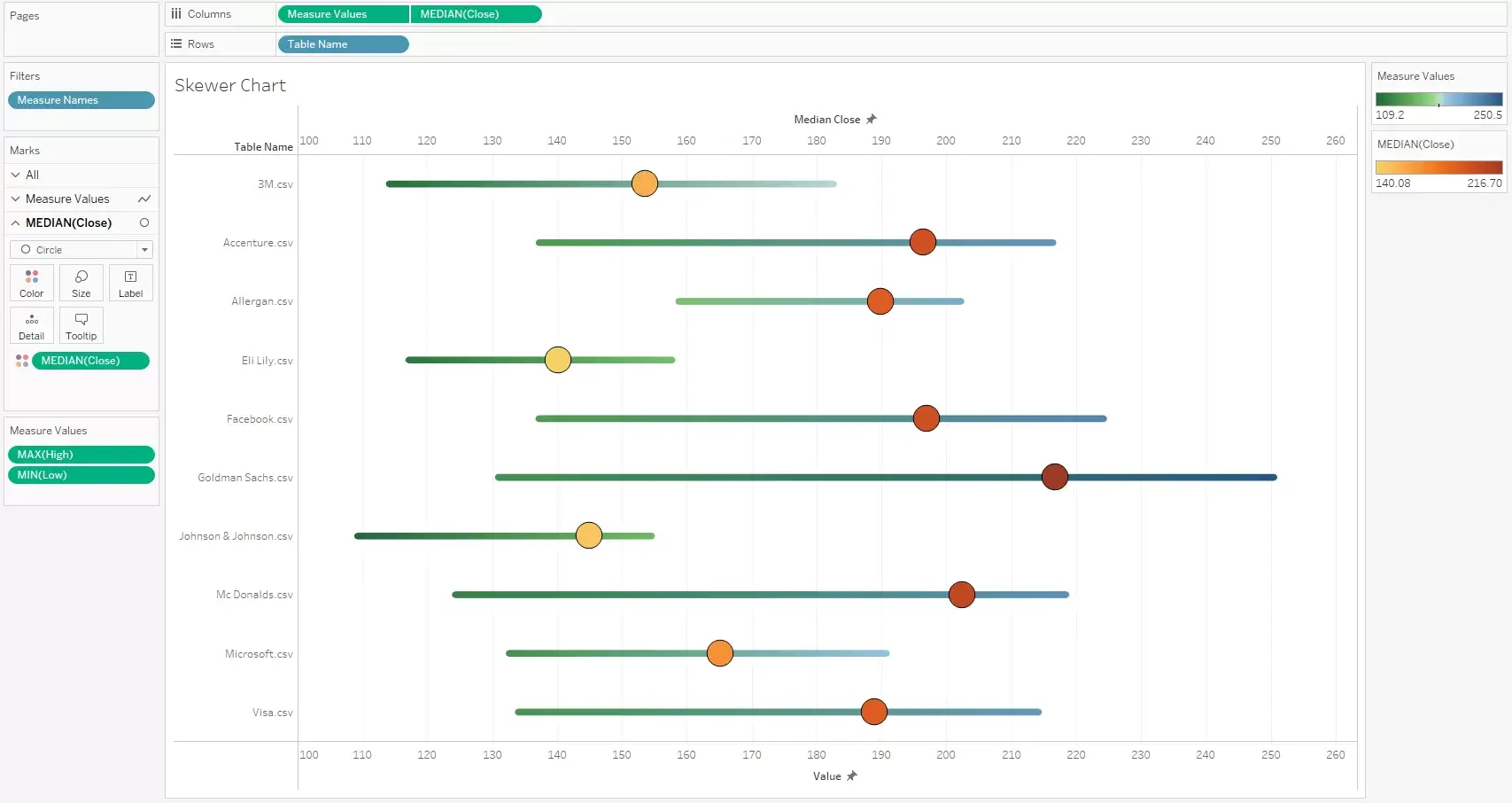
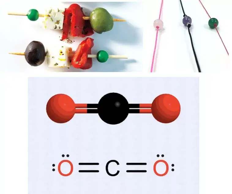
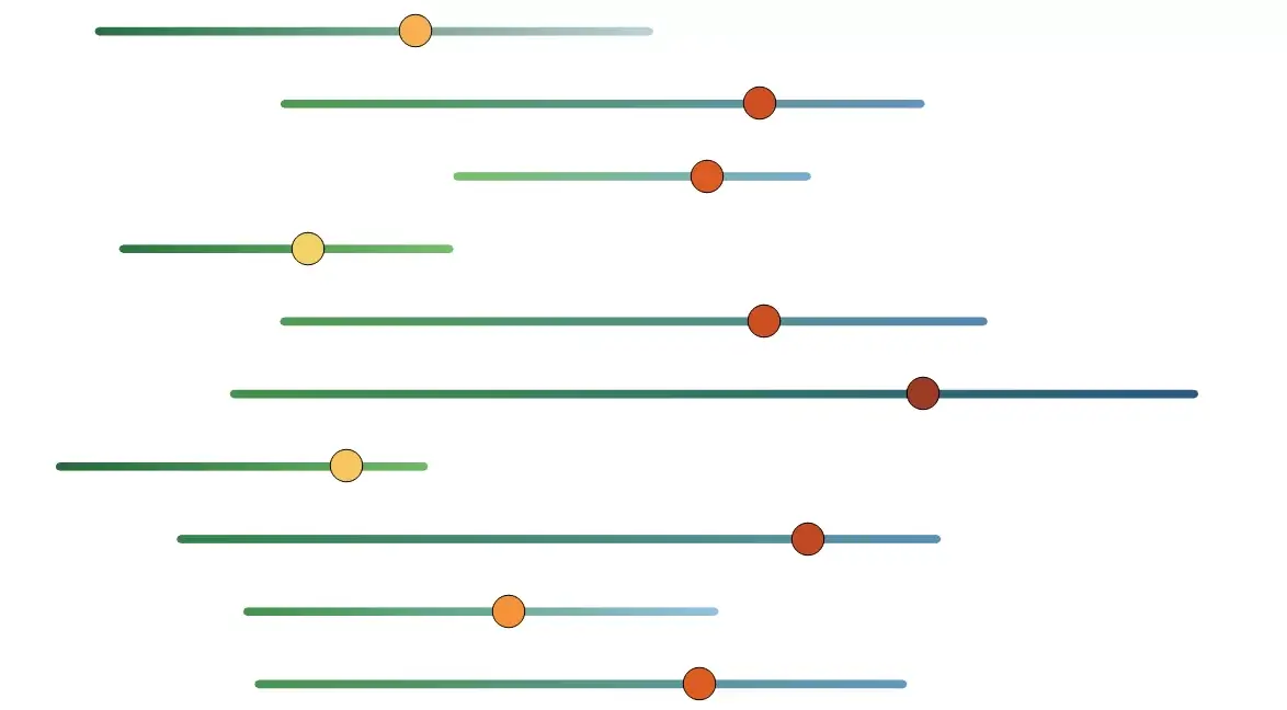
Since there is no chart like this, we would want to call it as the Skewer Chart or the Ball and Stick Model. The inspiration comes from the Skewers, the Chemistry molecular models and the Bead in a string concept. This has features of a Dumbbell chart and the Lollipop chart.
To build this chart, we have taken a very simple Stock Data set. Data has 10 companies and their High, Low and Close values among other fields across a time range of 3 months. We will use Max value for High and Min Value of Low and Median for Close. Any data with a good range of values will work. For the purpose of this blog, we have selected values that are good for visual representation.
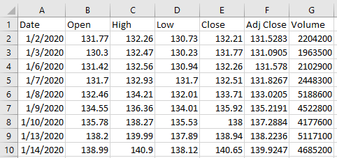
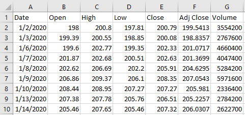
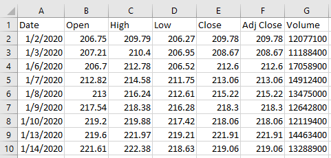
We have a set of files and we will bring those as a Union.
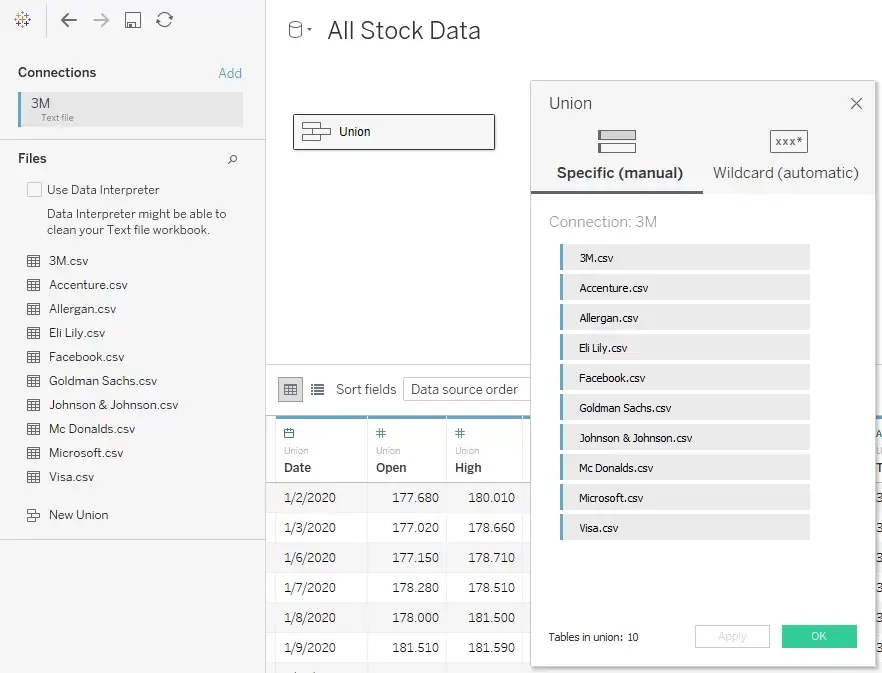
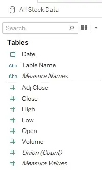
Here Table Name is the company name (coming from the path of the CSV file). For our visualization we will be using Max of High, Min of Low and Median of Close.
Understanding Skewer Charts: Concept and Application in Data Visualization
Building Ball-and-Stick Models: Techniques and Best Practices
Leveraging Tableau Features for Enhanced Visualizations
Exploring Creative Ways to Present Data with Skewer Charts and Ball-and-Stick Models
There a very few steps to achieve this.
- We shall start with Measure Names on the filter shelf and select High and Low measures.
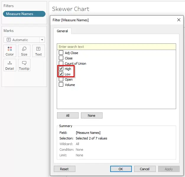
By default, the measures will be sum, we will change it accordingly on the visualization.
2) We will use Measure Values on Columns and Table Name field on Rows.

By default, a bar chart is created. At this point, it looks like a single bar. But in reality, both measures are aligned such that one measures is in front of the other. There are a lot of blogs that explain the concept of Measure Names and Measure Values.
3) Next, we need to change the aggregation and type of chart. We need a line chart to create the stick. The bead or the circle will come in later steps.
The Marks has to be converted into a Line chart.
Measure Names has to be used on the Path card
If needed, the Measure Values can be used on the Color card.
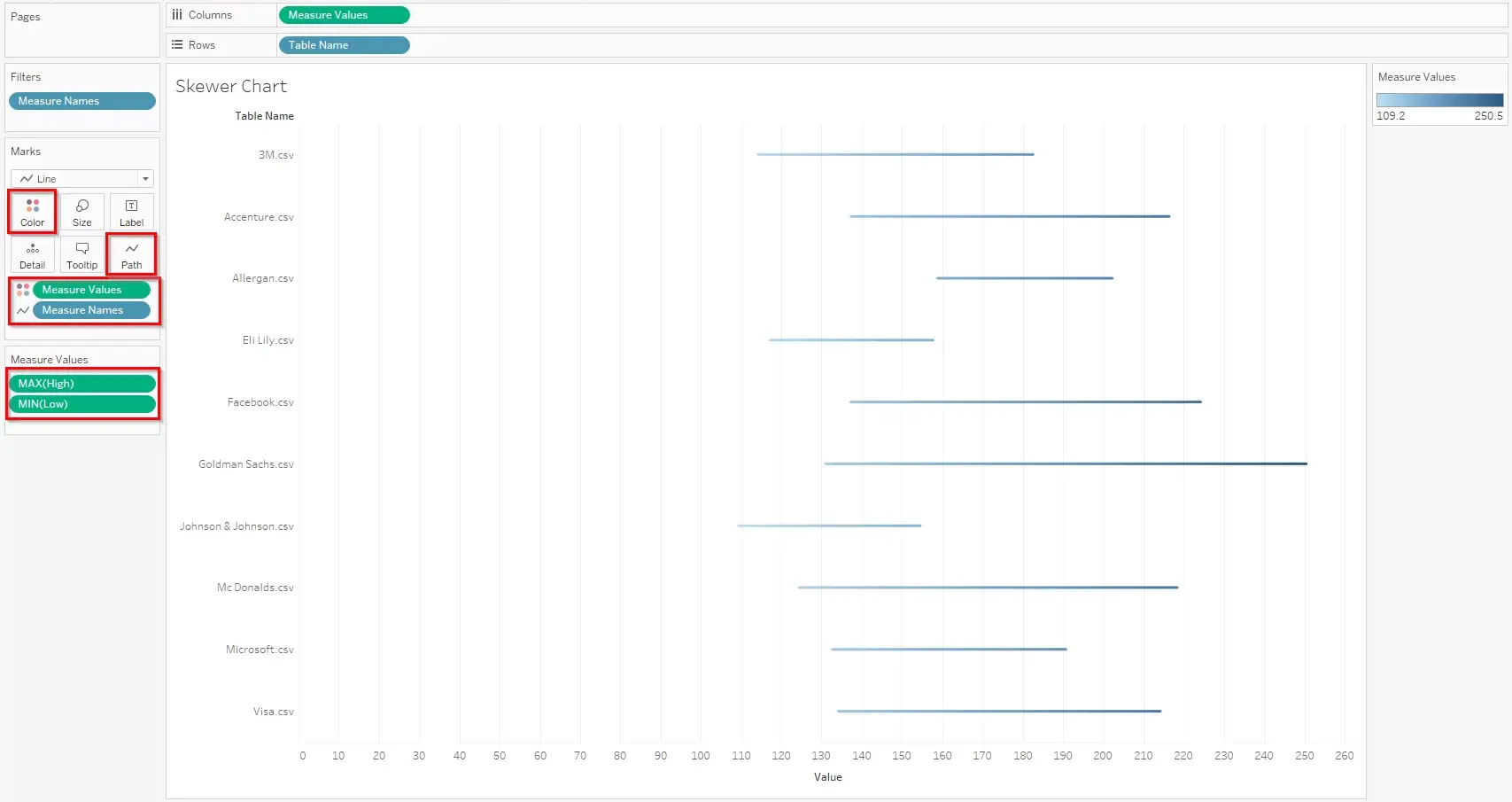
4) Next, for the circle we will use the Median of the Close measure and convert the Marks to Circle. At this point, the Marks shelf will split into 3 parts. We need to carefully change the Marks for the specific measure. If needed the measure can be used on Color too.
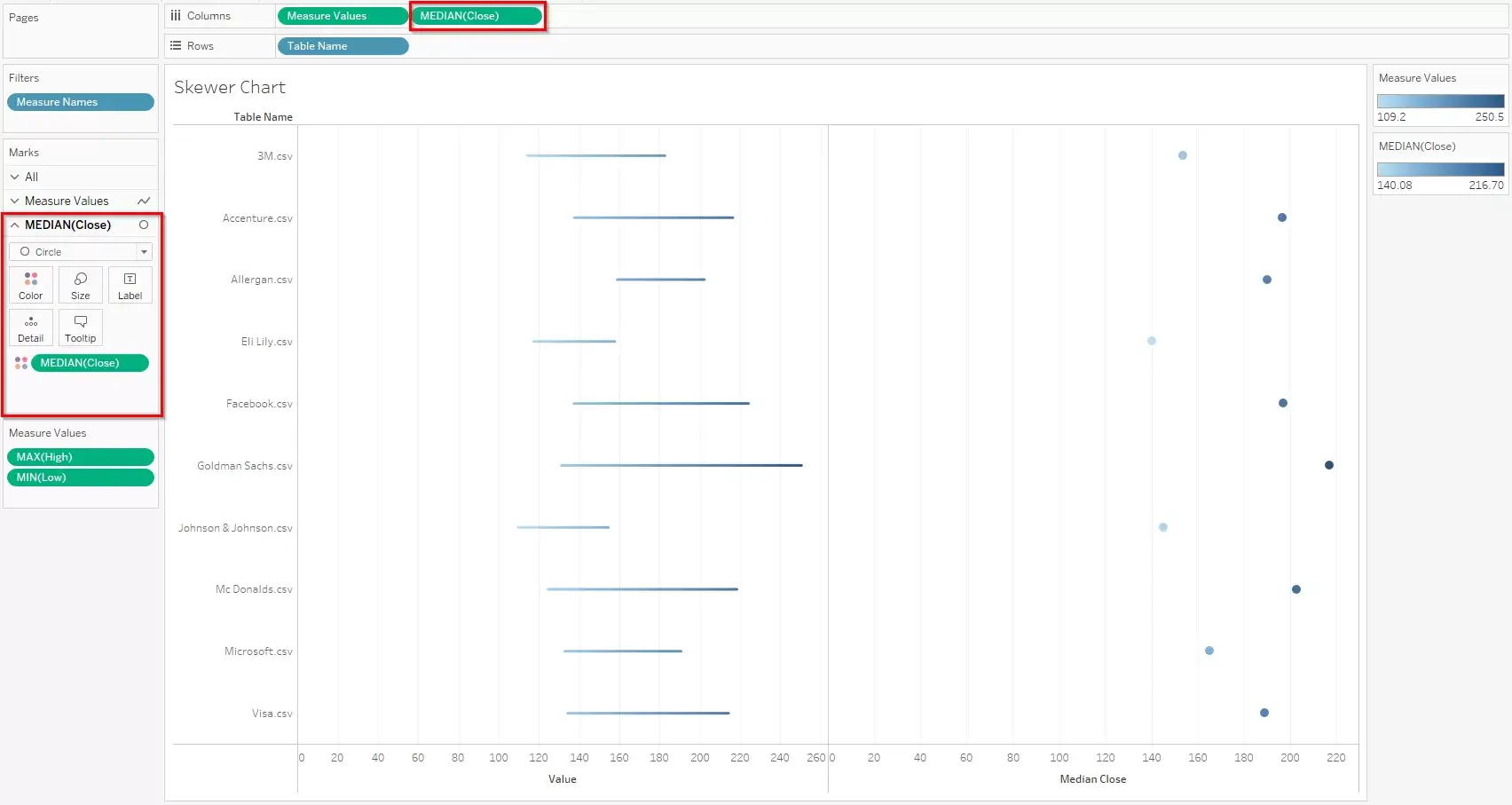
5) Now, the Close measure has to be superimposed on the line to make it a Skewer Chart or the Ball in Stick representation.
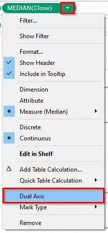
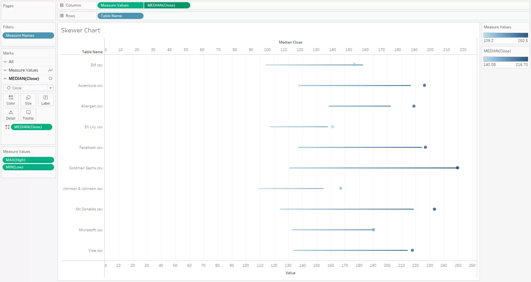
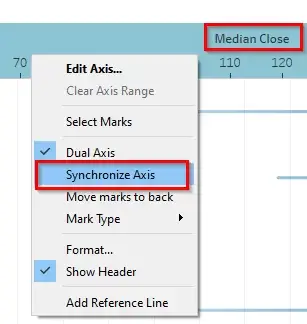
We can see that the Circle has not aligned well. So, we need to Synchronize the Axes.
6) We need to Synchronize the Axes, adjust axis width, adjust the color legends, size etc. and some cosmetic changes to arrive at the final visualization.
