 Media Coverage
 Press Release
Why Use Deneb for Power BI Visualizations?
Creating Interactive Data Stories with Deneb
Best Practices for Using Deneb in Power BI
What is Deneb in Power BI?
Getting Started with Deneb: Installation and Setup
Key Features of Deneb for Power BI Users
How to Build Custom Charts with Deneb
Exploring Vega and Vega-Lite for Deneb
Enhancing Dashboard Interactivity with Deneb Visuals
Common Challenges and Solutions with Deneb
Comparing Deneb with Other Power BI Visualization Tools
Deneb offers Power BI users unparalleled control over their visuals. This JSON-based tool unlocks visualization possibilities that standard visuals simply can’t match. Deneb harnesses the Vega and Vega-Lite languages to let you craft bespoke charts with pixel-perfect precision – without forcing your audience to install additional components. In this blog we will explore how Deneb can enhance your data storytelling.
What is Deneb in Power BI?
Deneb is a custom visual tool that allows you to build advanced, fully customizable visuals using the Vega and Vega-Lite declarative languages. Unlike standard Power BI visuals, Deneb provides greater flexibility and control over every aspect of your chart, from axis formatting to data encodings. It offers the following advantages:
- No additional dependencies on local libraries or gateways for your end-users when publishing reports; visuals will render in any Power BI client.
- Specifications are rendered directly inside Power BI rather than delegated to another location (typically resulting in faster render times for end-users).
- Built for the web, meaning that it’s possible to integrate with Power BI’s interactivity features, with some additional setup.
Getting Started: Creating Your First Deneb Visual
Step 1
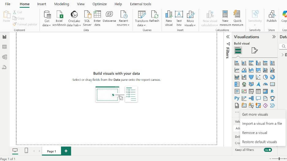
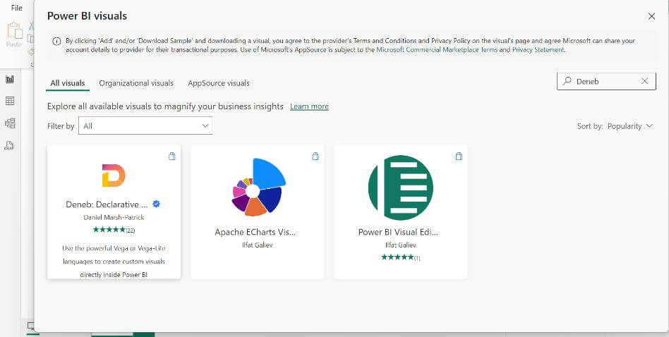
Installing Deneb
To begin using Deneb, install it from the Power BI Marketplace. Go to the Marketplace within Power BI Desktop, search for “Deneb,” and add it to visuals.
Step 2
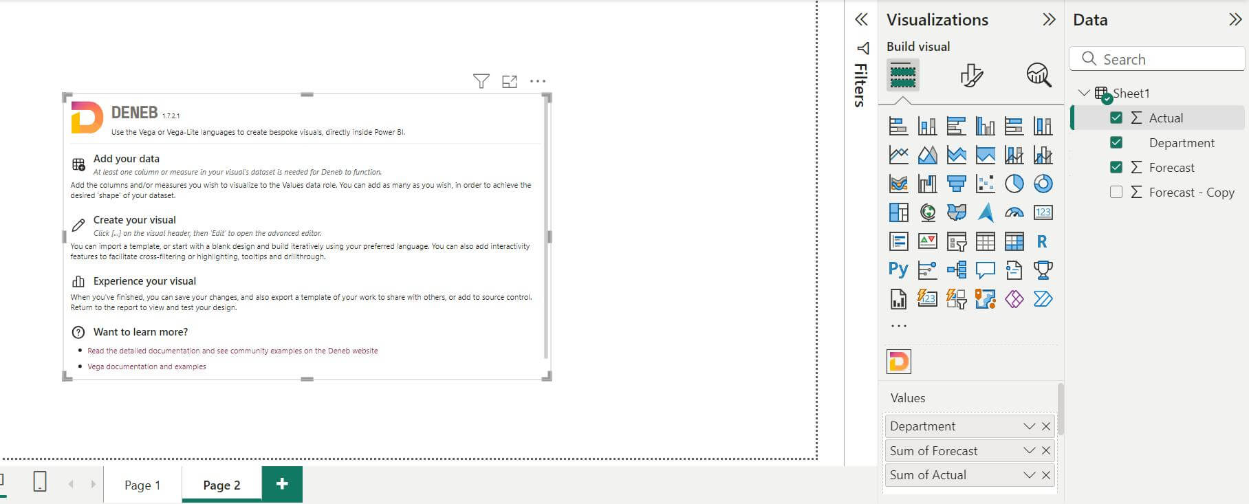
Adding data to Deneb Visual
At least one column or measure in the visual’s dataset is needed for Deneb to function.
Step 3
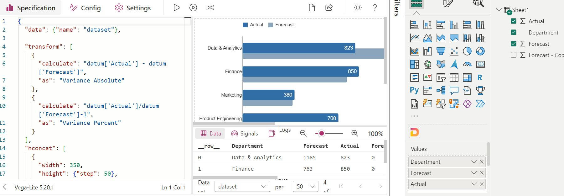
Writing code in Vega-lite to create a custom visual
The core of the Deneb visual lies in writing a Vega-Lite JSON specification.
Here’s an outline of the basic components you’ll need:
Data
Specifies the data source for the chart.
Mark
Defines the type of visual (e.g., bar, line, point, etc.).
Encoding
Maps the data fields to visual elements like the x-axis, y-axis, color, size, etc.
View Composition
create single view visualizations, but also facet, layer, concatenate, and repeat these views into layered or multi view displays.
Transform
Data transformations in Vega-Lite are described via either view-level transforms (the transform property) or field transforms inside encoding (bin, timeUnit, aggregate, sort, and stack).
Data
In Deneb, you can bind the data from Power BI by using dataName. To make your custom visual dynamic, map Power BI fields to Vega-Lite components.
Replace the static data values in your Vega-Lite JSON code with Power BI field mappings. Example: The dataset of Power BI is used as input to custom visual.
Mark
Marks are the basic visual building block of a visualization. They provide basic shapes whose properties (such as position, size, and color) can be used to visually encode data. Mark has following properties:
1. type:
- Specifies the type of mark to use (e.g., bar, line, point, area, text, etc.).
- Defines the basic shape or visual encoding for the chart.
2. color:
- Controls the fill or stroke color of the mark.
- For filled marks (e.g., bars, circles), it controls the fill color.
- For non-filled marks (e.g., lines, points), it controls the stroke color.
- Can be set to a single color or mapped to a data field for encoding.
3. size:
- Determines the size of the mark.
- For point-based marks (point, circle, square), it controls the size of the point.
- For line marks, it controls the line thickness.
- For bar marks, it can control the bar width in some contexts.
4. opacity:
- Controls the transparency level of the mark.
- Values range from 0 (completely transparent) to 1 (fully opaque).
5. tooltip:
- Enables tooltips on the mark.
- When hovered, it displays data information related to the mark.
- Can be set to true (default) to show a tooltip, or further customized with specific fields.
6. shape:
- Applicable to point marks.
- Specifies the shape of the points (e.g., circle, square, triangle).
- Can also be mapped to data fields to encode different shapes for different data points.
7. stroke:
- Defines the color of the border or outline of the mark.
- Applies to marks like line, rule, point, text, and even filled shapes when filled is set to false.
Example:
Encoding
An integral part of the data visualization process is encoding data with visual properties of graphical marks. The encoding property of a single view specification represents the mapping between encoding channels (such as x, y, or color) and data fields, constant visual values, or constant data values (datum).
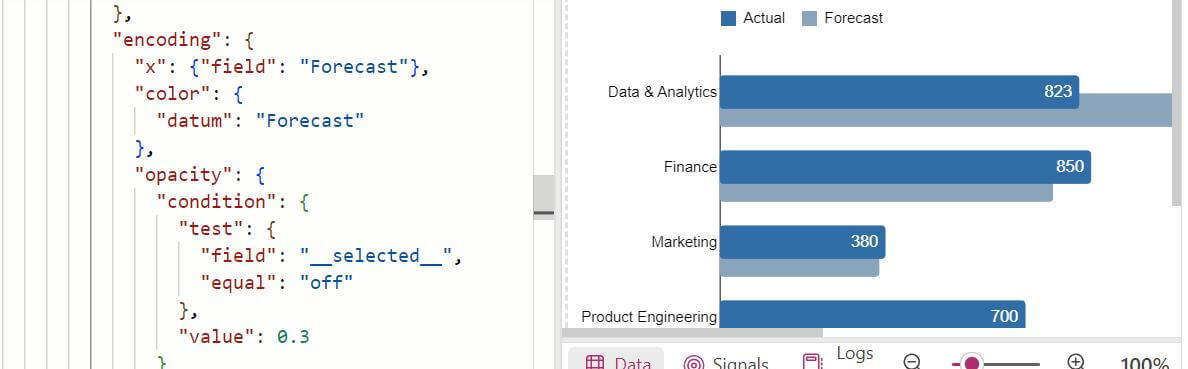
Key features of Encoding:
- Position Channels: x and y position channels determine the position of the marks, or width/height of horizontal/vertical “area” and “bar”.
- Datum: refers to a single data object (or row), and it allows you to access any property of that object directly. It is used when you want to perform specific operations or styling on an individual data value, rather than mapping a whole field to a visual property. Common Use Cases: Conditional formatting, annotations, labels, or adding reference points.
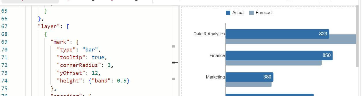
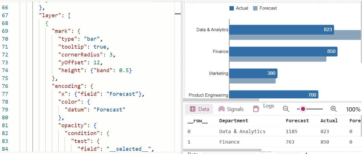
Layer
the layer property allows you to combine multiple visual elements (marks) into a single composite chart. Each layer can use the same data or different datasets and has its own mark type, encoding, and transformation. The layers are drawn in the order they are listed, meaning later layers will be placed on top of earlier ones.
Transform
Transform property allows you to modify or manipulate your data before visualizing it. These transformations include filtering, aggregating, calculating new fields, and more. Using transform, you can prepare your data directly within the visualization specification without needing to preprocess it outside of Vega-Lite.
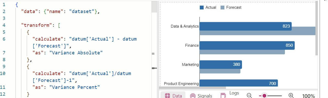
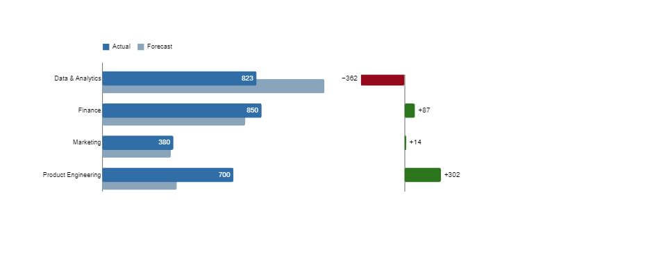
Example of custom visual
Along with a bar chart showing Department wise Actuals against Forecast numbers, Variance can also be seen in same visual.
Using Deneb, you can design highly customized, data-driven visuals that are tailored to specific reporting needs. Whether it’s fine-tuning visual elements, layering multiple chart types, or transforming data in real time, Deneb empowers users to take full control of their visualizations. This approach not only enhances the storytelling capabilities of your reports but also opens new opportunities for innovation and creativity in how data is presented.