 Media Coverage
 Press Release
Mastering Magic Menu Swaps in Tableau: Tips and Tricks
Enhancing Your Tableau Visualizations with Magic Menu Swaps
Advanced Techniques for Dynamic Visualizations in Tableau
“Real estate” on a dashboard is a precious commodity. As a dashboard developer, you want to maximize your space efficiently and effectively by giving the data center stage, but often, there are filters and parameters in the form of either drop-down menus or radio buttons that will take up valuable space to allow end-users to drill-down/slice the data the way they want. Additionally, you might have a wide variety of filter/parameter options you want to give an end-user but maybe not all at once because:
- It could cause an end-user to be overwhelmed by all the options
- Filters/parameter might be dependent on a selection in a previous menu
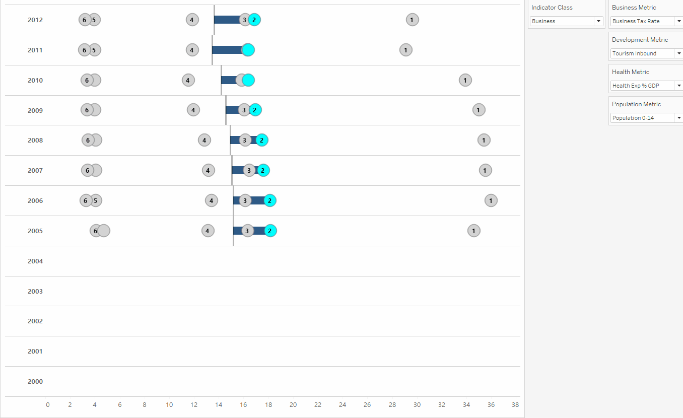
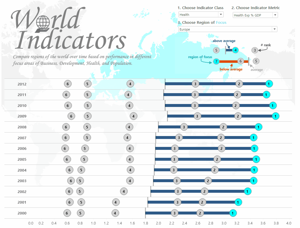
To simplify this scenario, I have created a dashboard that allows an end-user to compare regions of the world over time based on performance in different focus areas of business, development, health, and population. With each indicator class, there are different indicator metrics one can choose. For example, metrics related to business include [Business Tax Rate], [Lending Interest], and [Days to Start Business]. I want to limit end-user confusion by only displaying the appropriate metrics for each indicator class selection (for example it would be confusing for an end-user to select “Business” as the indicator class and then see [Infant Mortality Rate] as a metric to choose from).
Understanding the Power of Magic Menu Swaps in Tableau
Streamlining Your Workflow with Magic Menu Swaps: Expert Tips
Creating Dynamic Visualizations with Tableau: Advanced Techniques
Leveraging Tableau’s Features for Enhanced Data Presentation
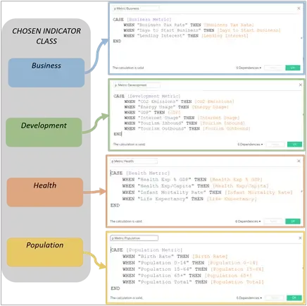
Before we get into the “magic” of swapping parameter menus, there needs to be some logic between the parameters and the sheet so that when an end-user selects an indicator class, only the metrics that are related to that class will be able to affect the view in question. Selecting “Business” as the indicator class will mean that ONLY the Business Metrics will change the view:
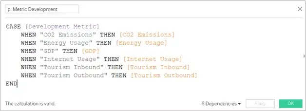
Each of the different metric parameters have multiple metric options for an end-user to choose from. For example, here is the Development metric parameter logic:
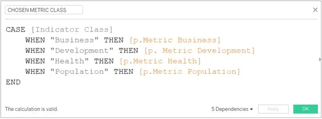
Now, only when I choose “Development” in the indicator class parameter should the above field get triggered. To do that, I had created a field called [CHOSEN METRIC CLASS] to capture that logic:
Below is the simplified logic chart showing that ONLY ONE color path would be triggered at a time based on what indicator class is chosen by an end-user:
Now that the logic was set in place, it was time to implement the trick of parameter pops outlined by Joe Oppelt and Matt Lutton in this video series, along with some formatting tweaks, to “magically’ swap the parameter menus for indicator metrics based on what indicator class is chosen in the first parameter.
Exploring Advanced Tableau Functionality: Magic Menu Swaps Demystified
Optimizing Tableau Workflows: Tips and Tricks for Efficient Data Visualization
Enhancing Data Insights with Dynamic Visualizations in Tableau
Mastering Tableau Techniques: Unlocking the Potential of Magic Menu Swaps
** NOTE: Before attempting to reverse engineer the World Indicators dashboard I have built out here, please watch the parameter pop video series to gain a better understanding of what role the parameter pop sheets play.
To get this “magically” seamless switch with parameter menus, let us breakdown what is within the container that will allow me to “switch” among parameters. I needed to have all four of my parameter options (Business, Development, Health, and Population), along with the parameter pop sheets that will expand/collapse based on the selection in the first “indicator class” parameter:
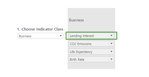
Once I had the parameters in the correct order along with the parameter pop sheets, the next step was to “cover” up everything besides what is shown in the green box above:
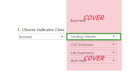
To make the covered areas (which are just blank/text objects) “invisible” to an end-user when viewing it on the dashboard, I matched the white background of the dashboard and added some text to give the end-user some direction:
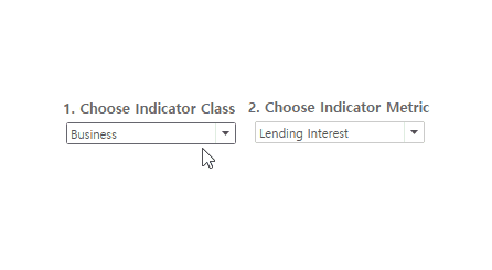
With the parameter popping working, all that was left to do was add my worksheets along with some formatting tweaks to finalize the dashboard:
Of course, this trick is not limited to just parameters. You can use it to swap legends, filters, and more. I hope this tip/trick helps you to get creative in your dashboard design and functionality.
Please feel free to interact with and download this workbook at this link.
Thanks for reading
References
Additionally, be sure to check out the following blog posts/video series that helped me when developing this dashboard:
- Joe Oppelt and Matt Lutton’s Video Series on Sheet Swapping and Popping in Tableau: https://vimeo.com/107352893
- Ryan Sleeper’s blog on Leapfrog Charts in Tableau: https://playfairdata.com/introducing-leapfrog-charts-in-tableau/
Please feel free to visit my profile to check out this and other visualizations