 Media Coverage
 Press Release
Mastering the BUFFER Function in Tableau: Your Ultimate Guide
Exploring the Power of Spatial Analysis with Tableau’s BUFFER Function
Enhance Your Data Visualizations: Understanding and Utilizing the BUFFER Function in Tableau
Recently, I have been working on various dashboards that have a heavy focus on geospatial analysis and I have grown more comfortable with creating insightful maps and visualizations that work together to allow the end user to understand just how critical proximity analysis is when working with geospatial data. Proximity analysis is one of the most basic GIS analyses; it answers the question, “what’s near what?”. Some examples of this include:
- How close is the nearest police station?
- What is the distance between point A and point B?
- What is the shortest route from point A to point B?
We use these analyses all the time – think about anytime you type a desired destination into Google Maps.
Understanding the Basics: What Is the BUFFER Function in Tableau?
Getting Started: How to Use the BUFFER Function for Spatial Analysis
Advanced Techniques: Customizing Buffer Sizes and Features in Tableau
Real-World Applications: Practical Examples of Using the BUFFER Function in Tableau
Getting to Know the BUFFER Function: Key Concepts and Terminology
Step-by-Step Tutorial: Implementing the BUFFER Function in Your Tableau Projects
Fine-Tuning Your Analysis: Tips and Tricks for Optimizing BUFFER Function Usage
Beyond the Basics: Exploring Advanced Features and Integrations with the BUFFER Function
Geospatial and proximity analysis, as you can imagine, can get very complex and complicated. That is why, for this blog, I am just going to focus on introducing the Buffer function that can help answer the question, “How many houses exist within a certain mile radius?”.
Introduced in the 2020.1 release of Tableau, the Buffer function allows the developer/user to create a radius (or boundary) around a specific spatial point. This can be used to determine where boundaries overlap each other or what points are situated within the given radius. In this blog, I am focusing on the latter.
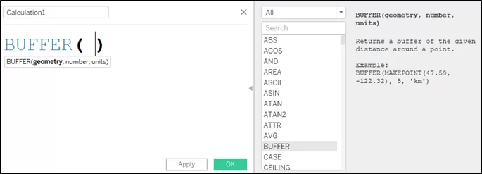
The three parameters needed:
- Geometry field: a spatial point within your dataset (if one does not exist, you can use the Makepoint function using latitude and longitude fields)
- Number: the size of the radius you want to create
- Units: the measure of the number (miles, km, etc.)
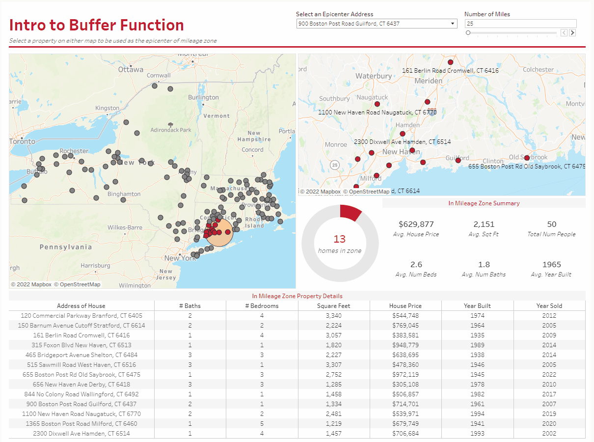
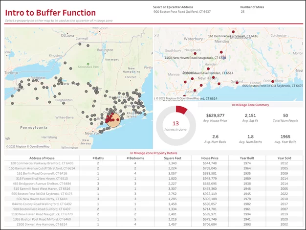
The dashboard that I have built out that incorporates the Buffer function allows users to select an epicenter address and the number of miles to see how many other homes are within the buffer area.
Below is what the final version looks like:
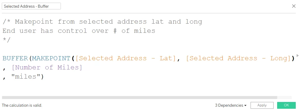
Since the focus of this blog is on the Buffer calculation, I am not going to go through all of the calculations I created to tie together each action/functionality of the dashboard (mainly the parameterized calculations). I only want to draw focus to the geospatial-related calculations.
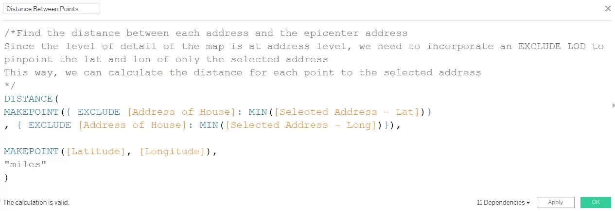
That being said, below is the Buffer calculation that I created in order to create an area for the address that I have selected as an epicenter:
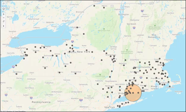
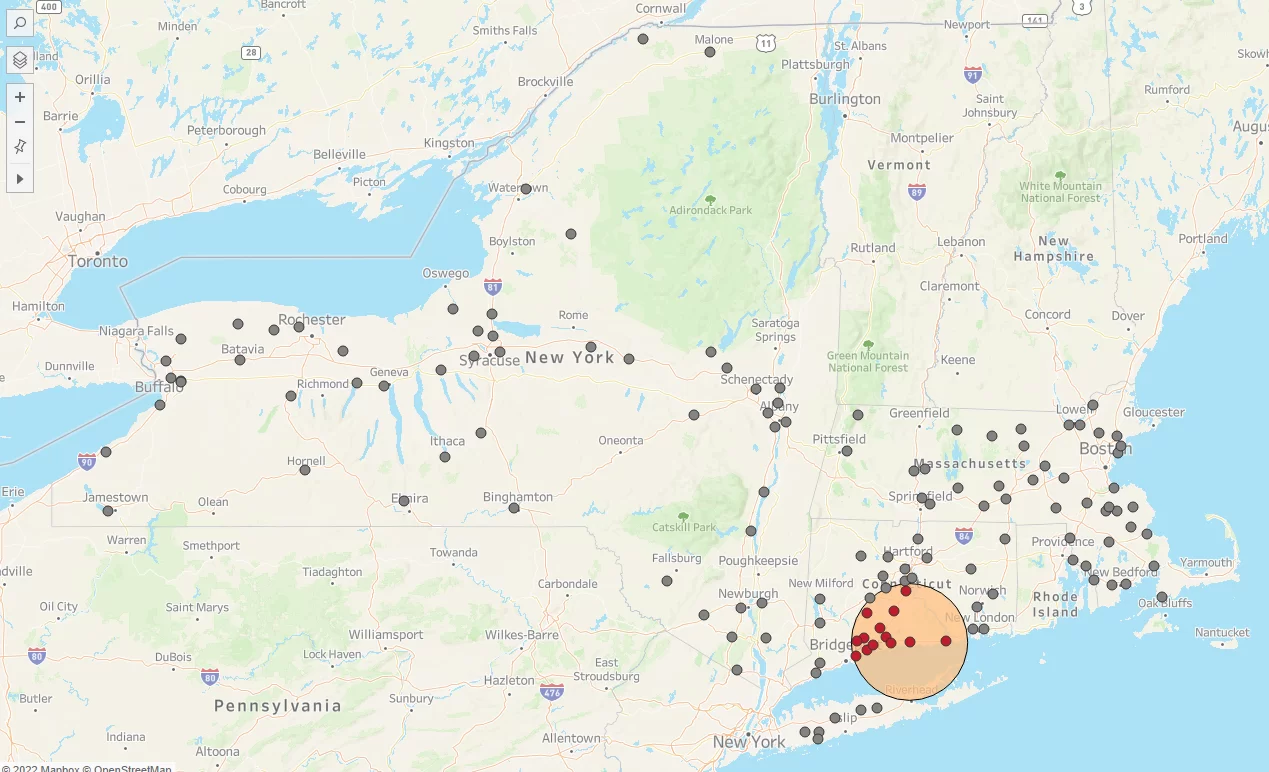
With just this calculation, we could get the following map view:
But, since we want to bring attention to those properties within the radius, I wanted to create a few more calculations to spruce up the dashboard.
Below are some of the calculations:

With the two calculations above, we can now have a more interesting and intuitive map that draws attention to properties within the buffer zone:
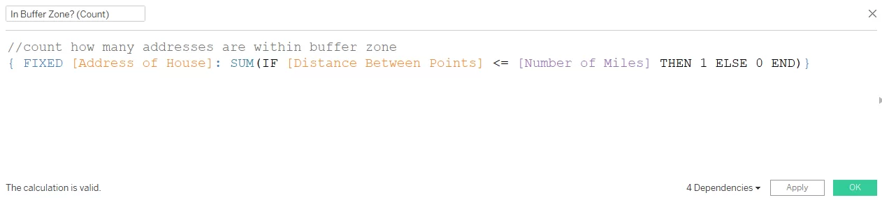
To add to this map, I would also like to count how many properties are within the buffer zone and be able to focus in on those properties. I created another calculation to do just that.
Putting it all together and customizing some new views allows me to create an easy-to-use dashboard that is efficient and effective.
As previously mentioned, there are many ways in which you can take the Buffer function and other geospatial features to the next level with Tableau. This blog is just meant to show you how a few quick calculations can create extremely insightful and effective dashboards when it comes to geospatial and proximity analysis.
As always, feel free to interact and download the workbook!