Generating Mock Data in Alteryx: A Comprehensive Guide
Simulating Datasets for Testing and Training in Alteryx: Step-by-Step Tutorial
Creating Custom Mock Data with Alteryx: Essential Techniques and Tips
Imagine this: It is Monday morning and during your team’s daily call, your boss tasks you with creating a beautiful and insightful dashboard that explores your company’s recent performance in response to recent news/world events. You are excited! You can start to show off all your data visualization skills!
But there is one problem. You don’t have any data!
Your data team says they are working on it and that you should have it in a few days, but your presentation is on Friday. You probably want to get started right away with creating and testing out design concepts and chart types for your dashboard. So, what can you do?
Enter mock data.
Mock data is fake, synthesized data that is generated in order to test scenarios, simulate the behavior of real data, and when it comes to design and development of a dashboard, can be used to develop on as a sort of “template” until your real data is shaped and prepped.
The challenge with mock data is that you want to replicate or “mimic” real-life behaviors as closely as possible using “randomly” generated data points. You might be thinking, “How am I supposed to create random yet purposive data?”.
This is where we can leverage the power of Alteryx to create mock data sets that simulate real-life scenarios. This blog is going to walk through a use-case where I have created a mock data set in which the trends were based off recent news articles and high-level statistics.
Understanding the Importance of Mock Data in Alteryx
Step-by-Step Tutorial: Creating Mock Data in Alteryx
Advanced Techniques for Generating Realistic Mock Data in Alteryx
Best Practices for Using Mock Data in Alteryx Workflows
Introduction to Mock Data Generation in Alteryx
Exploring Alteryx Tools for Data Simulation and Generation
Tips for Customizing and Scaling Mock Data Generation in Alteryx
Integrating Mock Data into Alteryx Workflows for Testing and Training
THE CONTEXT/BACKGROUND
Recently, the COVID-19 pandemic has flipped our world upside-down. Businesses across the United States have been forced to temporarily shut down and most people have had to quarantine in their homes. This has caused consumer spending throughout the country to shift dramatically. What I wanted to do was to visualize these shifts/trends in a dashboard to see how consumer spending habits have changed and try and predict future behavior.
THE PROBLEM
I scoured the internet for transaction-level consumer spending data for the entire United States but like you would probably guess, I was not successful. What I did find was a bunch of articles discussing the impact that COVID-19 has had on consumer spending at a higher, overall trend level.
THE PLAN
After some research, I found the following main trends/points:
- Money spent on alcohol, video games, groceries, streaming services, etc. increased drastically.
- Money spent on traveling, lodging, restaurants, fitness facilities, sporting/entertainment events, decreased drastically.
What I wanted to do was mimic/imitate these trends with my mock data, but I had to remember some key points:
- Shifts in spending were not the same for every state/region due to varying “shelter-in-place” orders.
- The overall number of reported cases varied by state, thus affecting how people feel about shopping In-Person vs. Online and the severity of the situation.
- It is not as simple as In-Person vs. Online spending. There might be some categories of spending that are technically “In-Person” that were not affected in the same manner as they were still deemed “essential” businesses (i.e. Grocery Stores).
With these things in mind, it was time to start building the workflow.
THE SOLUTION/ALTERYX WORKFLOW
INPUT DATA
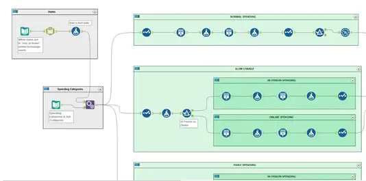
Before I can apply any trends, I must have some data to start off with.
States:
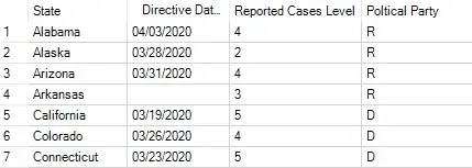
Using a Text Input Tool, I started off with some basic information for each State.
- When their “Stay-At-Home” Directive Order was put in place.
- Based on how many confirmed cases they had, a relative “Reported Cases Level” (5 being the highest/worst).
- Their representative’s political party.
I then used a Formula Tool to add some more information in:

- A start date (how far back did I want to view data).
- When was the first Case in the United States?
- How far forward do I want to project out?
Spending Categories:
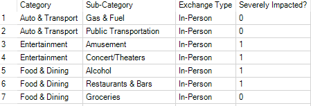
Using a Text Input Tool, and based off my research, I had created a list of Categories/Sub-Categories with their exchange types (In-Person vs Online) and if they had been severely impacted due to COVID-19 “stay-at-home” orders.
Using the Append Tool, I then combined these two mini-datasets into one:

Now I have a dataset to start working with!
Click to download copy of A Practitioners Guide To Alteryx Beginner Series (Exercises and Data included)
CREATING THE TRENDS
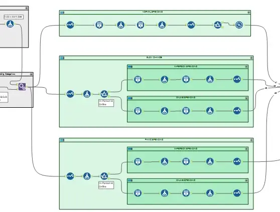
This is the where the magic happens. Before diving deep into the different workflow tools, I had to come up with a plan. To portray the shifts in spending habits of United States consumers over time, I needed to break out my flow into three main phases:
- Normal Spending – pre-COVID consumer spending
- Slow Changes – some “stay-at-home” orders start to go into effect and people’s spending habits start to shift to prepare for what is to come
- Panic Spending – states are completely shut down and “Oh no! There’s no toilet paper left!!”
Within the “Slow Changes” and “Panic Spending” phases, the workflow is split by Exchange Type so that I could appropriately address the trends. Generally, we should see an increase in Online transactions while at the same time seeing a decrease in In-Person transactions.
The driver behind this section of the workflow is the “Generate Rows Tool” which allowed me to create the records I need to start seeing trends in consumer spending.
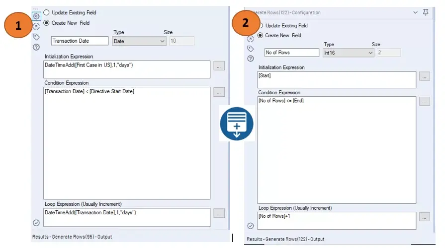
I leveraged this tool in two ways:
- To generate rows for all transaction dates in between starting and ending dates (i.e. First Case in the US -> Directive Start Date).
- To generate varying number of records/rows for transaction types.
Example of Generate Rows Tool Configuration below:
After I got the trends I was looking for, it was time to combine them into one dataset. Using the Union tool, I combined the “Normal Spending”, “Slow Changes”, and “Panic Spending” phases together and then from there, it was just adding in some transaction-level information to “beef-up” the dataset.
TRANSACTION-LEVEL INFO
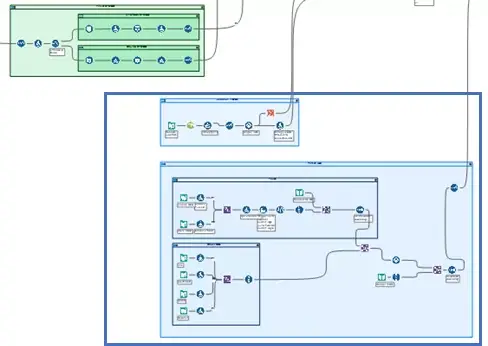
Depending on your use case, you might not need this information, or you might wish to add even more. For the COVID-19 consumer spending use case that I was focused on, I wanted to give a little more info so we could start to test out different views/chart types that were more focused around demographic/geographic analysis.
This additional information included the following:
- Customer Information (Name, Credit Card Information, Age, Gender, Annual Income)
- Location Information (what state the transaction occurred)
OUTPUT
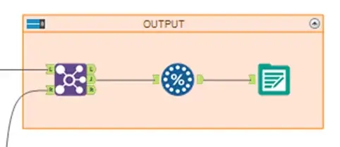
Now that I had the transaction-level mock data created with the relevant trends applied, it was time to output my results. For my use case, I was using Tableau to develop visualizations and analyze my mock trends to test out what type of story would be intriguing once I got a hold of real transaction-level data. For this reason, I saved a sample of my workflow output as a Tableau Hyper Data Extract (.hyper) file to bring it straight into Tableau:
Looking back, I know there are things in this workflow that can be tweaked/adjusted to mimic the real-life trends even more. Different categories/sub-categories could be weighted differently, trends could have been adjusted to depict state-level trends more accurately, county-level detail could have been added, etc.
But while improvements can be made (and I hope that some of you reading this are inspired to improve upon this workflow), the mock data set served its purpose for me. I was able to use this to start testing out design concepts and visualizations in Tableau so that when I received real transaction-level data, I could just swap data sources. The headache of worrying if my real data was going to tell a similar story to what I was developing on was now gone!
So now you know how to generate mock data out of thin air! But what if you already have some data that you need to anonymize or “mock-up”? Be on the lookout for a follow-up blog that will go through how we can achieve this in Alteryx!
Thanks for reading,



 Media Coverage
 Press Release
