Enhance Report Interactivity with Field Parameters in Power BI
Step-by-Step Guide: Creating and Implementing Field Parameters
Dynamic Data Analysis: Leveraging Field Parameters in Power BI
In Power BI, the x-axis of the visual can be changed using a feature called as ‘Field Parameter’. This feature allows the users to toggle between the fields within the data model. It provides enhanced flexibility to the report views where they can select the x-axis of the visuals on their own. Also, it saves a lot of space on the canvas of the report. It adds a new table in the data model and the fields can be controlled by a slicer on the canvas.
If the feature is already not enabled the Power BI report, you can do that by going to the following – File > Options & Settings > Options > Preview Features > Field Parameters.
Introduction to Field Parameters in Power BI
Creating Field Parameters: A Comprehensive Tutorial
Implementing Field Parameters in Power BI Reports
Enhancing Report Flexibility: Tips and Best Practices
Understanding the Role of Field Parameters in Power BI
Configuring Field Parameters: Options and Settings Explained
Use Cases: Practical Applications of Field Parameters in Power BI Reports
Maximizing Interactivity: Advanced Techniques for Field Parameter Utilization
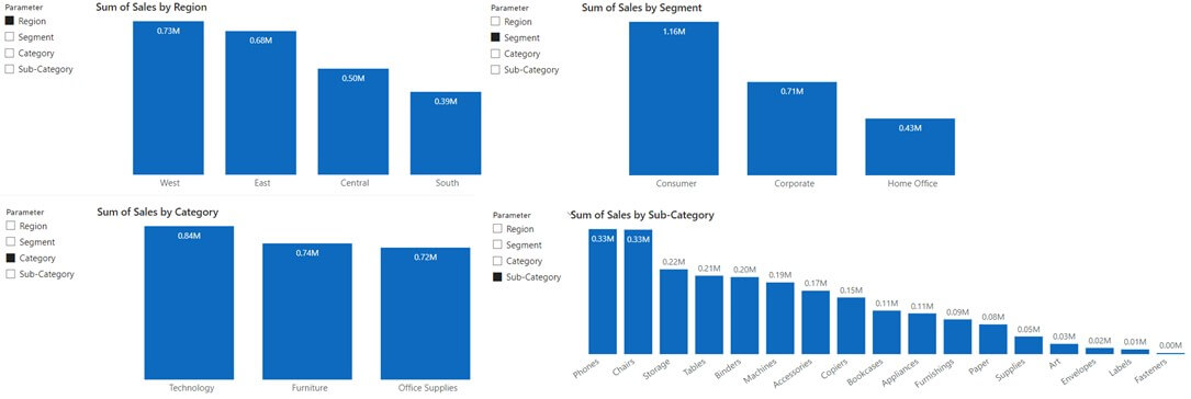
In this article, I have demonstrated how to create a dynamic x-axis for a clustered column chart using field parameter feature. Here, I have used the Superstore dataset that has various fields. We will be focusing on the fields – Region, Segment, Category, Sub-Category and Sales only. To evaluate the total sales for each of them, we will take sum of Sales.
Tips for Using Field Parameters in Power BI
Step 1: Open Power BI and Select Your Report
Open the Power BI desktop app and load the Superstore data into the Power BI file by using ‘Get Data’ under the ‘Home’ button in the ribbon section. You will need only the Orders table for this dataset. Once the data will be loaded into the Power BI file, you will be able to then see the ‘Orders’ table under the ‘Data’ pane along with all the fields.
Step 2: Create a New Parameter
To start creating the field parameter, first the fields along with their sequence need to be decided basis which the analysis has to be done.
Here, for my dataset I have selected the following fields with the sequence as below –
- Region
- Segment
- Category
- Sub-Category
Step 3: Configure Your Parameter Settings
On the top, in the ribbon section, go to ‘Modelling’ button.

Step 4: Use Your Field Parameter in Your Report
Under this, click on ‘New Parameters’.

STEP 5: After this, there will be two different options – ‘Numeric Range’ and ‘Fields’. Select ‘Fields’.

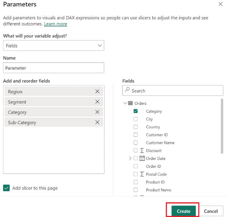
STEP 6: After selecting ‘Fields’ option, a new pop-up window will show on the screen with the name ‘Parameters’.
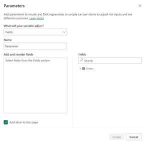
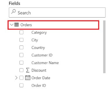
STEP 7: In this window box, there will be a ‘Fields’ section on the bottom-right. In this, the ‘Orders’ table will be there. Expand the table to start selecting the fields.
STEP 8: On the left side in the ‘Parameters’ window box, you will be able to see ‘Add and reorder fields’ section. Once you start selecting the fields, those selected fields will get displayed in the sequence of selection.
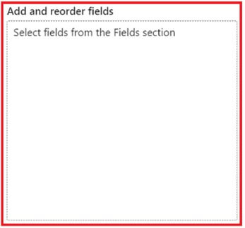
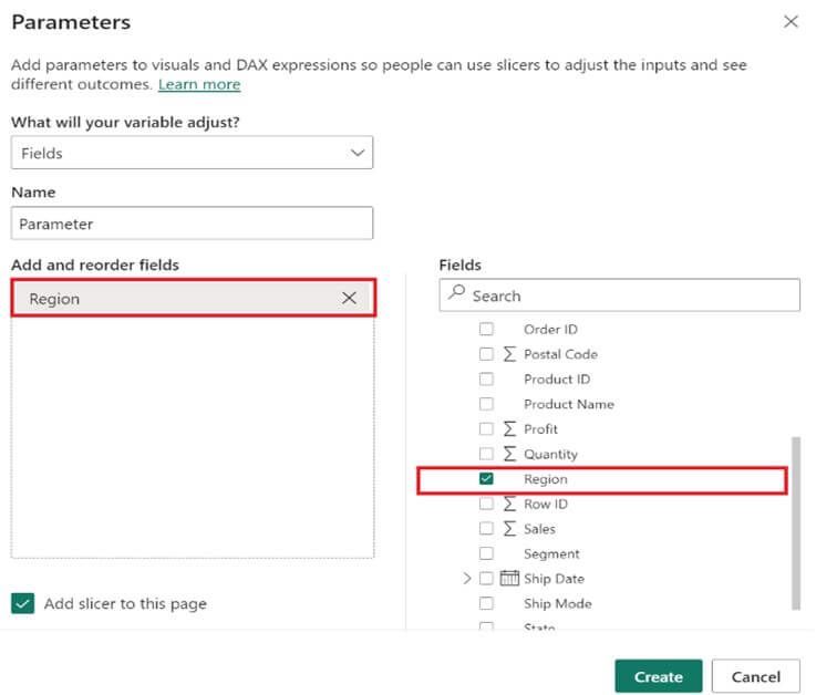
STEP 9: To select a field, click on the checkbox present on the left side of each field. The selected field will start reflecting under the ‘Add and reorder fields’ section. Here, we can see ‘Region’ field as the first selected field.
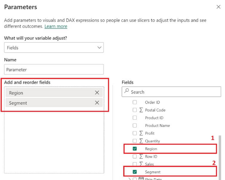
STEP 10: Similarly, select the next field ‘Segment’ and it will get added under the previous field i.e., ‘Region.
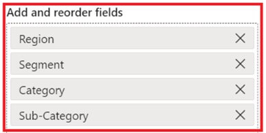
STEP 11: Once, all the fields are selected and added, it will look like as below –
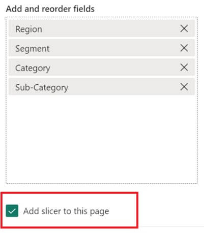
STEP 12: At the bottom left, there will be another option that says ‘Add slicer to this page’. Keep the checkbox of this as selected, as this will add a slicer to the page once the parameter is ready.
STEP 13: If required, you can also name your parameter accordingly.
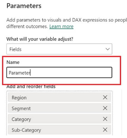
STEP 14: After this, click on ‘Create’ to create the parameter.
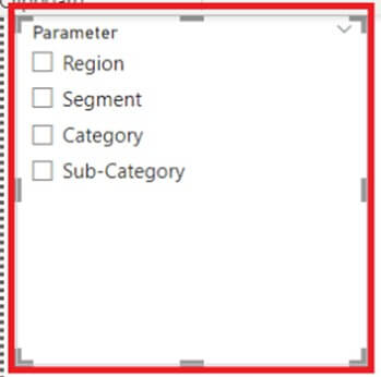
STEP 15: As soon as you click on the ‘Create’ button, a slicer will get added to the canvas with the fields that were selected, in the same order.
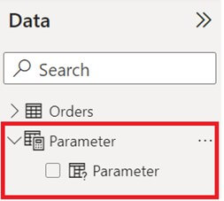
Under the ‘Data’ pane, you will also be able to see the newly added parameter.
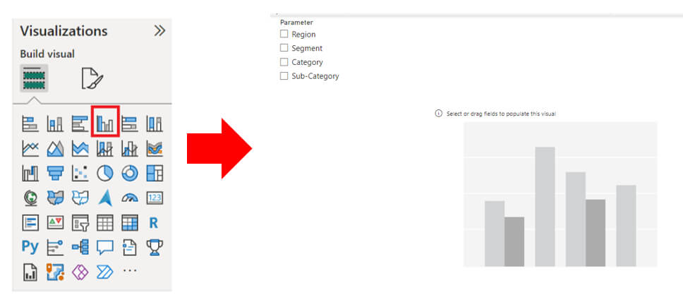
STEP 16: To make use of this parameter, add a clustered column chart from the visualization pane to the canvas.
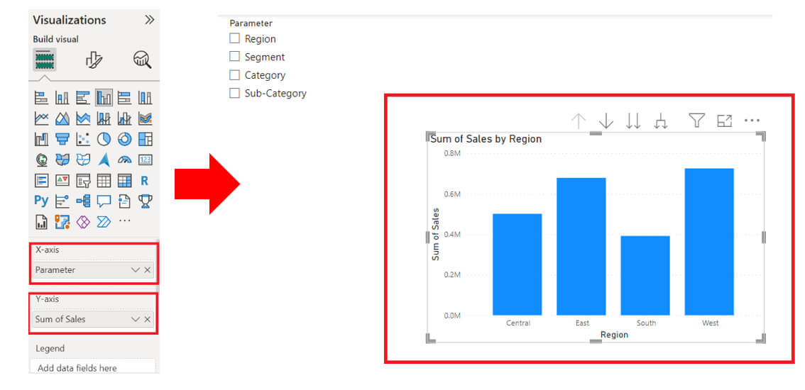
STEP 17: Select the visual and add the parameter to the x-axis and sum of sales to the y-axis. Since, no value from the parameter slicer has been selected, hence the visual is showing the first field from the parameter i.e., ‘Region’ in the x-axis.
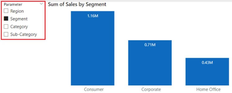
STEP 18: As soon as a different selection is made from the parameter slicer, the title, x-axis and x-axis label of the visual will change accordingly. The below snip shows the output after doing the formatting of the visual and selecting the value ‘Segment’ from the slicer.
Output:
