Crafting Custom Waffle Charts in Tableau: A Step-by-Step Guide
Mastering Waffle Chart Design: Tips and Techniques in Tableau
Elevating Data Visualization with Custom Waffle Charts in Tableau
The Waffle Chart is going to give a rough idea of progress towards a set target.
It looks like a Waffle and hence the name.
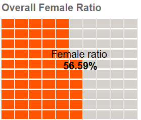
Video Description:
The video includes the step-by-step instruction of building a waffle chart from the scratch.
Chart Description:
Create a custom data for your waffle chart.
Understanding Waffle Charts and Their Applications in Tableau
Step-by-Step Guide to Creating a Custom Waffle Chart in Tableau
Designing Effective Waffle Charts for Data Analysis in Tableau
Tips for Enhancing Waffle Chart Visualizations in Tableau
Introduction to Waffle Charts and Their Benefits in Tableau
Exploring Advanced Formatting Options for Waffle Charts in Tableau
Leveraging Calculated Fields for Custom Waffle Charts in Tableau
Best Practices for Designing Interactive Waffle Charts in Tableau
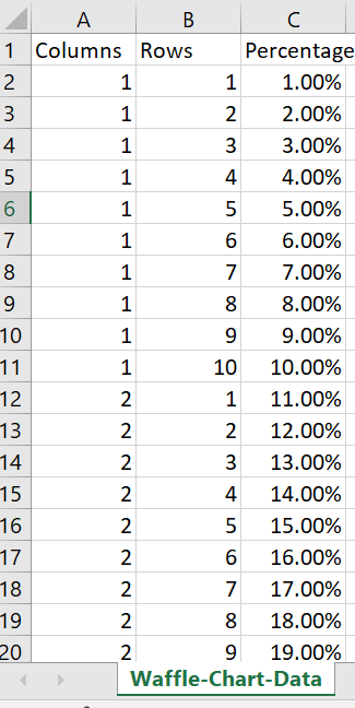
Open an excel and fill in the rows, columns and percentage as shown below. The percentage can be dragged till 100% for our viz.
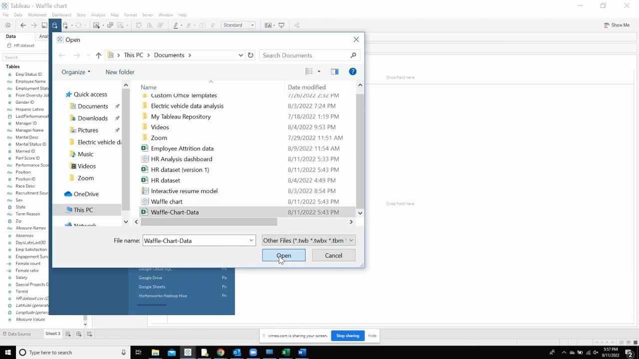
Import the waffle data set to the dashboard by click on Data panel and Add new data source.
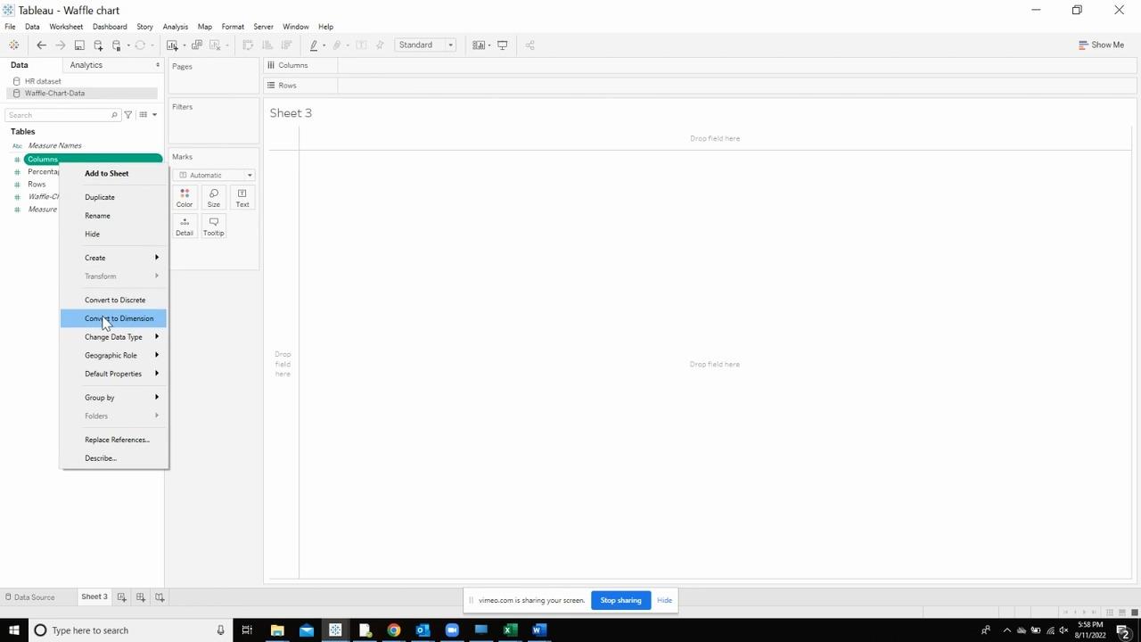
Select the waffle data set and right click on the columns to convert it to dimension. And repeat the same to Rows as well.
Drop the rows on the rows shelf and the columns on the columns shelf.
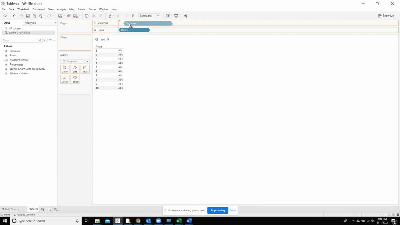
Drag the percentages and drop it on the text marks card.
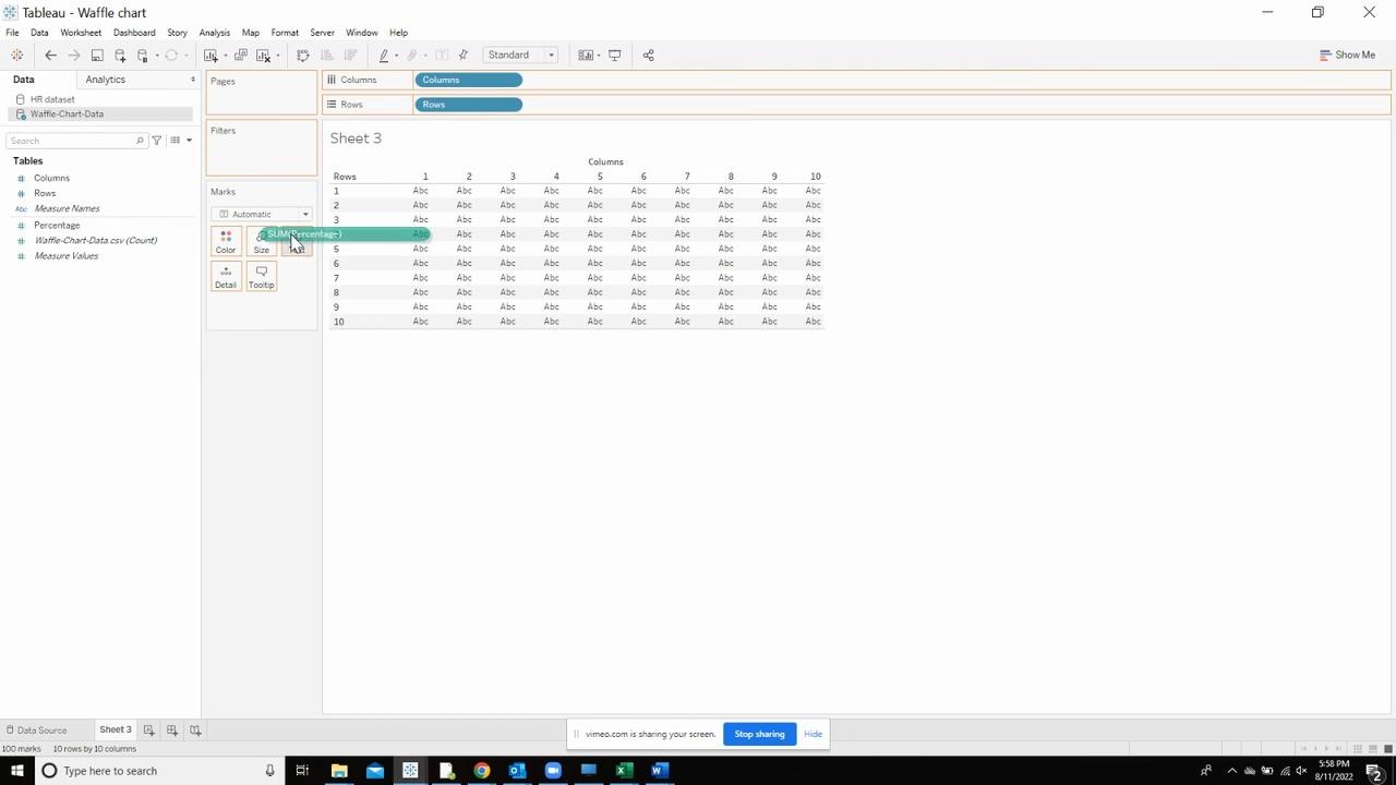
Click on “Sort”
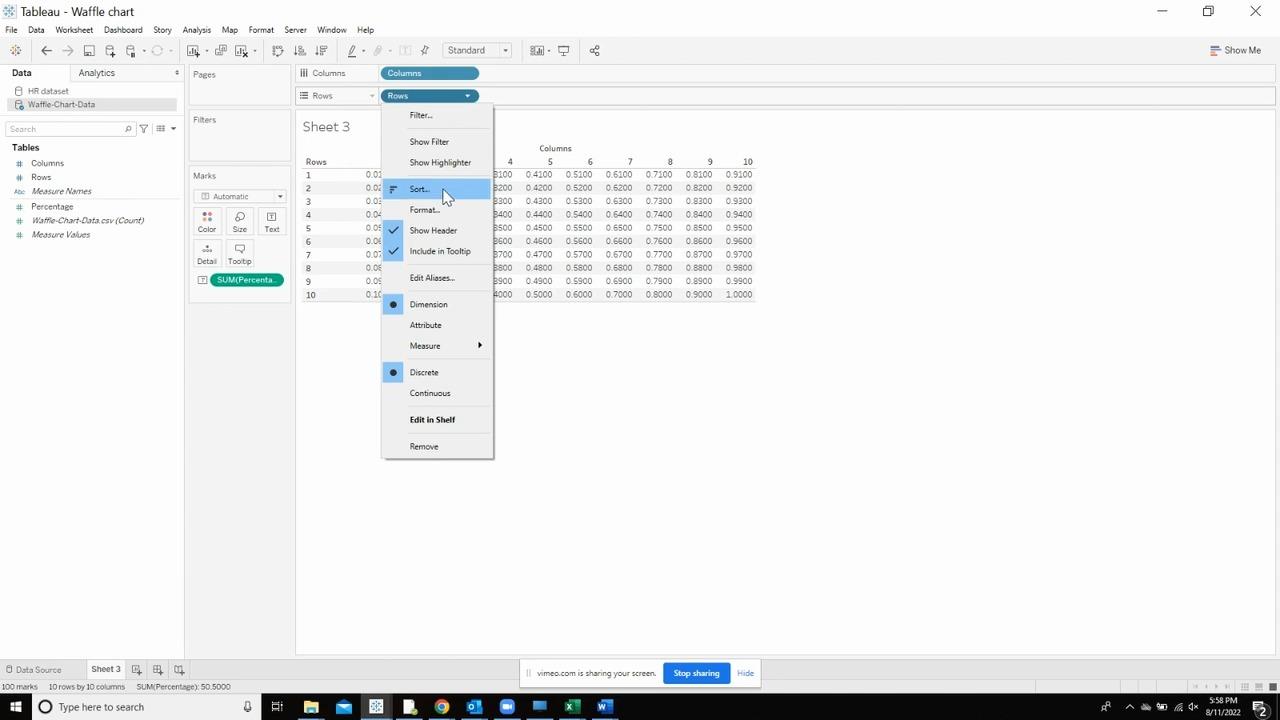
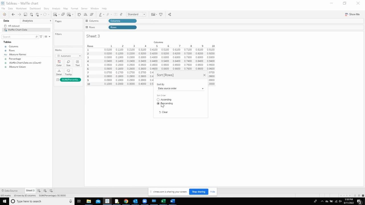
Select the “Descending” option.
Now, create a calculation called “Percentage Color” in the original dataset that contains the following calculation.
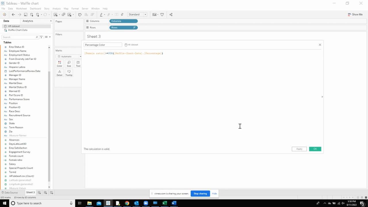
Drop this created calculated field on the colors shelf of the marks card.
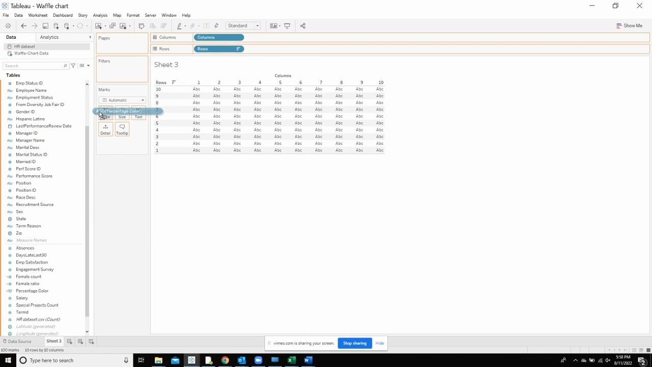
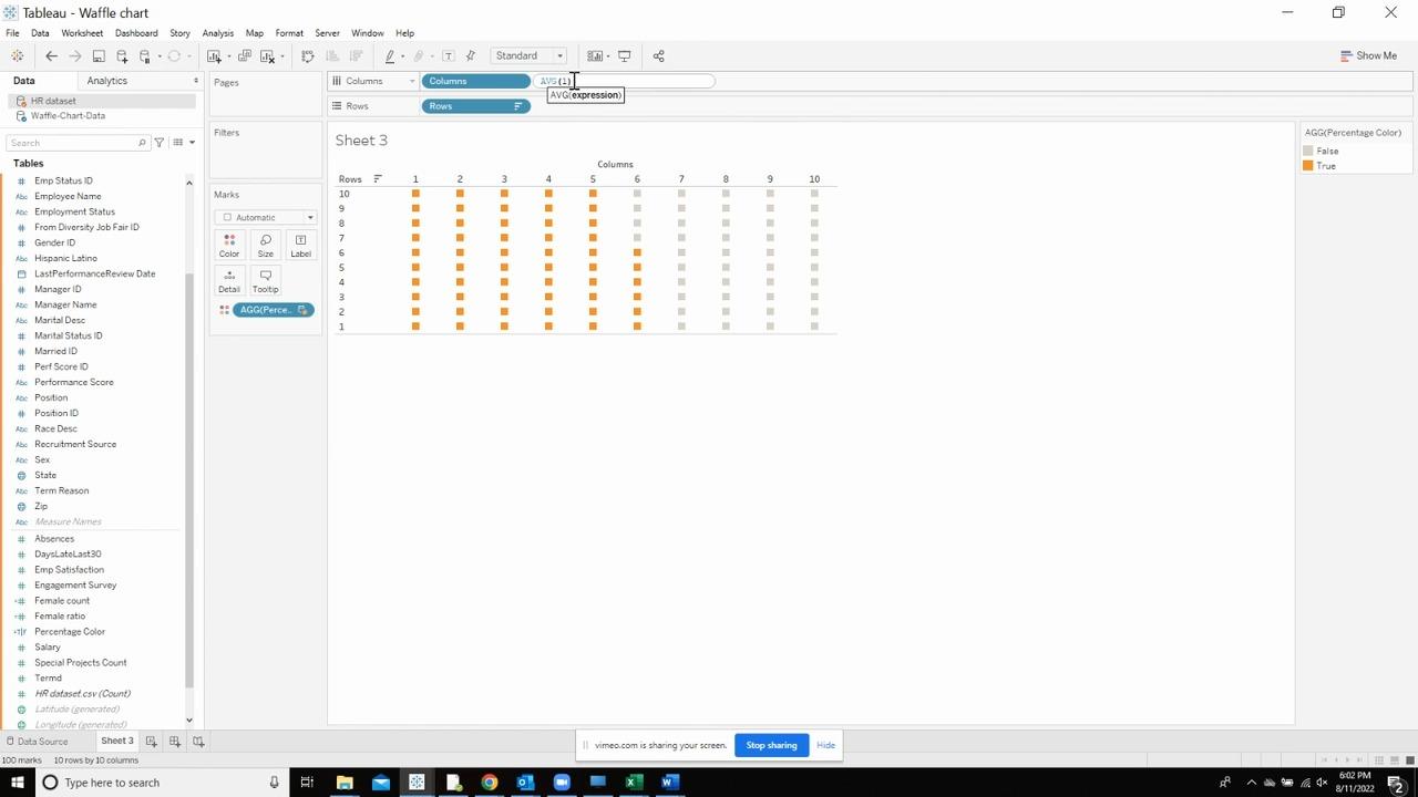
Create a dummy field called “AVG(1)”. It should give us an output like below.
Uncheck the “Show header “for both the measures by right clicking on the axis. This way, we hide both the headers and only the waffle becomes visible.
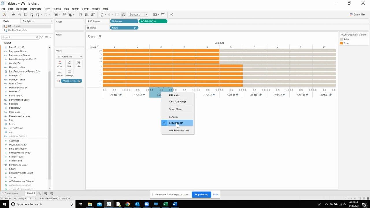
Work on resizing the waffle to make it a square and drag it from the right to the left to make this change It should look like the below.
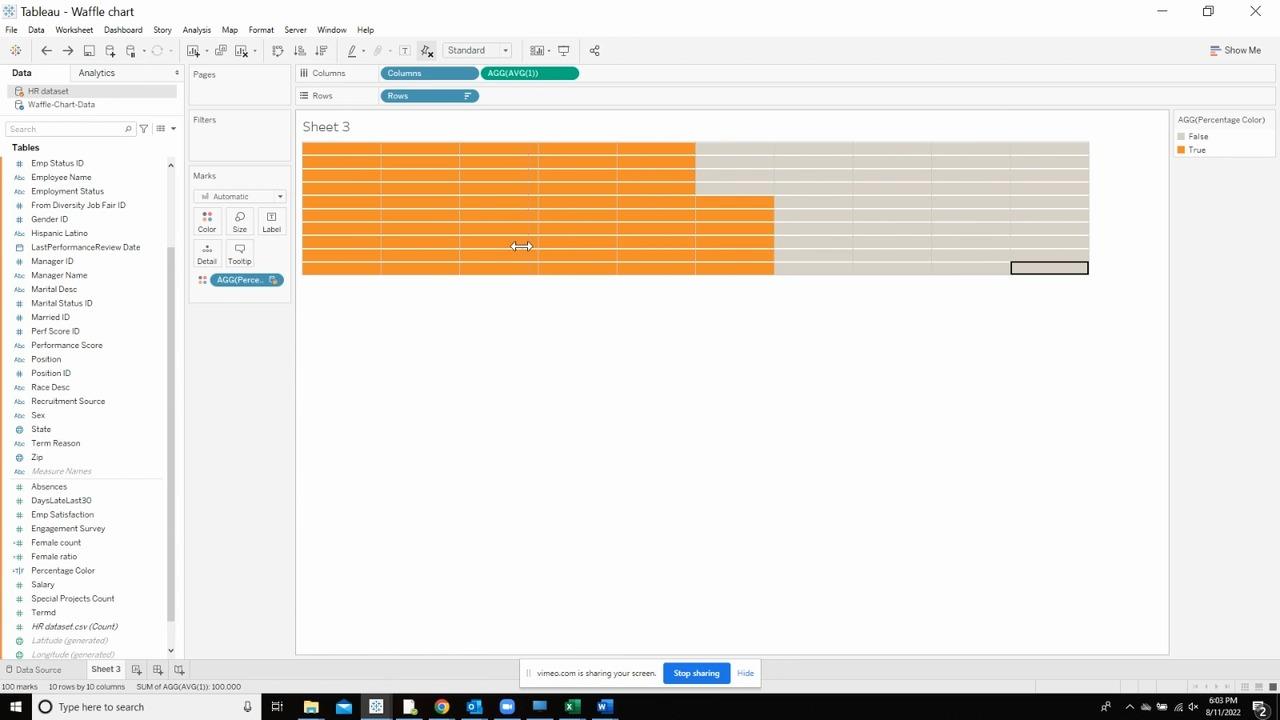
Now, open the tooltip and empty the tooltip and also uncheck the “include Command buttons” from the three options.
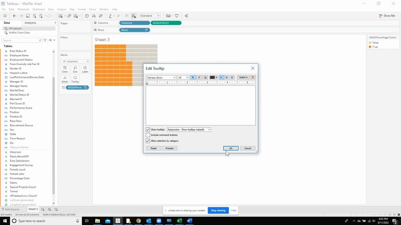
Pick the measure which you want to display and drop it on the details shelf of the marks card.
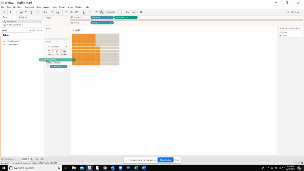
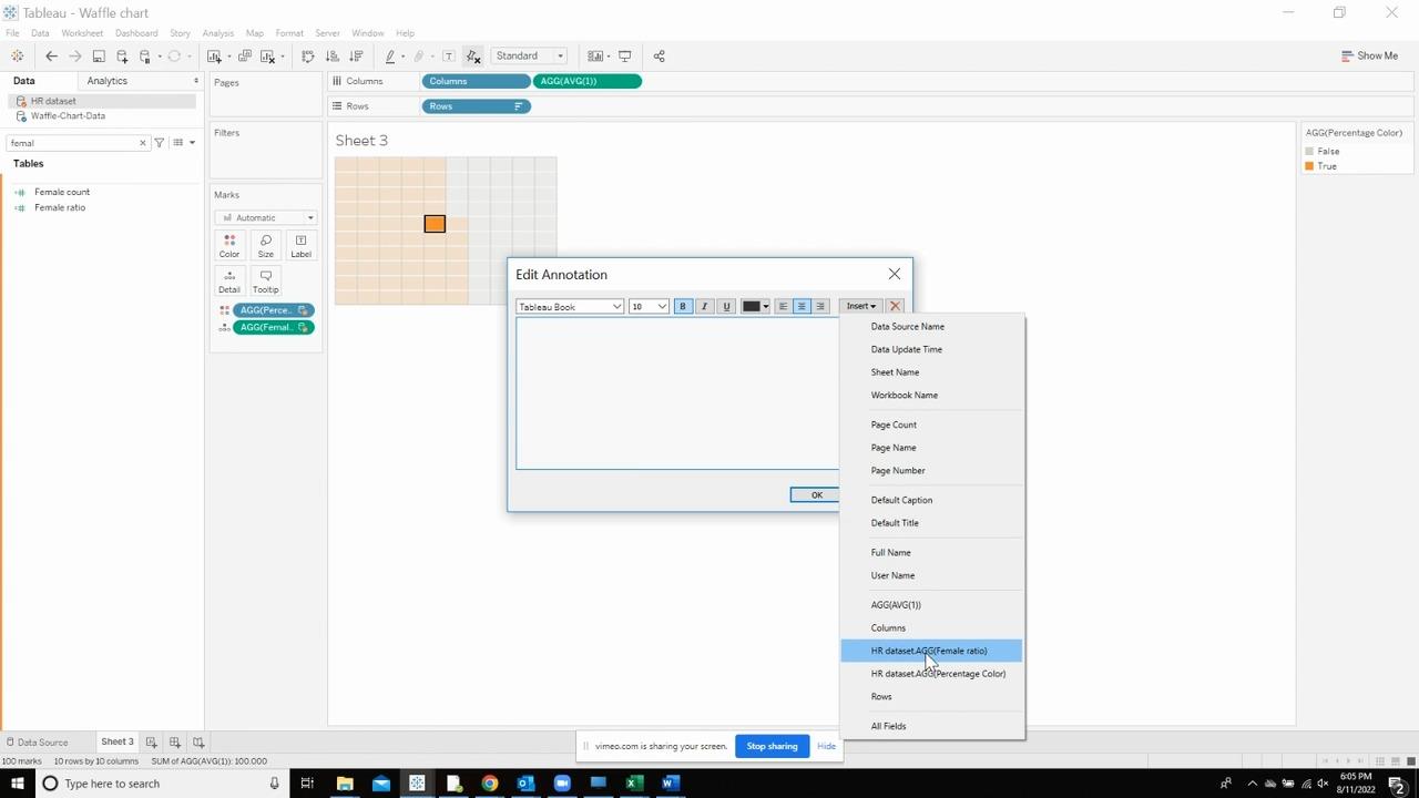
Right click the waffle and hover on the annotate option and select the “Mark” option.
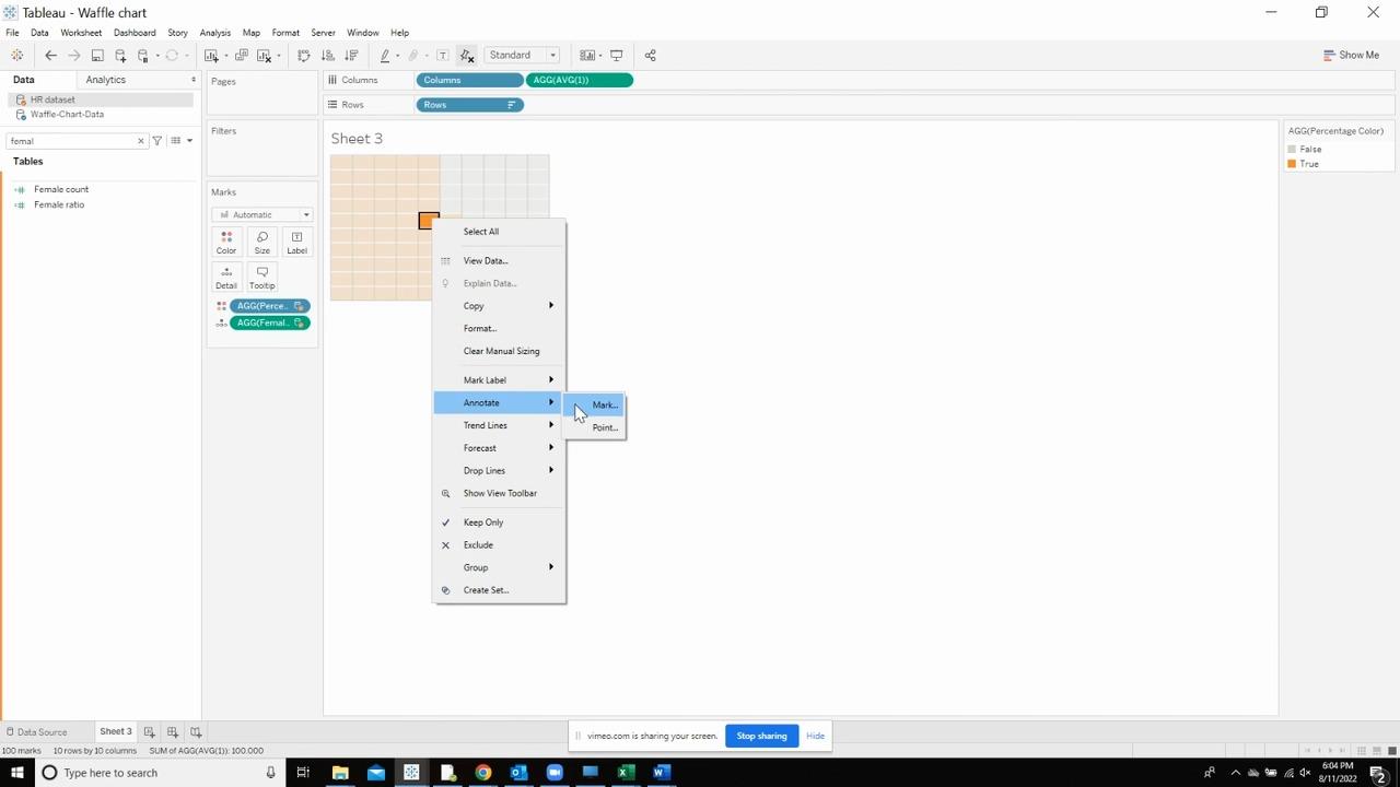
In the edit annotation, select the measure you want to display in the waffle chart. It should look like below.
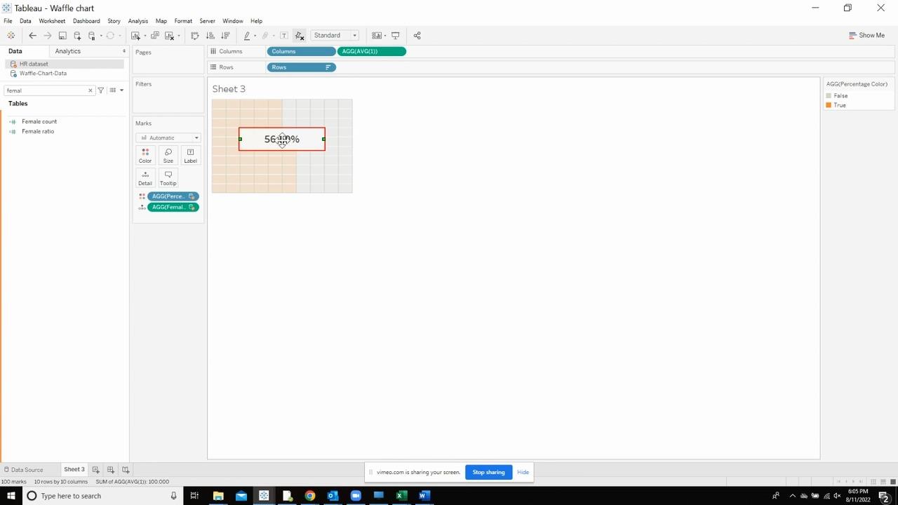
Reposition the box by dragging it to the middle of the waffle and resize it if you want.
Also, right click on the box and select the format option. This should give you a pane on the left . Select “None” from all the options so that the background color is removed from the box and the border disappears.
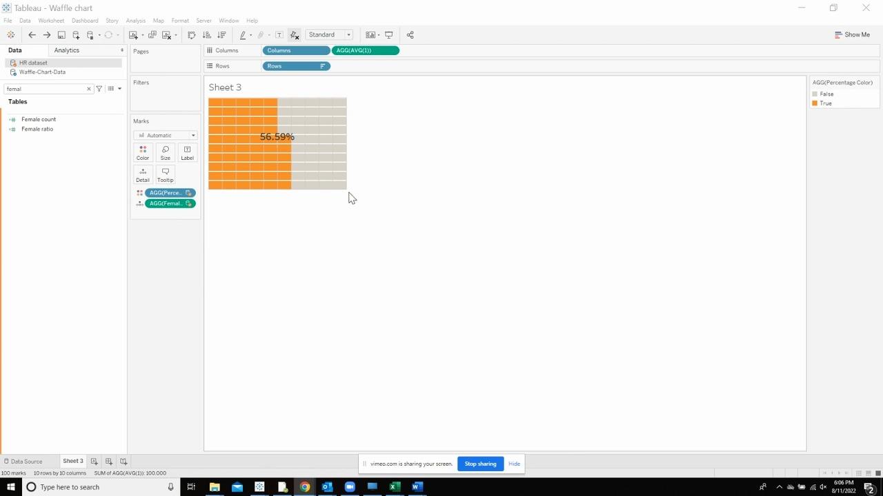
Finally, the Waffle will look like this which can then be added to the KPI




 Media Coverage
 Press Release
