Creating a Custom Radial Bar Chart in Tableau: Step-by-Step Guide
Mastering Data Visualization: Building Radial Bar Charts in Tableau
Unlocking Insights: Customizing Radial Bar Charts in Tableau
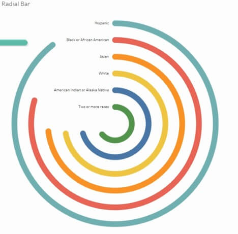
A Radial bar chart displays the performance of a metric relative to another in a radial format
This chart gives us a quick glimpse on how we are doing when compared to the other metrics.
The following chart gives us the glimpse of how salary varies through different races in the US in a certain organization.
In this article, I have used a dataset from an open-source HR dataset which can be found on https://www.kaggle.com/datasets/rhuebner/human-resources-data-set.
Understanding Radial Bar Charts in Tableau
Step-by-Step Tutorial: Building Your Own Radial Bar Chart
Design Tips for Optimizing Radial Bar Charts in Tableau
Enhancing Data Analysis with Custom Visualizations in Tableau
Introduction to Radial Bar Charts and Their Applications
Building Blocks: Components of a Radial Bar Chart in Tableau
Customization Options: Styling and Formatting Your Radial Bar Chart
Tips for Effective Data Presentation: Best Practices for Radial Bar Charts
Video Description:
The video includes the step-by-step instruction of building a radial chart from the scratch.
Chart Description:
To begin with, we are going to create an excel file called path which will have the following data input into it. Save it into a folder where we will use this to connect to our data source.

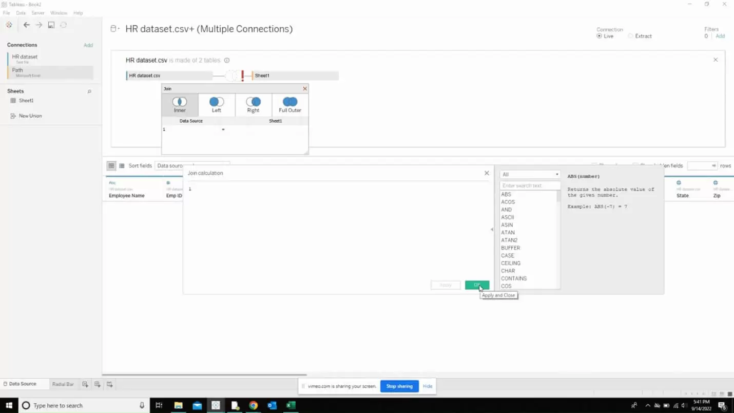
The next step is to connect this path file to our data source and create a relationship between the both. Set it to inner join and enter when when asked to define the “Join calculation”.
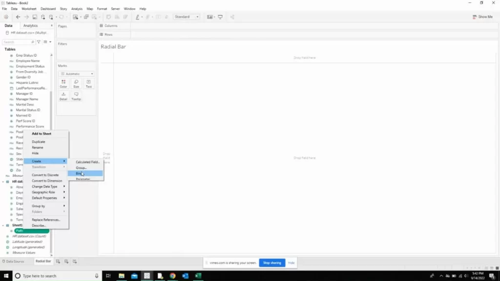
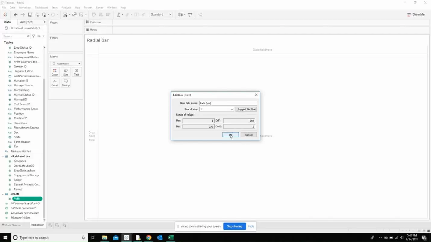
Now, right click on the path column present in the sheet 1 and click on create bins.
Enter the following as input in the window that appears.
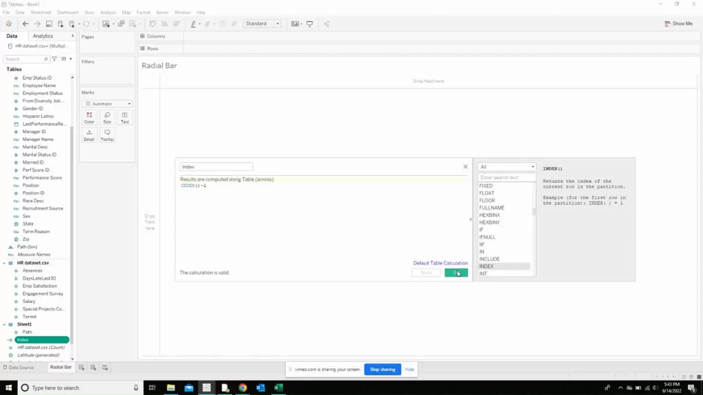
Now, create a new calculated field as shown below. Name this as “Index”
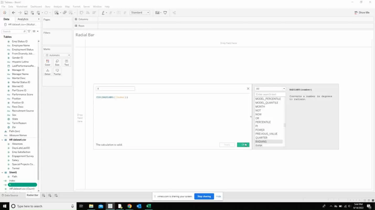
Create another calculated field and name it as “X”
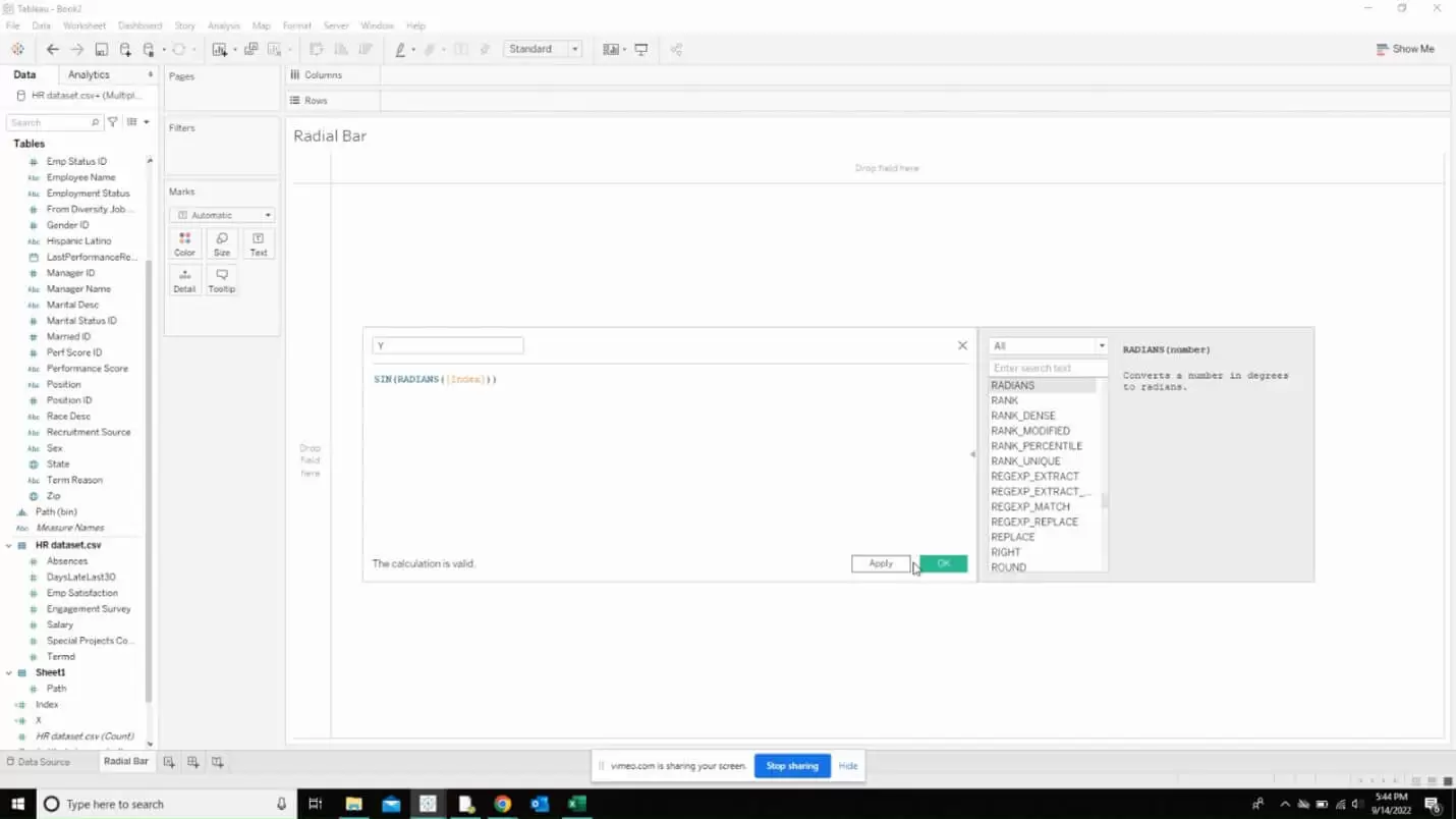
Same way, create another calculated field and name it as Y
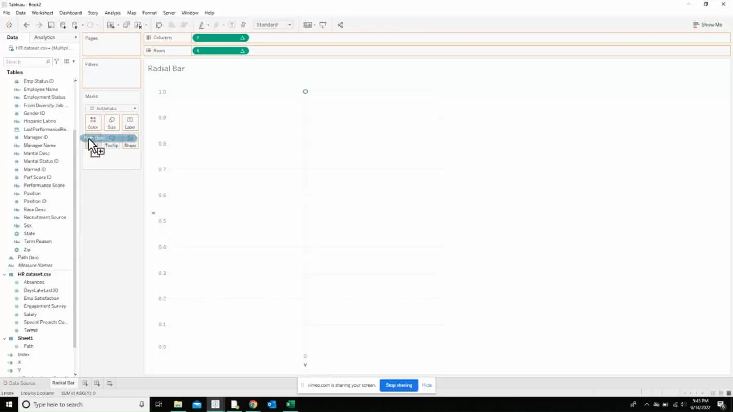
Now, drag Y to columns and X to rows as shown below. Also drag the created calculation path bin to detail.
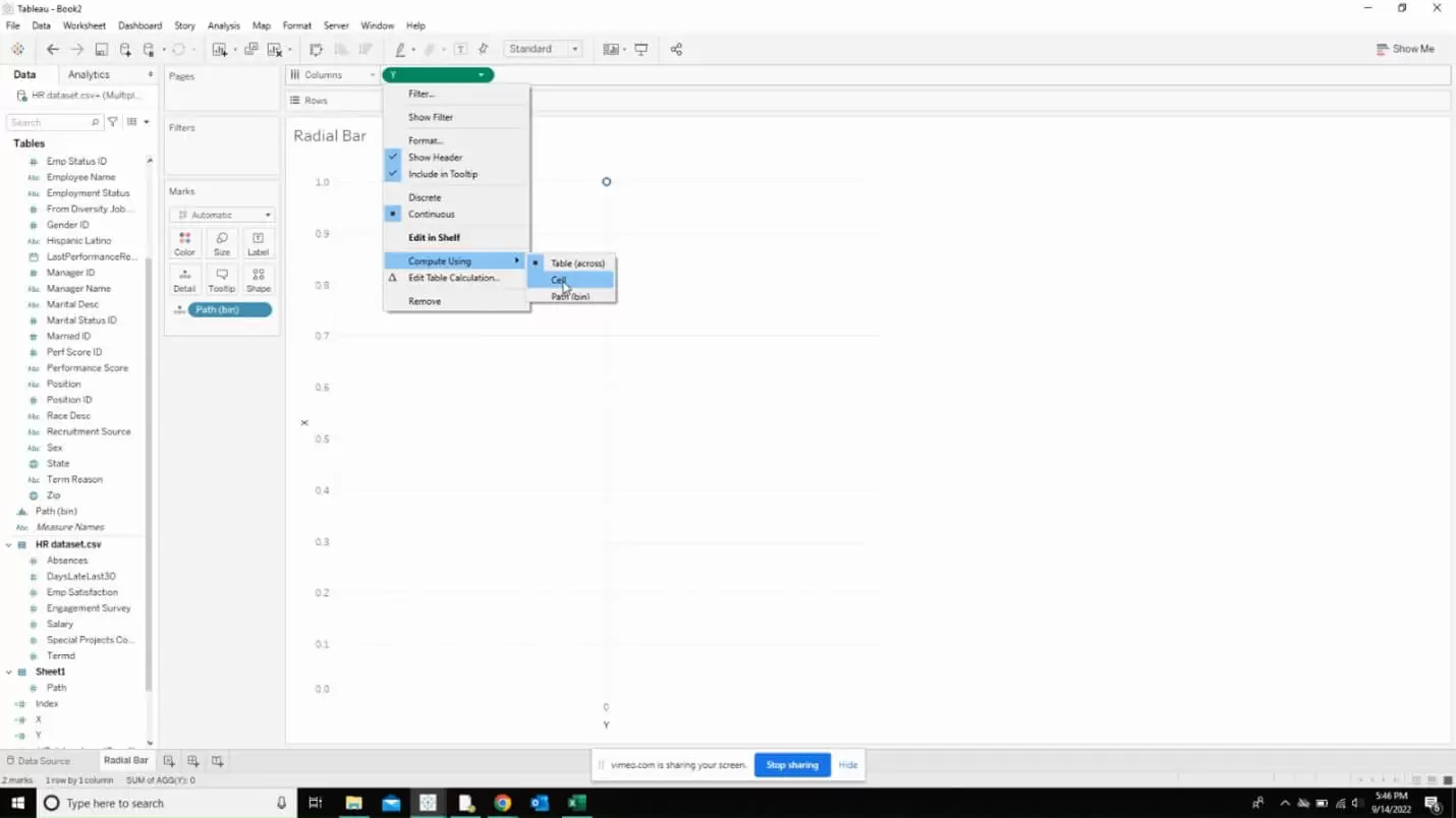
Right click on Y and select compute using the created calculation path bin.
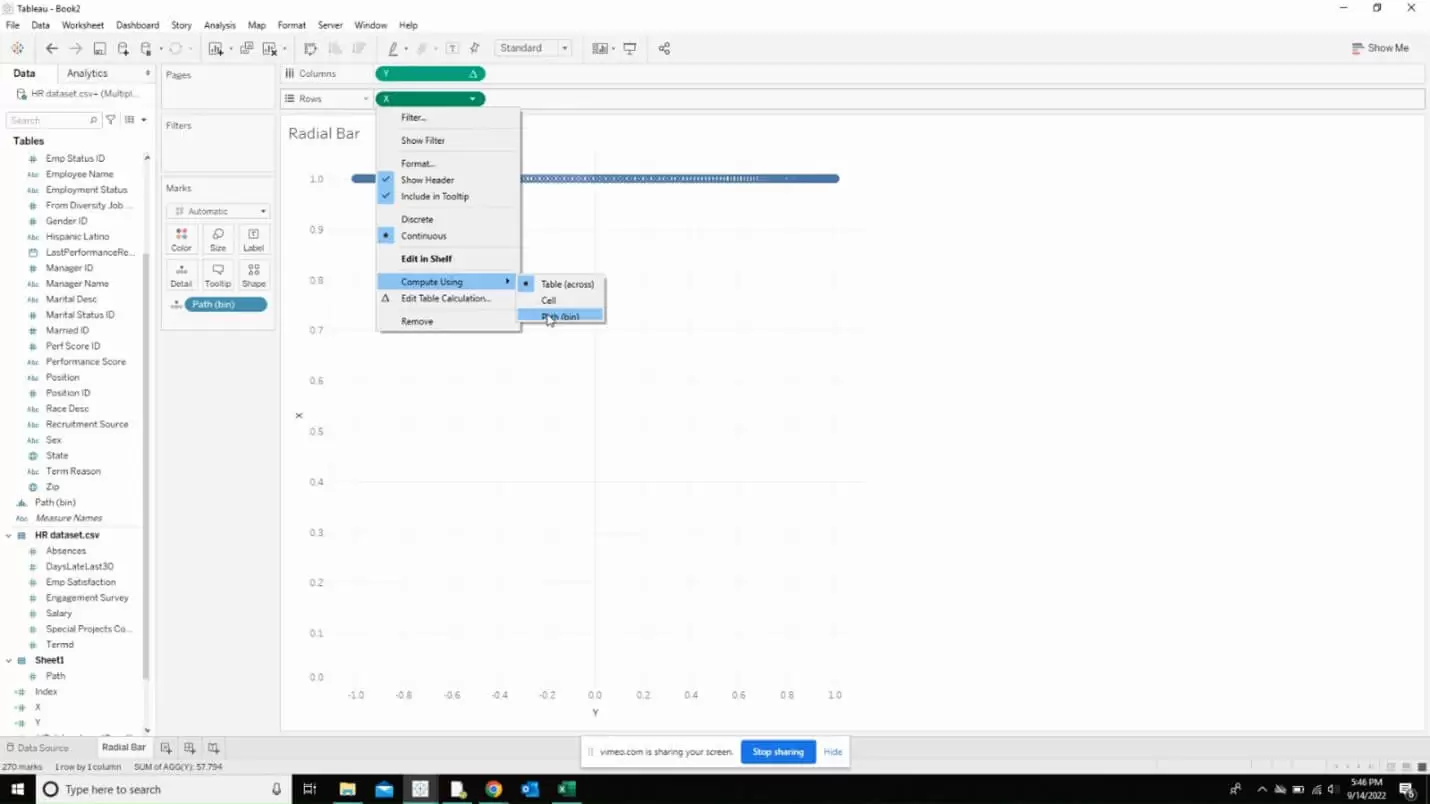
Repeat the same thing for X as well.
When that is done, you will get the following image as output. This is the start point for creating our radial bar chart.
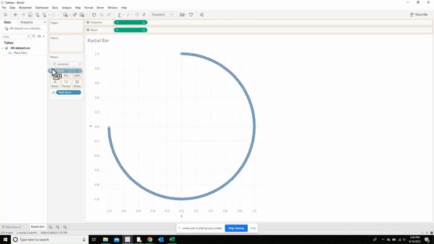
Click on the down arrow near the marks card and select “circle”.
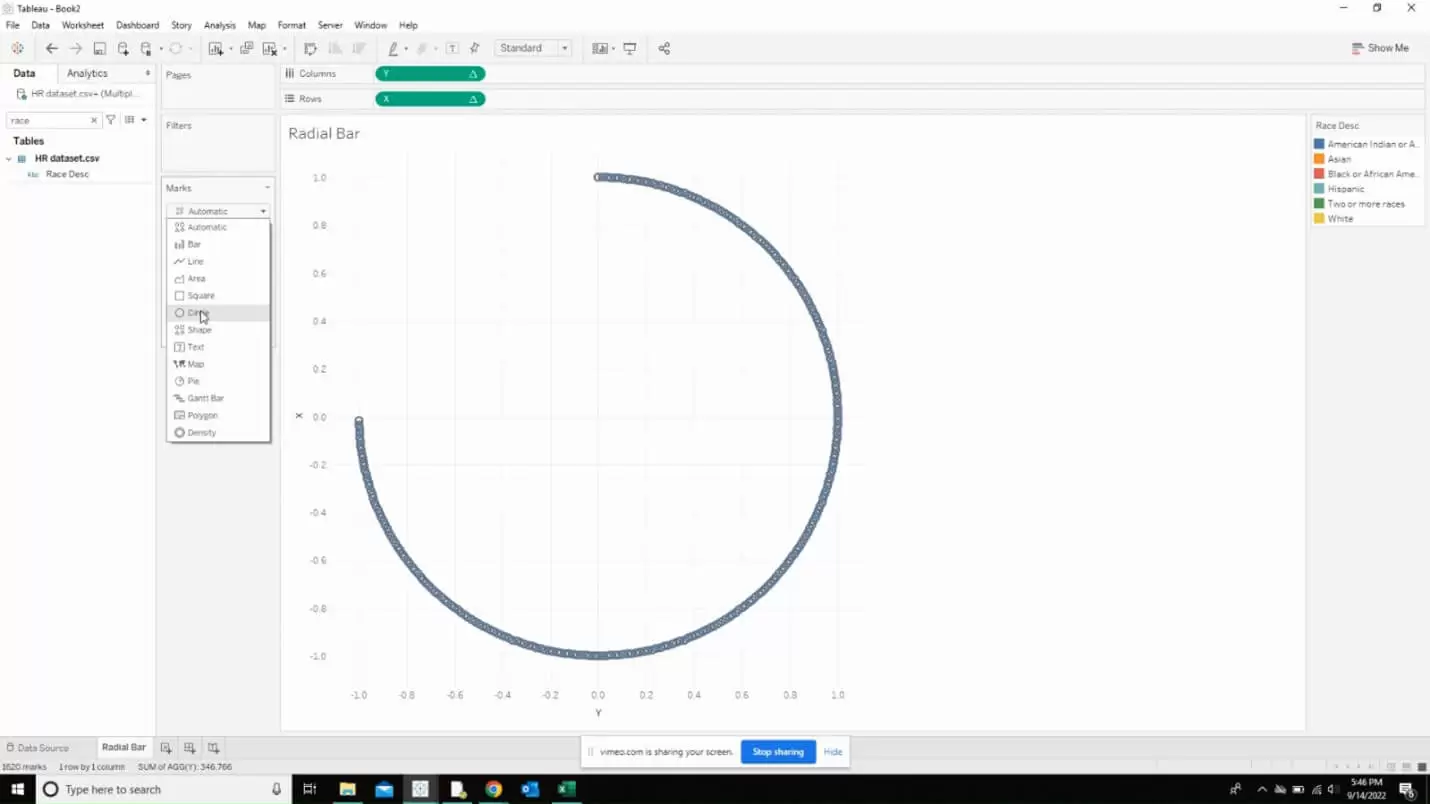
Now, the next step is to create the following calculated field which is going to calculate the window average of our field.
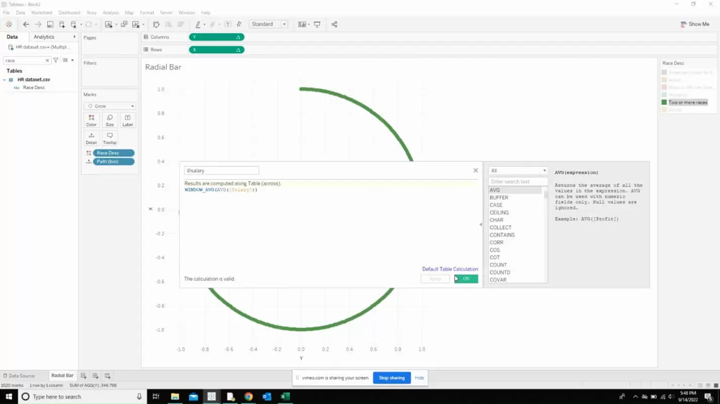
Also, create a rank calculation as below which will be computed along the table.
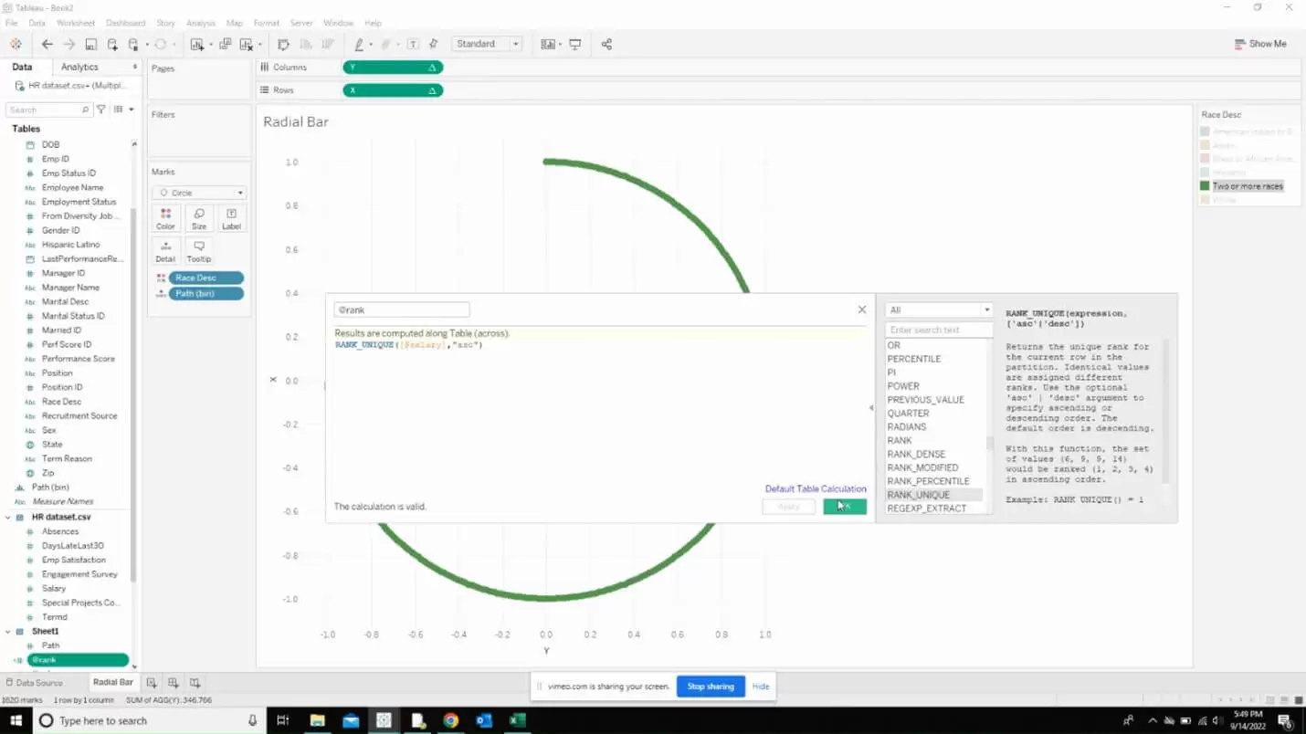
Now, we are going to modify the X and Y calculated fields to include the rank calculation that we created previously.
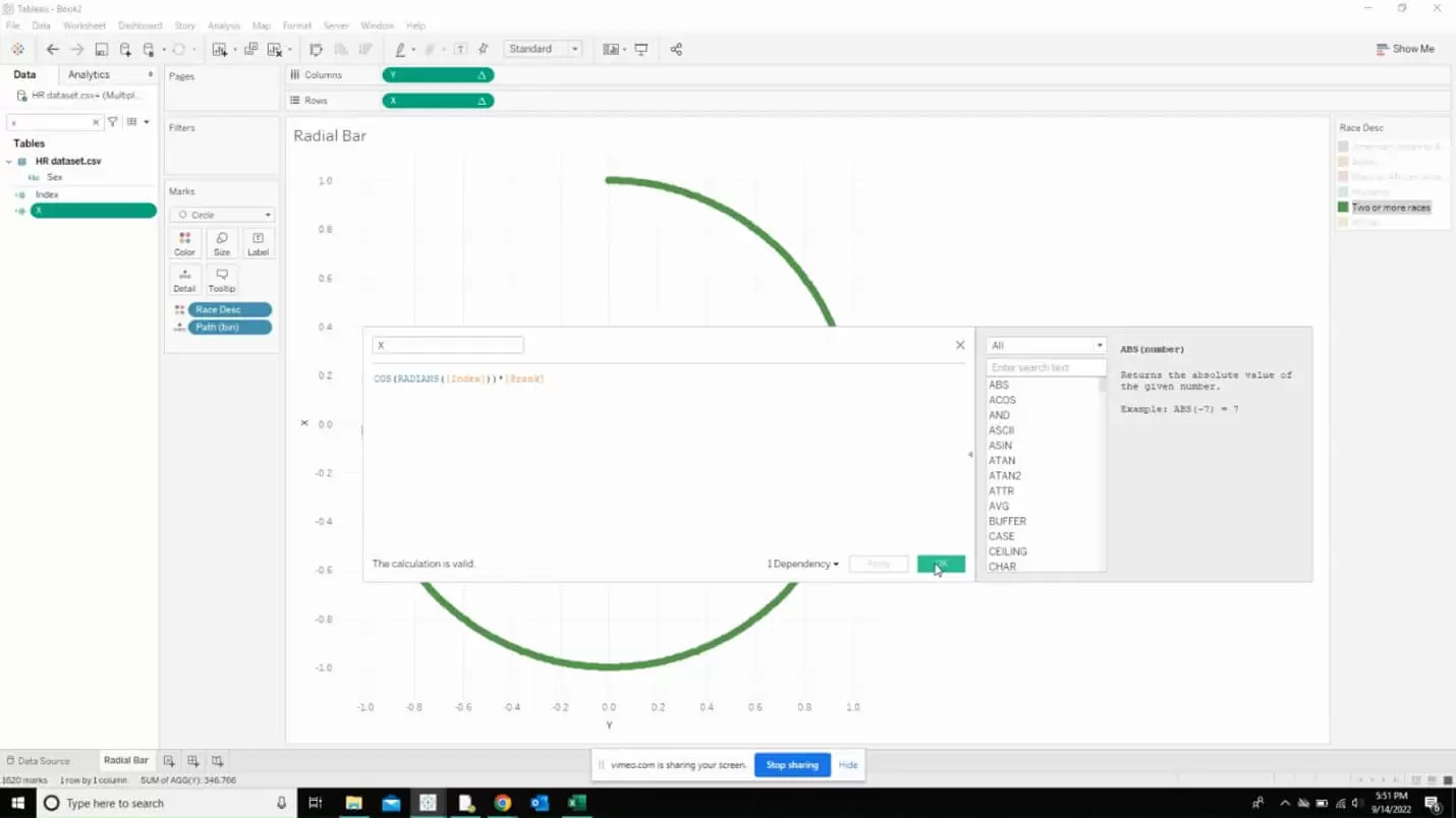
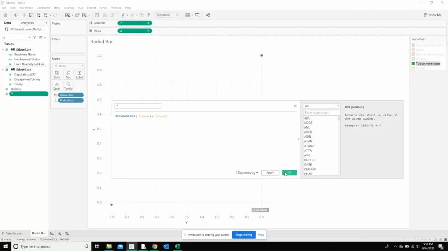
Now, we are going to set the table calculations to be computed against the calculatons we created and we can f=do that by right clicking on the down arrow near our X and Y fields added to the rows and columns.
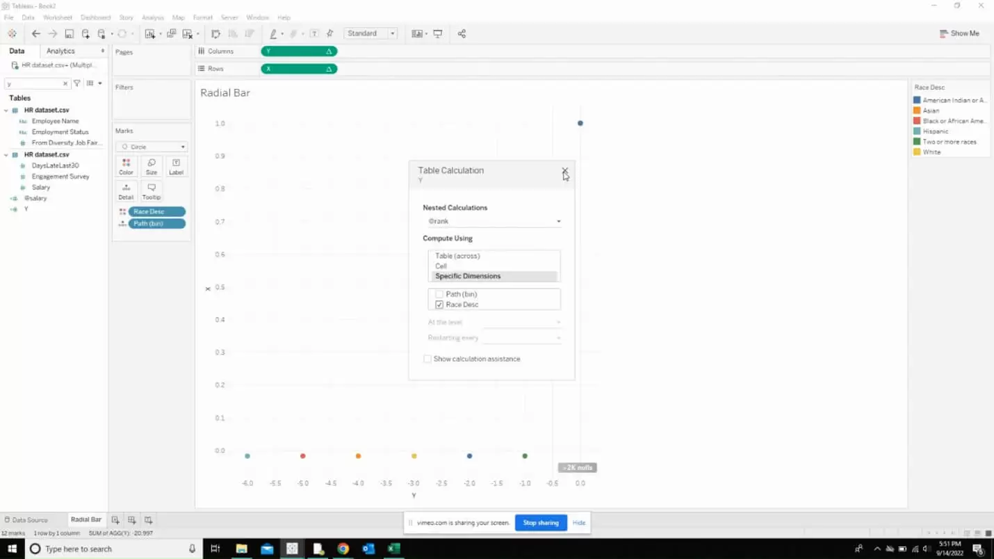
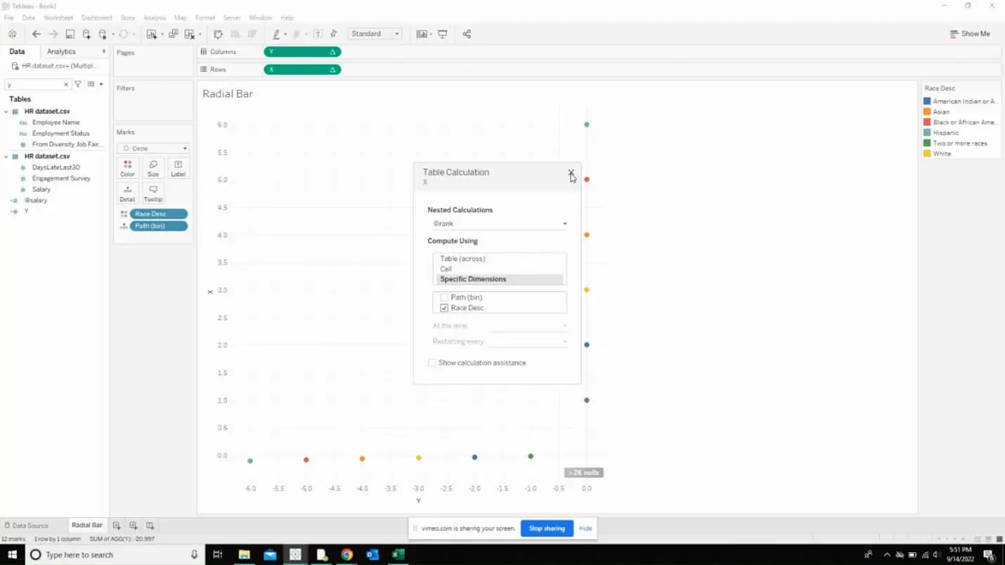
Uncheck everything except path (bin) for the salary field.
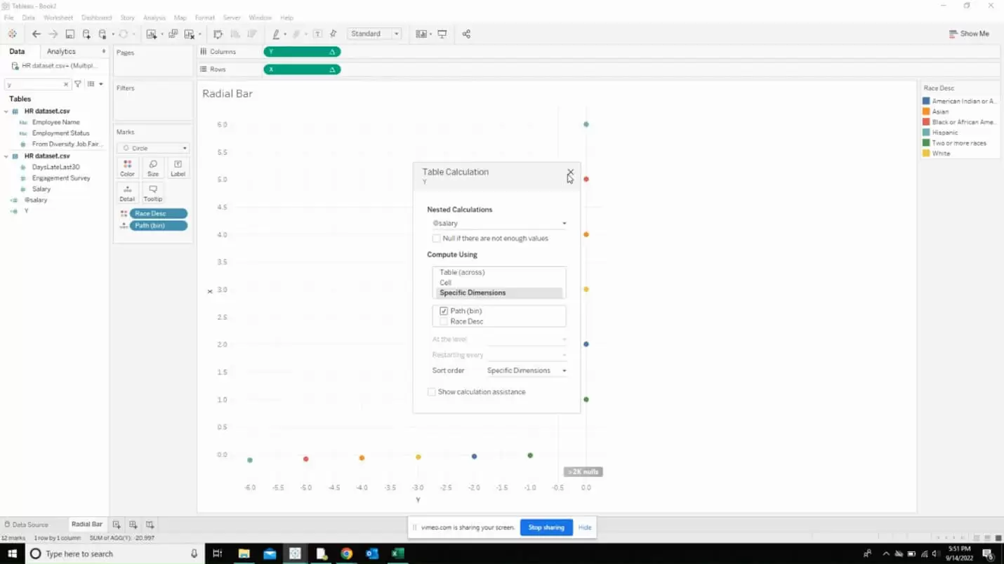
Now, we are going to create another calculated field that is going to get us the window average of the salary field we created before.
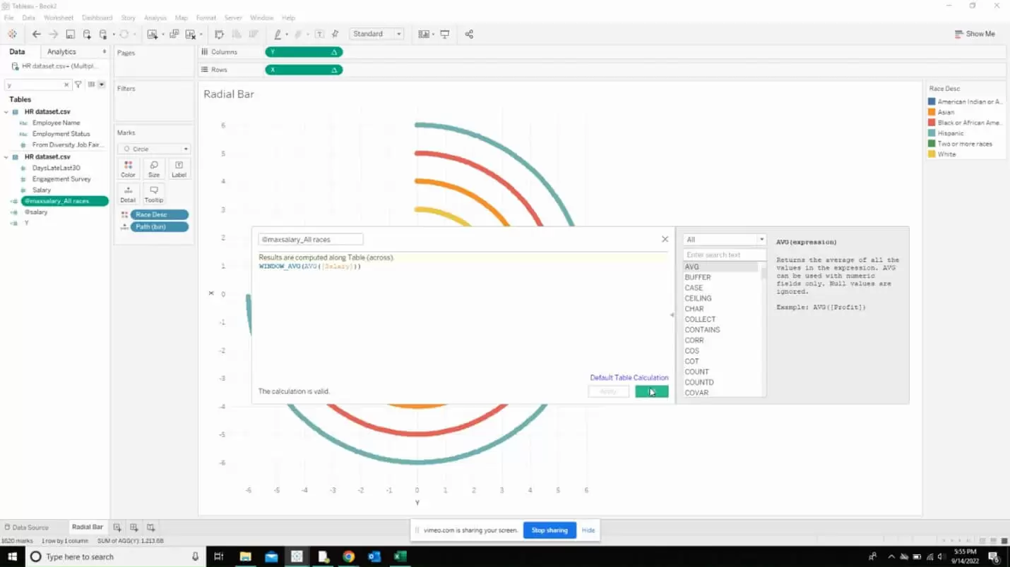
Calculate the percentage using the following calculated field.
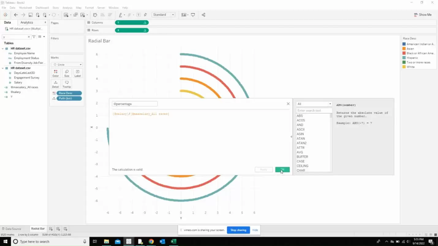
Now, we are going to introduce the percentage field we created in the X and Y calculated fields as shown below.
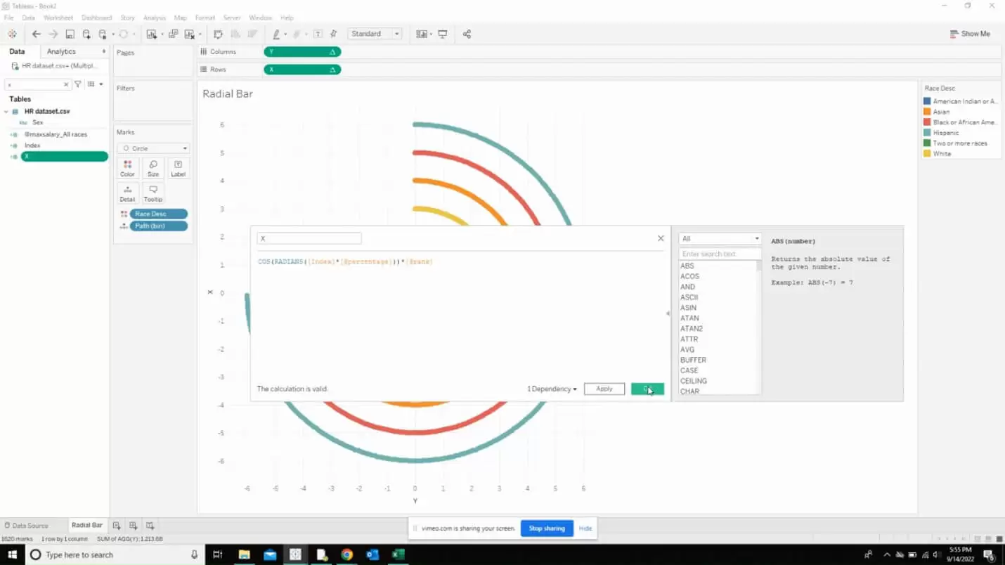
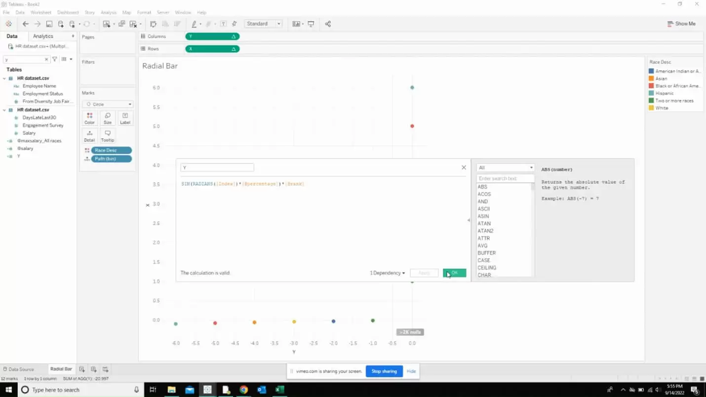
Now, we are done with creating calculated fields.
We have to edit the table calculation for the X and y fields by repeating the same step. Select every option in the compute using box and set the level to be the deepest. Repeat the same for both X and Y.
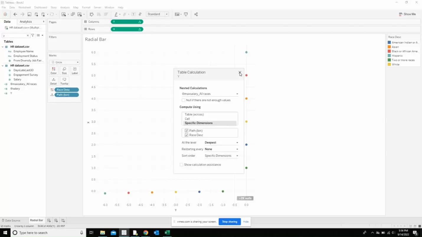
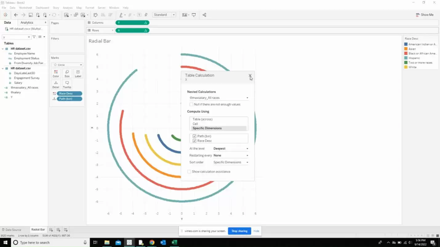
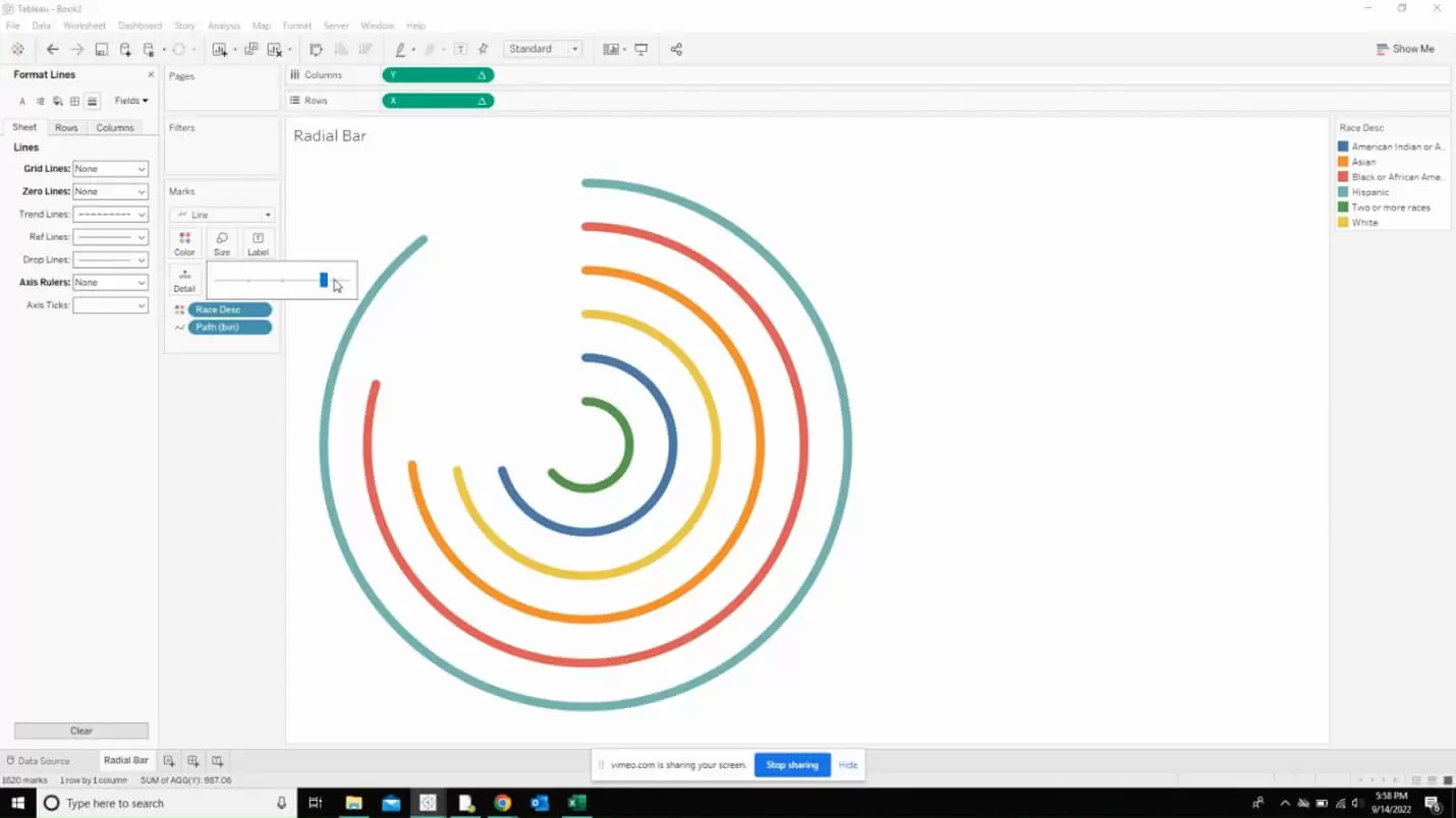
Now, you should be able to see the complete radial chart where you can adjust the size of the ring using the size option in the marks view.
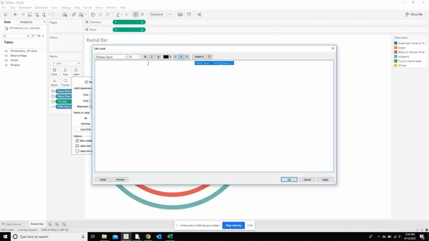
Now, it is time to throw in our mark labels. Select the field that goes into the mark label and drop it as shown below.
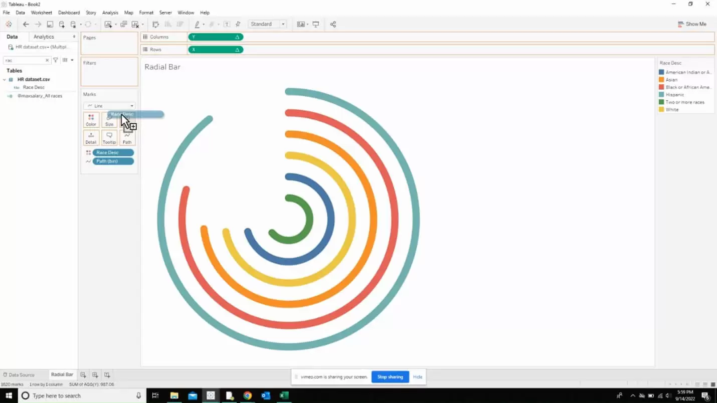
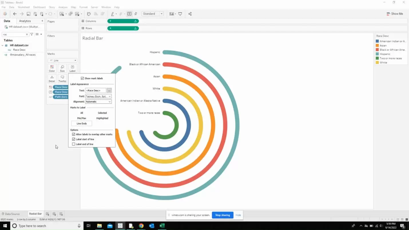
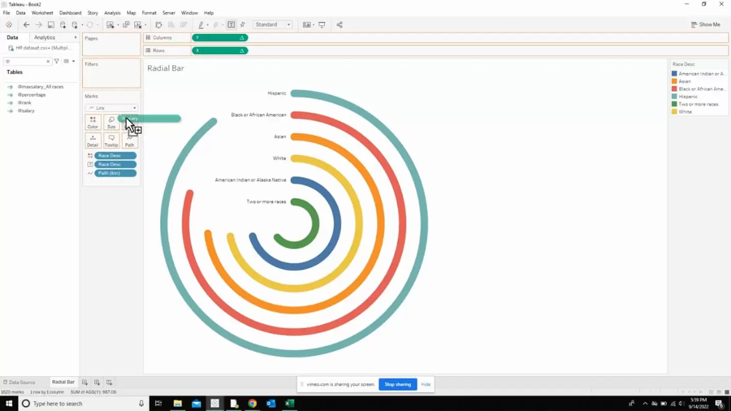
You can also edit the label to show the category and then the number associated with the category as shown below.
