Crafting Custom Lollipop Charts in Tableau: A Step-by-Step Guide
Mastering Lollipop Chart Design: Tips and Techniques in Tableau
Elevating Data Visualization with Custom Lollipop Charts in Tableau
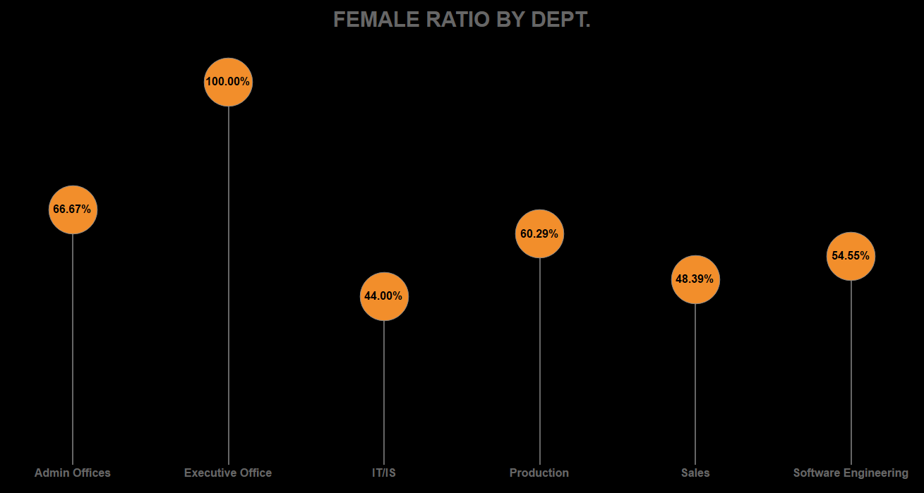
The Lollipop Chart is a combination of bar chart and a shape chart and can be used when we need to show a comparison.
Video Description:
The video includes the step-by-step instruction of building a lollipop chart from the scratch.
Chart Description:
In this article, I have demonstrated how to build donut chart using a HR data sets pre-packaged with Tableau app. The lollipop chart is a composite chart with bars and circles. It is a variant of the bar chart with a circle at the end, to highlight the data value.
Understanding Lollipop Charts and Their Applications in Tableau
Step-by-Step Guide to Creating a Custom Lollipop Chart in Tableau
Designing Effective Lollipop Charts for Data Analysis in Tableau
Tips for Enhancing Lollipop Chart Visualizations in Tableau
Introduction to Lollipop Charts and Their Benefits in Tableau
Exploring Advanced Formatting Options for Lollipop Charts in Tableau
Leveraging Calculated Fields for Custom Lollipop Charts in Tableau
Best Practices for Designing Interactive Lollipop Charts in Tableau
Drag the measures and dimensions you want in the view to the rows and columns shelf.
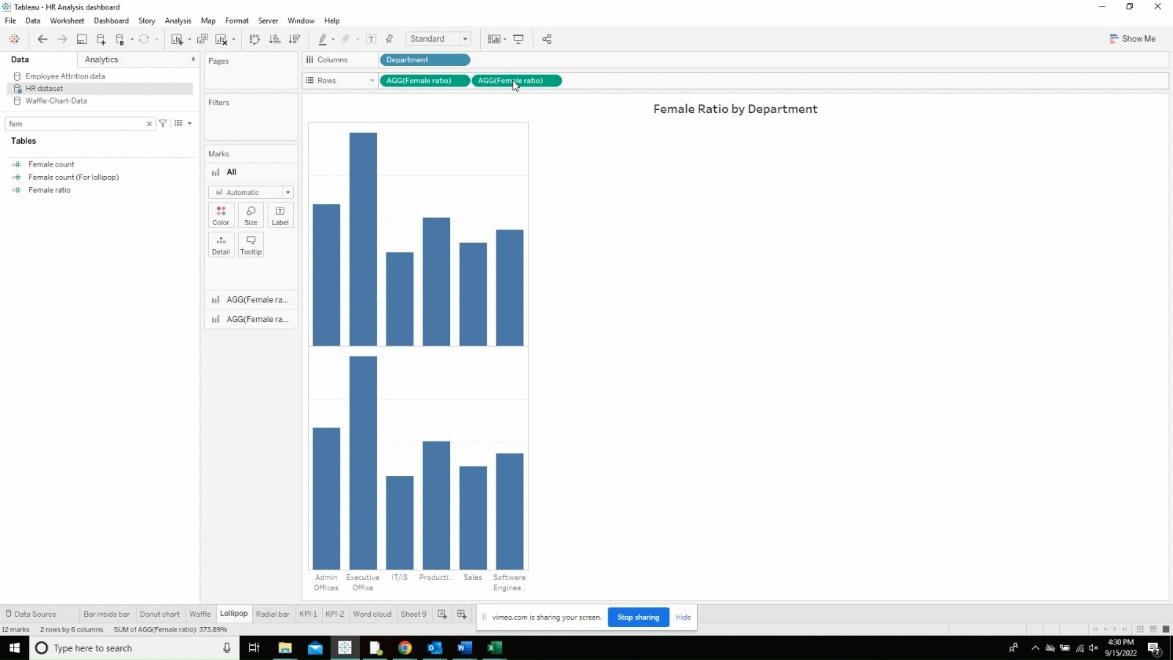
Click on the drop-down option in the second measure found in the rows shelf and click on the dual axis option.
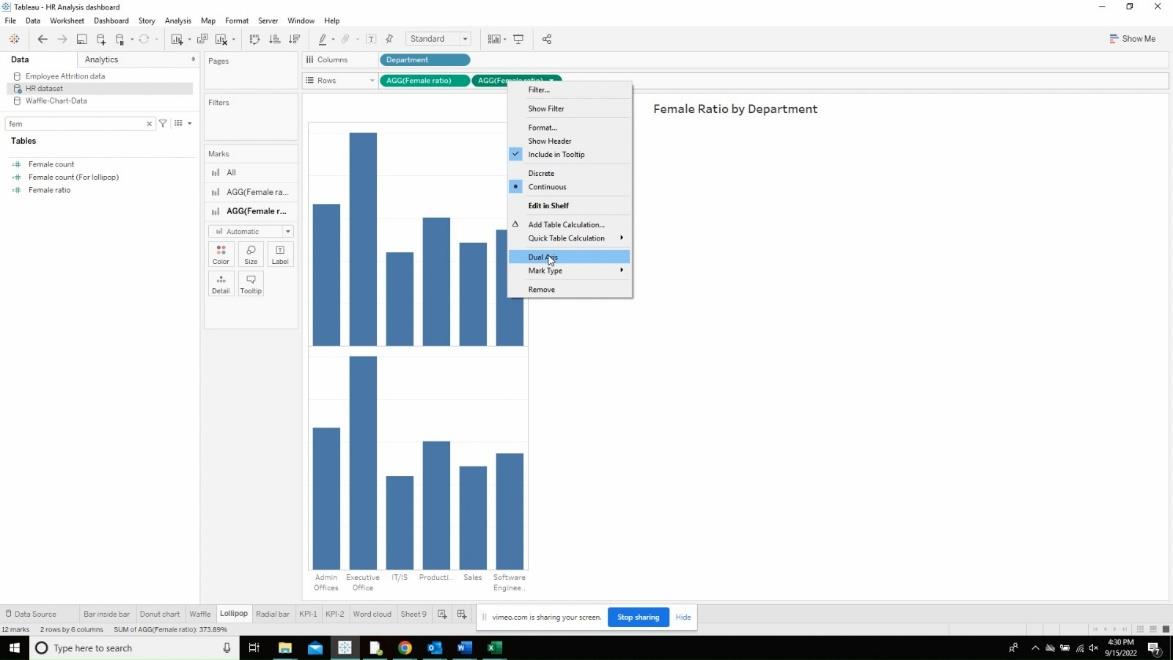
Click on the first measure and change the marks card to “Bar”. Then resize the bar size small so that it looks like a lollipop.
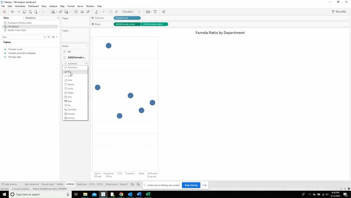
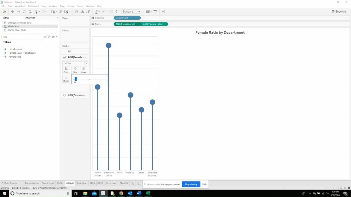
Change the color and sizing of both the bars and the circle to the desired colors.
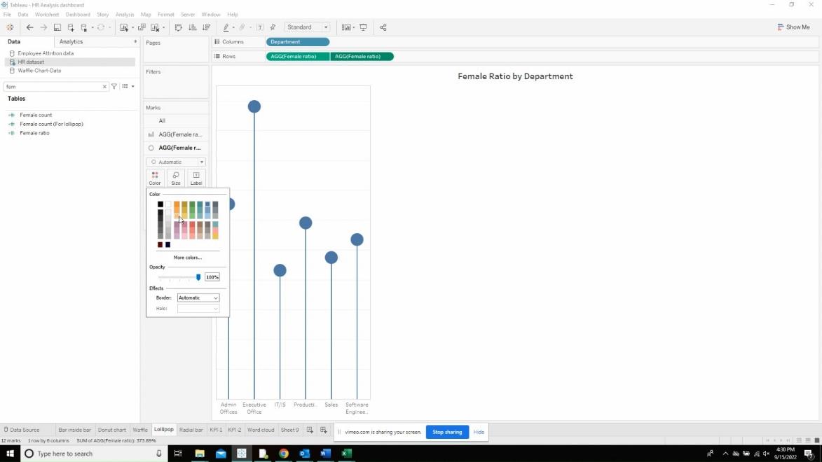
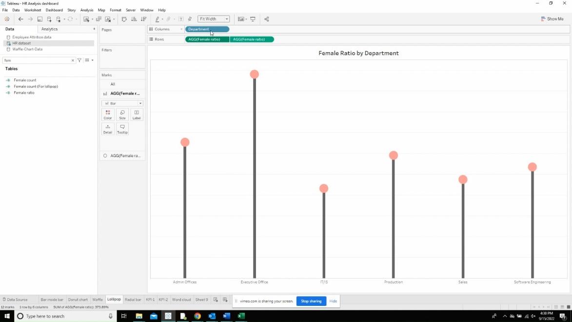
Drag the measure to the text box of the second measure in the row shelf so the text appears in the middle of the circle.
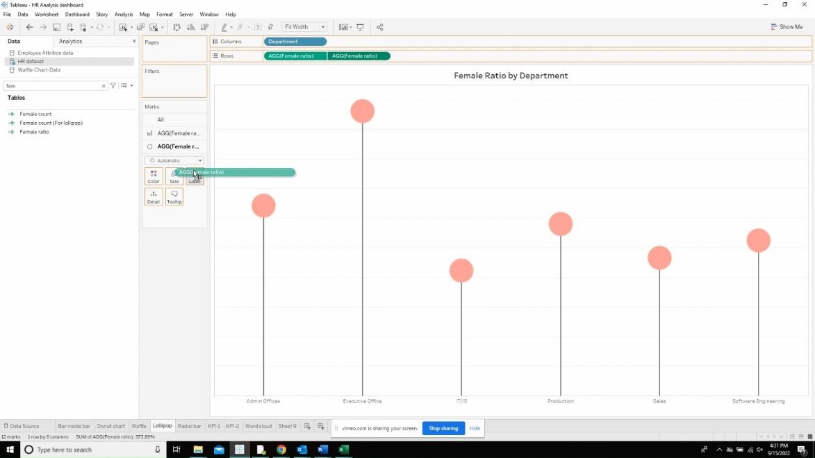
Right click on the sheet and format the page to remove grid lines and zero lines.
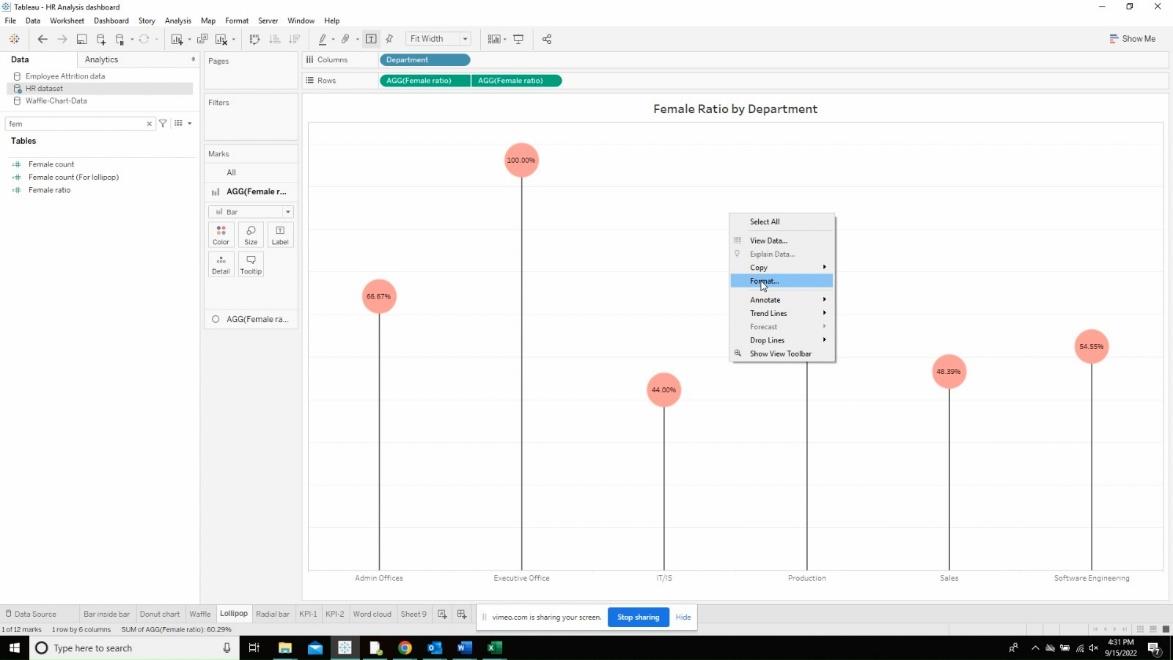
In the rows and columns tab, change the options to none.
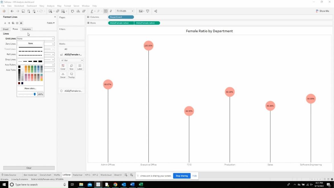
Now, format the sheet by right clicking the page and turning off the grid lines and zero lines.
