Elevate Your Tableau Dashboards: Designing Custom KPI Sparkline Charts
Mastering KPI Visualization: A Step-by-Step Guide to Tableau Sparkline Charts
Enhance Data Insights: Building Dynamic KPI Sparkline Charts in Tableau
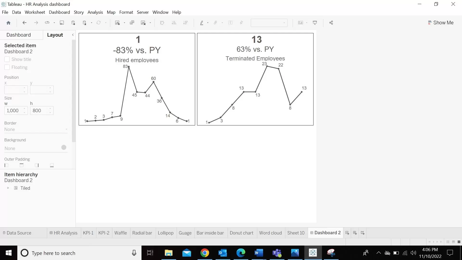
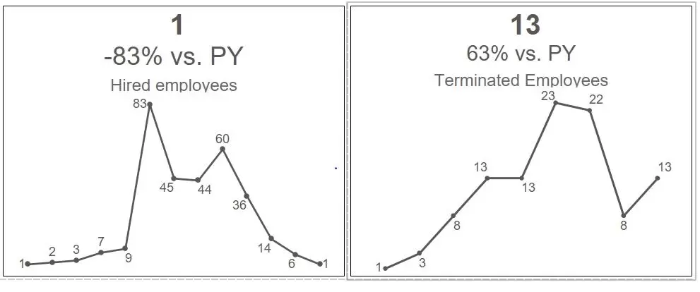
A KPI Sparkline chart basically combines both the KPI chart and sparklines chart in a single chart to give a quick glimpse of the KPI.
Video Description:
The video includes the step-by-step instruction of building a KPI Sparkline chart from the scratch.
Chart Description:
Since we will be creating a line chart that represents the difference between the current year and the prior year numbers, we will be creating our first calculation as below. This will calculate the numbers for the current year as shown below.
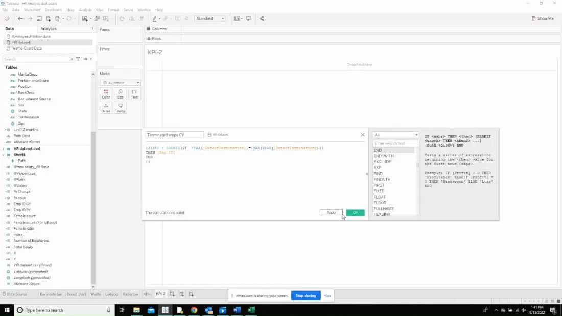
Create another calculated field for prior year as shown below.

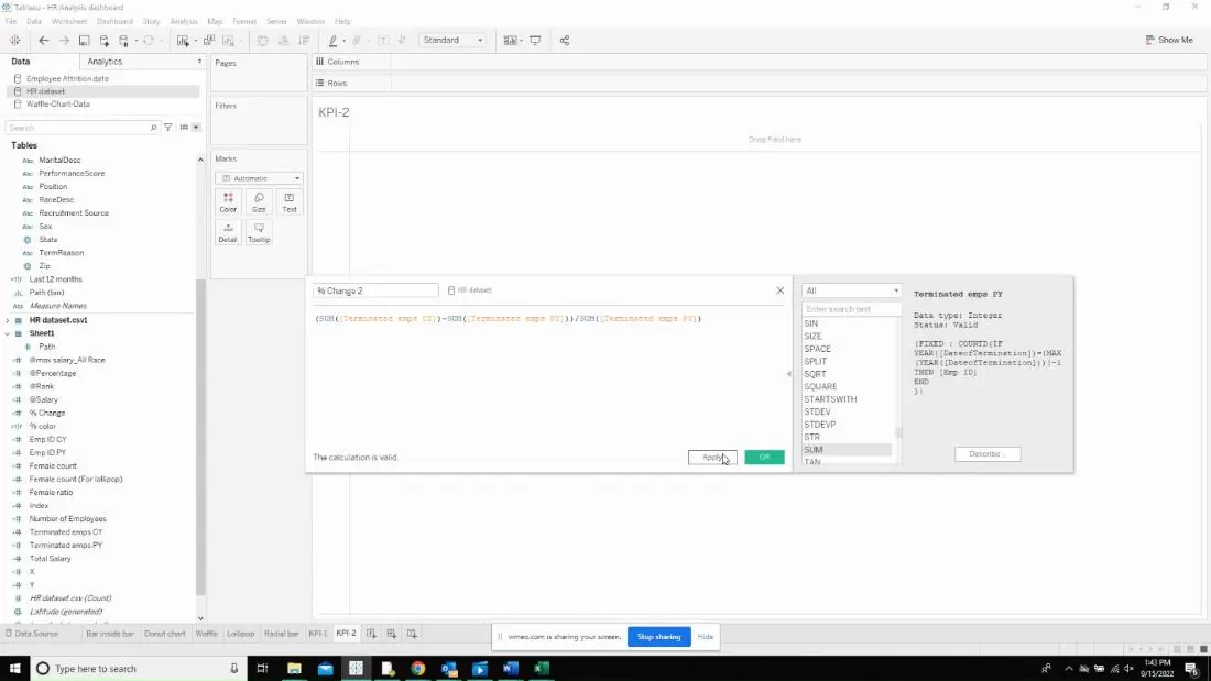
Now, create the calculation that will calculate the percentage change as shown below. This will ideally be a number in our case. To convert it to percentage, right click on the newly created measure and say “Number format” and change it to percentage.
Now, let us start creating the line chart by pulling in measures that we need for the chart. In our case, it is going to be the date of termination.
Understanding KPI Sparkline Charts: An Introduction to Data Visualization
Designing Custom KPI Sparkline Charts: Step-by-Step Instructions
Leveraging Tableau Features: Enhancing KPI Visualization with Interactivity
Best Practices for Effective KPI Sparkline Chart Design
What Are KPI Sparkline Charts and How Do They Work?
Step 1: Data Preparation and Formatting for KPI Sparkline Charts
Step 2: Creating KPI Sparkline Charts in Tableau
Step 3: Adding Interactivity and Customization to KPI Sparkline Visualizations
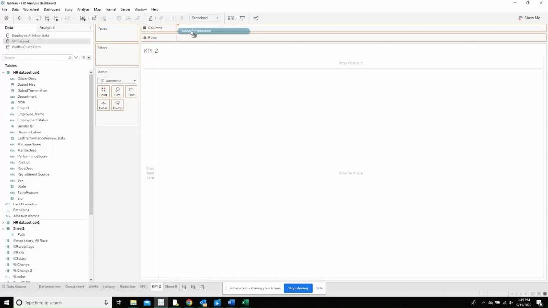
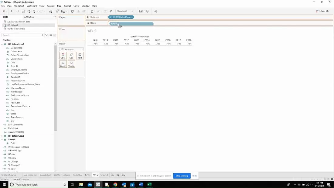
Now, bring in the other measure to create a line chart.
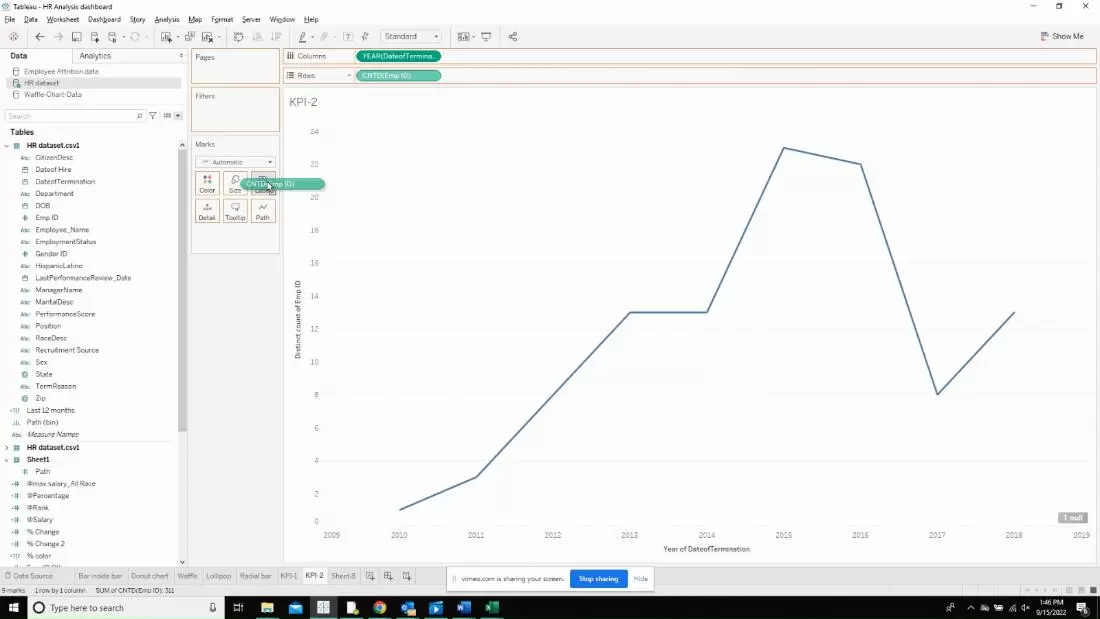
Drop the label on the label marks card.
Now, a little formatting has to be done to the line chart before we add the text chart. Right click on the page and click on sheet. Then change all the drop down options to None.
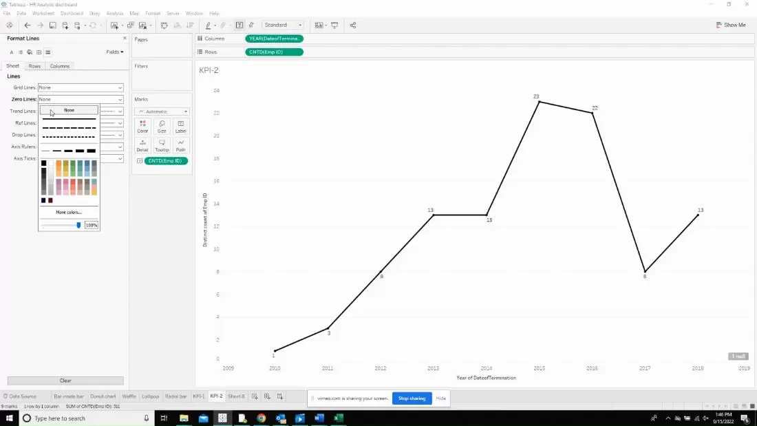
The line chart will look like the below with labels. Make sure to turn off the headers by clicking on the axis and unchecking the show header option.
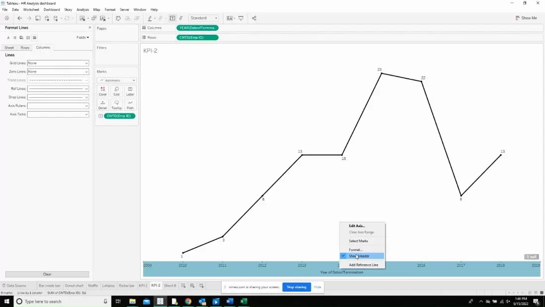
Now, we move to the next step of duplicating the same measure by clicking on CTRL+drag the measure value right next to the same measure in the rows shelf.
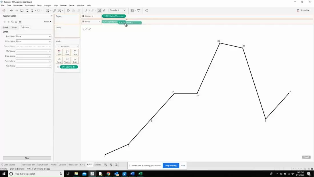
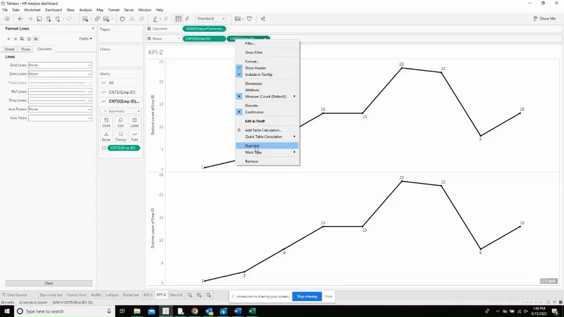
This will give us an image like below and click on “Dual axis” to overlap the charts on each other.
The second part is to start working on the text box that will go above the line chart. Add the measures to the details card and then click on the edit title. Now, make the first measure a little bigger than the other measure.
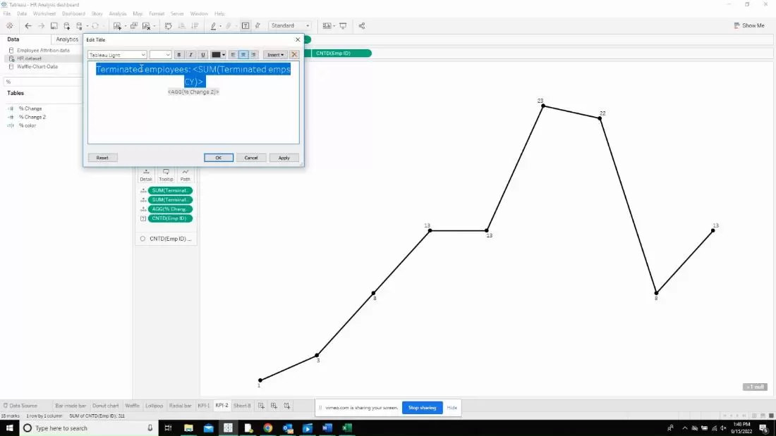
It will look like below which will need further formatting.
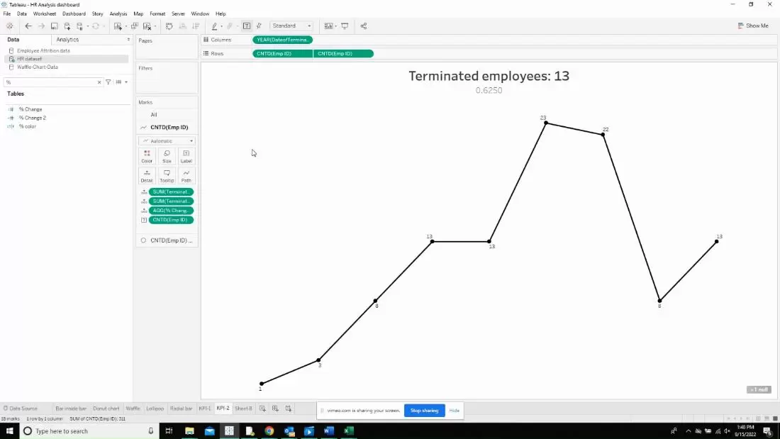
After the formatting is done, open a new dashboard and drop the newly created sheets to check if they are fine.
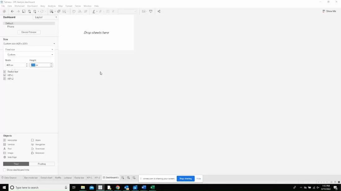
After dropping the sheets and resizing each of them , they should look like below. Now, go to the layout option and add borders to distinguish the charts from each other. Now, the same chart will have both the KPI and the sparklines which avoids the usage of two charts to show the same representation.
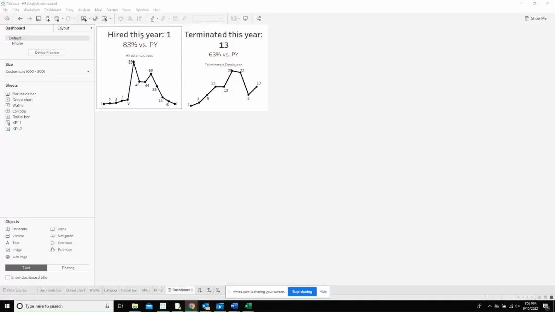
This is the final output I got after resizing the charts and working on the layouts.
