 Media Coverage
 Press Release
Mastering Gauge Charts: A Comprehensive Guide for Tableau Users
Creating Custom Gauge Charts in Tableau: Your Ultimate Tutorial
Enhance Your Data Visualizations: Building Dynamic Gauge Charts in Tableau
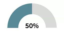
A gauge chart displays the performance of a metric relative to another in a scale using a needle on a dial.
This chart gives us a quick glimpse on how we are doing when compared to the target.
Video Description:
The video includes the step-by-step instruction of building a gauge chart from the scratch.
Chart Description:
In this article, I have demonstrated how to build donut chart using a HR data sets pre-packaged with Tableau app. The goal of the chart is to displays the performance of a metric relative to another in a scale using a needle on a dial.
Understanding Gauge Charts: What Are They and When to Use Them?
Step-by-Step Tutorial: Building a Custom Gauge Chart in Tableau
Advanced Techniques: Customizing Gauge Chart Design and Functionality
Practical Applications: Real-World Examples of Gauge Charts in Tableau Dashboards
Getting Started: Setting Up Your Data and Parameters for Gauge Charts
Designing Your Gauge Chart: Tips for Customization and Visualization
Enhancing Interactivity: Adding Dynamic Features and Controls to Gauge Charts
Optimizing Performance: Best Practices for Building Efficient Gauge Charts in Tableau
This chart gives us a quick glimpse on how we are doing when compared to the target.
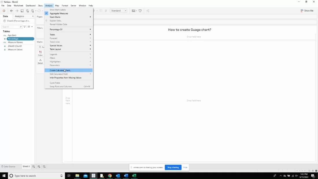
Create the following calculated field and name them in the same format as below. The first calculated field is called “slice 1” and contains the following calculation. The first slice is a variable sized slice starting at 12:00 and ending between 12:00 and 3:00.
This slice will be used to show the second part of the percentage (if the value is greater than 50). Otherwise, this slice will have 0 size, making it invisible.
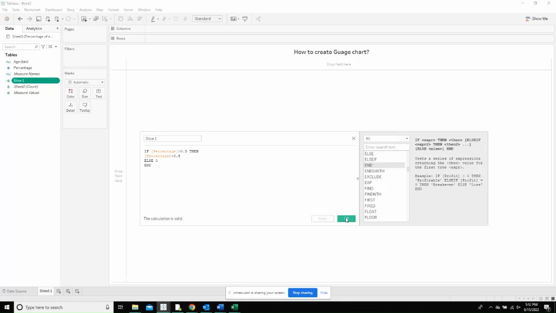
The second slice is a Variable sized slice starting and ending somewhere between 12:00 and 3:00, after slice 1. If the percentage is less than 100, then this slice will be visible and will appear in a light grey color.
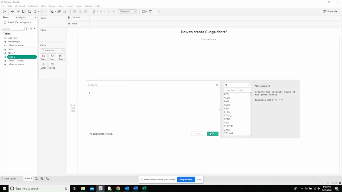
Slice 3 is a Hidden slice starting at 3:00 and ending at 9:00. This slice will always be the same color as the background, making it invisible, making it a half-donut.
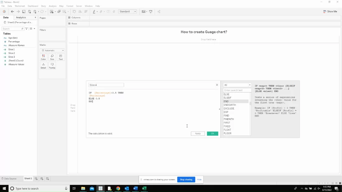
Slice 4 is a Variable sized slice starting at 9:00 and ending between 9:00 and 12:00. This slice will be used to show the first part of the percentage (values between 0 and 50).
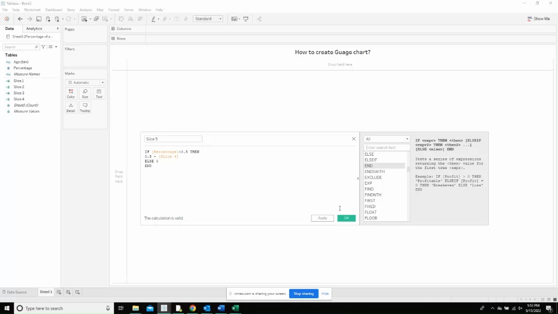
Slice 5 is a variable sized slice starting and ending somewhere between 9:00 and 12:00, after slice 4. If the percentage is less than 50, then this slice will be visible and will appear in a light grey color, like Slice 2.
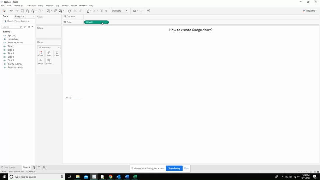
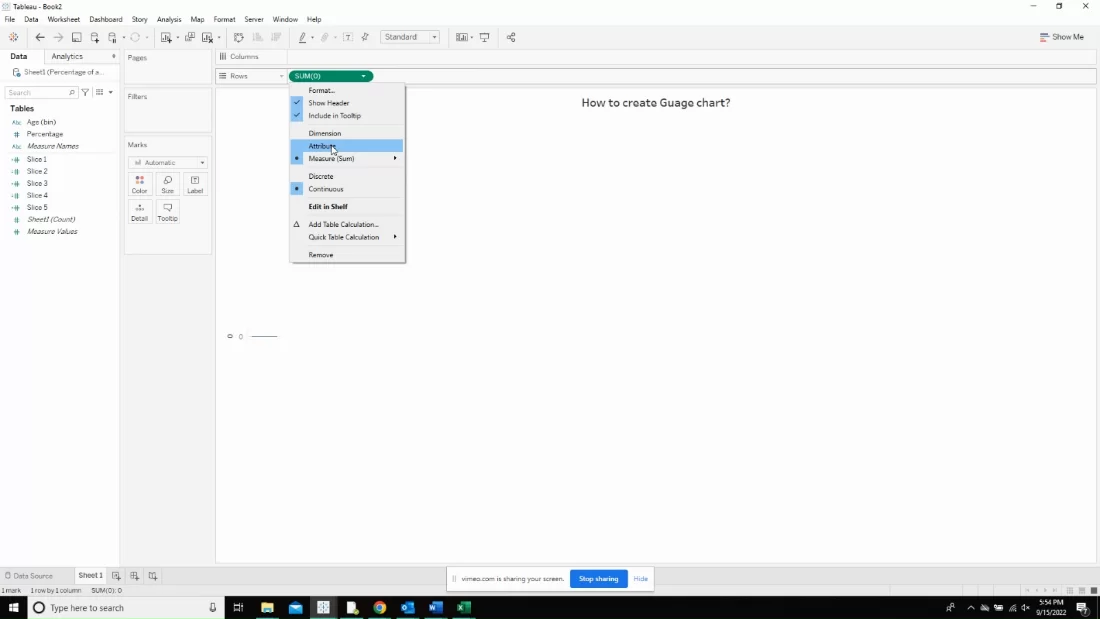
Create a dummy calculation named “Sum(0)”
Change it to attribute by clicking on the down arrow on the created dummy calculation.
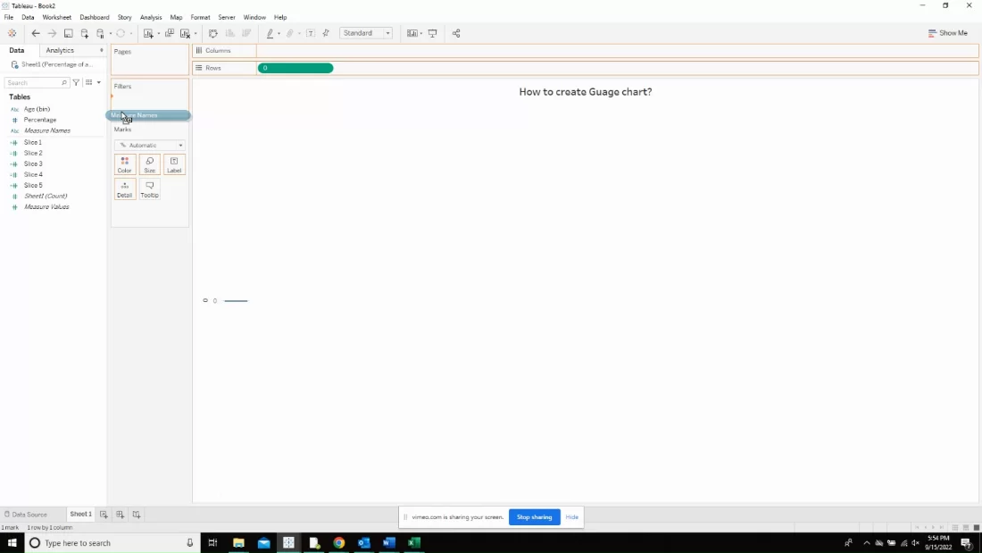
Now, drop the measure names in the filters tab.
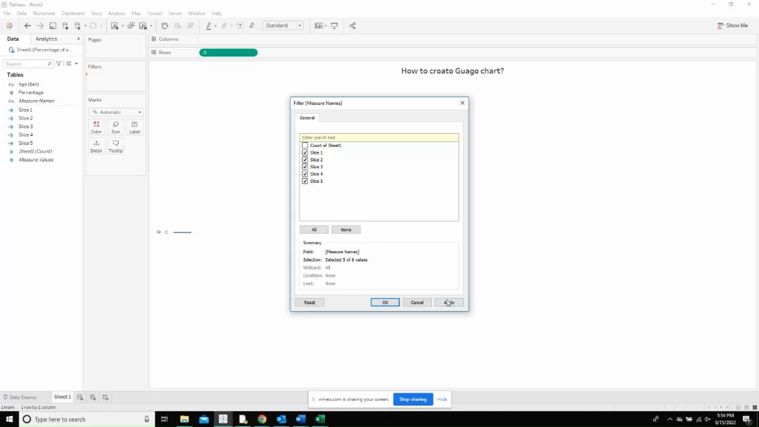
Now, uncheck everything other than slice 1-5.
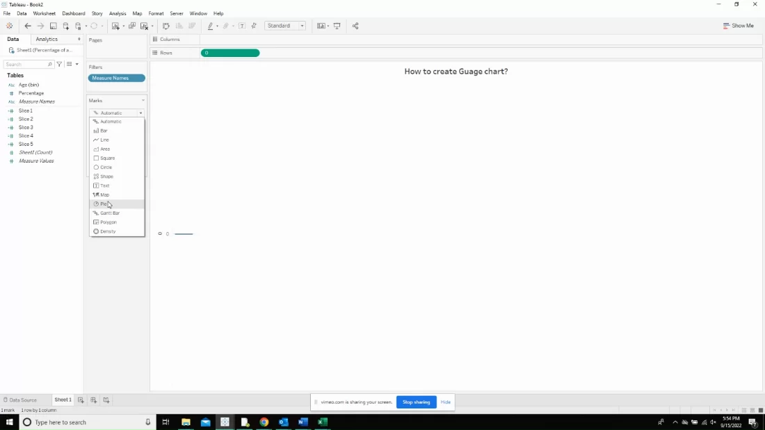
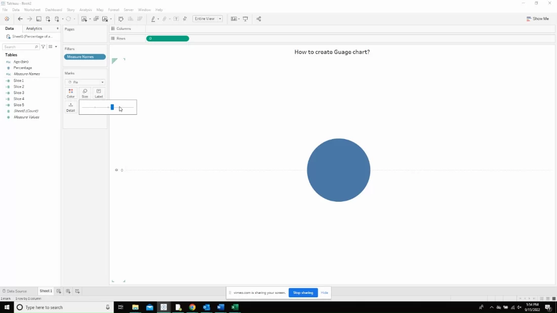
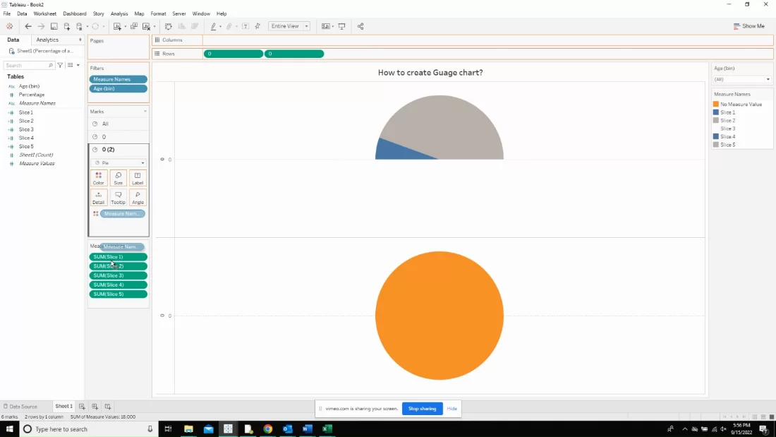
Click on the marks card and select pie from the list.
Now, adjust the size of the pie to whatever you need and play around with the size bar.
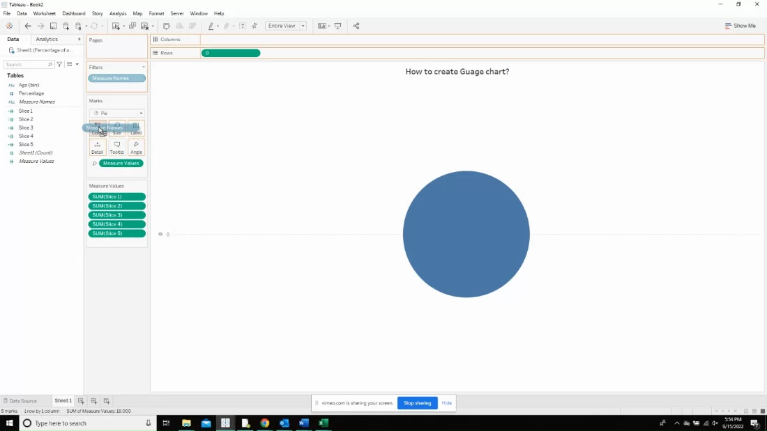
Drop the measure values in the angles shelf.
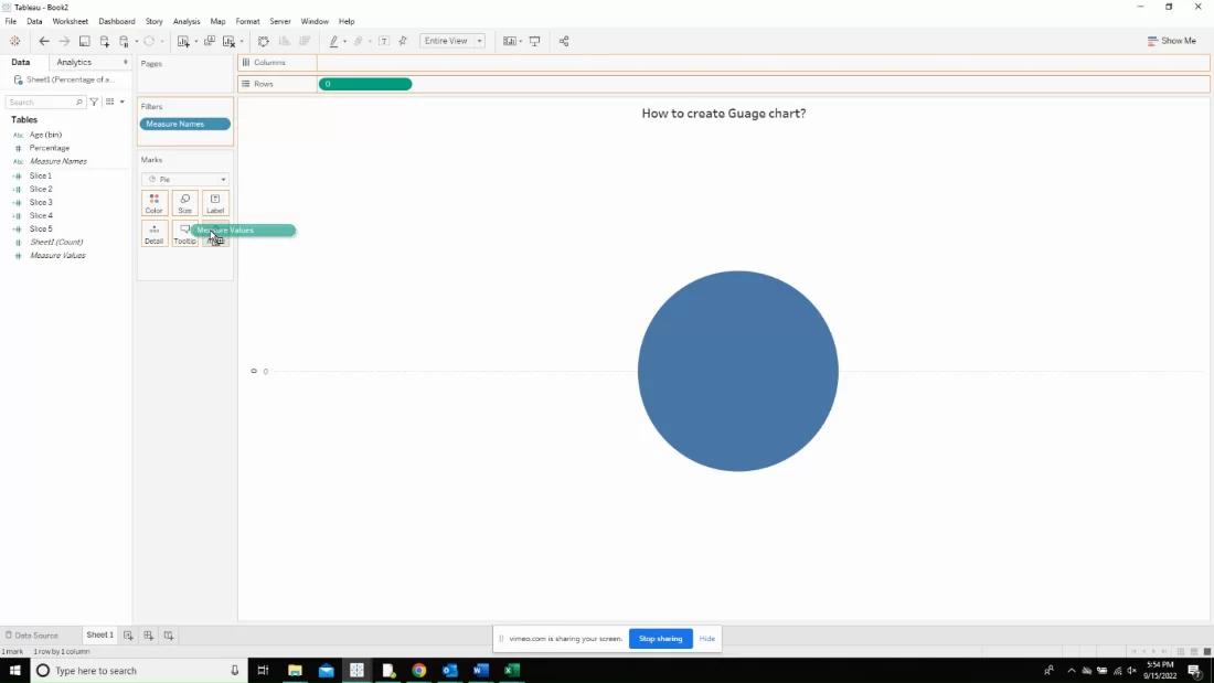
and measure names in the color shelf.
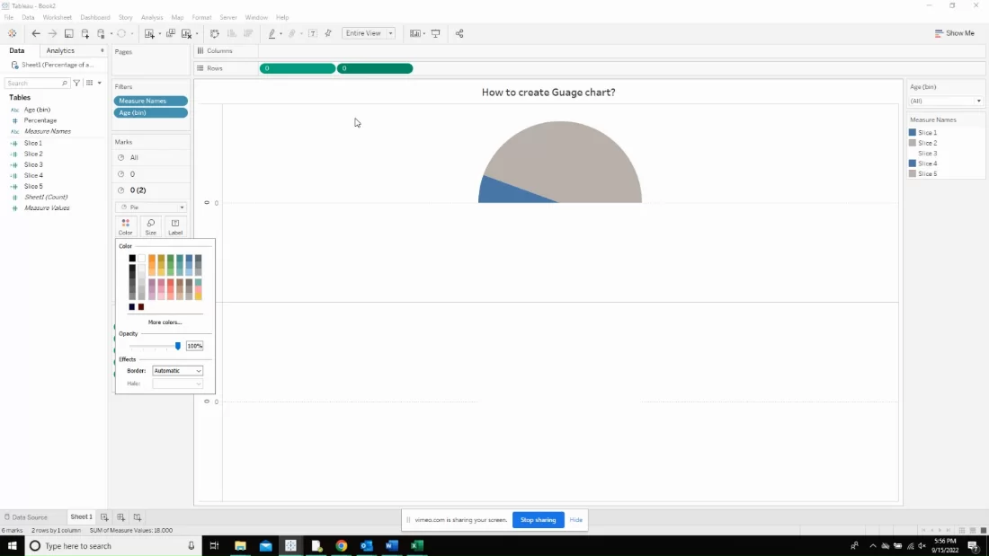
Change the colors of the slice to as shown below. 2 of the slices will share a same color and the other two will share a different color. Now, duplicate the already created dummy field and throw it in the side of the same field as shown below.
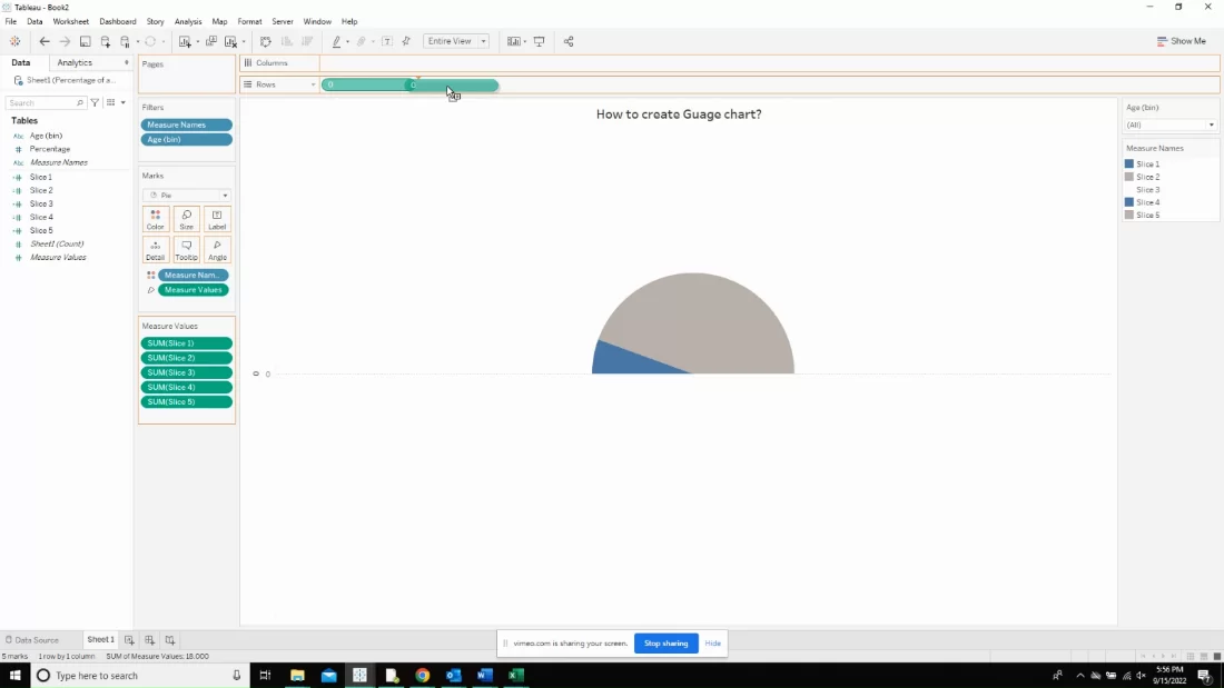
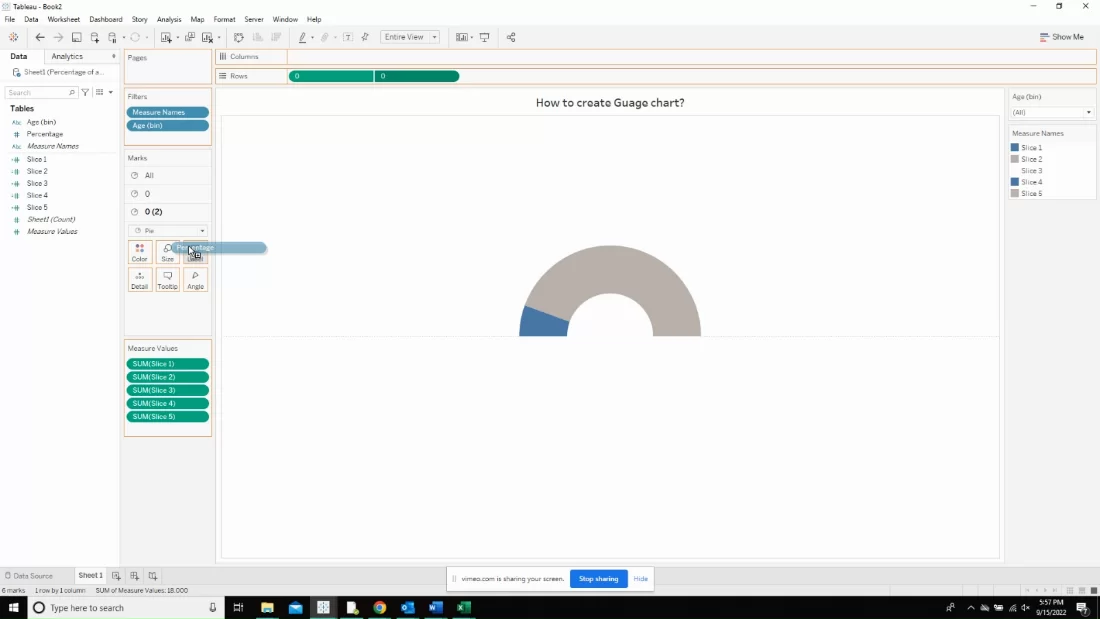
Arrange the slices as shown below and change the color of the second pie to that of the background.
Now, you can see the half donut, or the speedometer and the next step is to bring in the labels.
Finally, we have a speedometer shaped object that is going to show us the percentage against target. This chart can be used for any data that needs to answer how much of the target is already fulfilled and how much of the target is remaining to be achieved.