Crafting Custom Donut Charts in Tableau: A Step-by-Step Guide
Mastering Donut Chart Design: Tips and Techniques in Tableau
Elevating Data Visualization with Custom Donut Charts in Tableau
The Donut Cart is an extension of a pie chart and can be used when we need to compare proportions.

Video description:
The video includes the step-by-step instruction of building a donut chart from the scratch
Chart Description:
In this article, I have demonstrated how to build donut chart using a HR data sets pre-packaged with Tableau app. The goal of the chart is to show the proportions of categorical data, with the size of each piece representing the proportion of each category.
Understanding Donut Charts and Their Applications in Tableau
Step-by-Step Guide to Creating a Custom Donut Chart in Tableau
Designing Effective Donut Charts for Data Analysis in Tableau
Tips for Enhancing Donut Chart Visualizations in Tableau
Introduction to Donut Charts and Their Benefits in Tableau
Exploring Advanced Formatting Options for Donut Charts in Tableau
Leveraging Calculated Fields for Custom Donut Charts in Tableau
Best Practices for Designing Interactive Donut Charts in Tableau
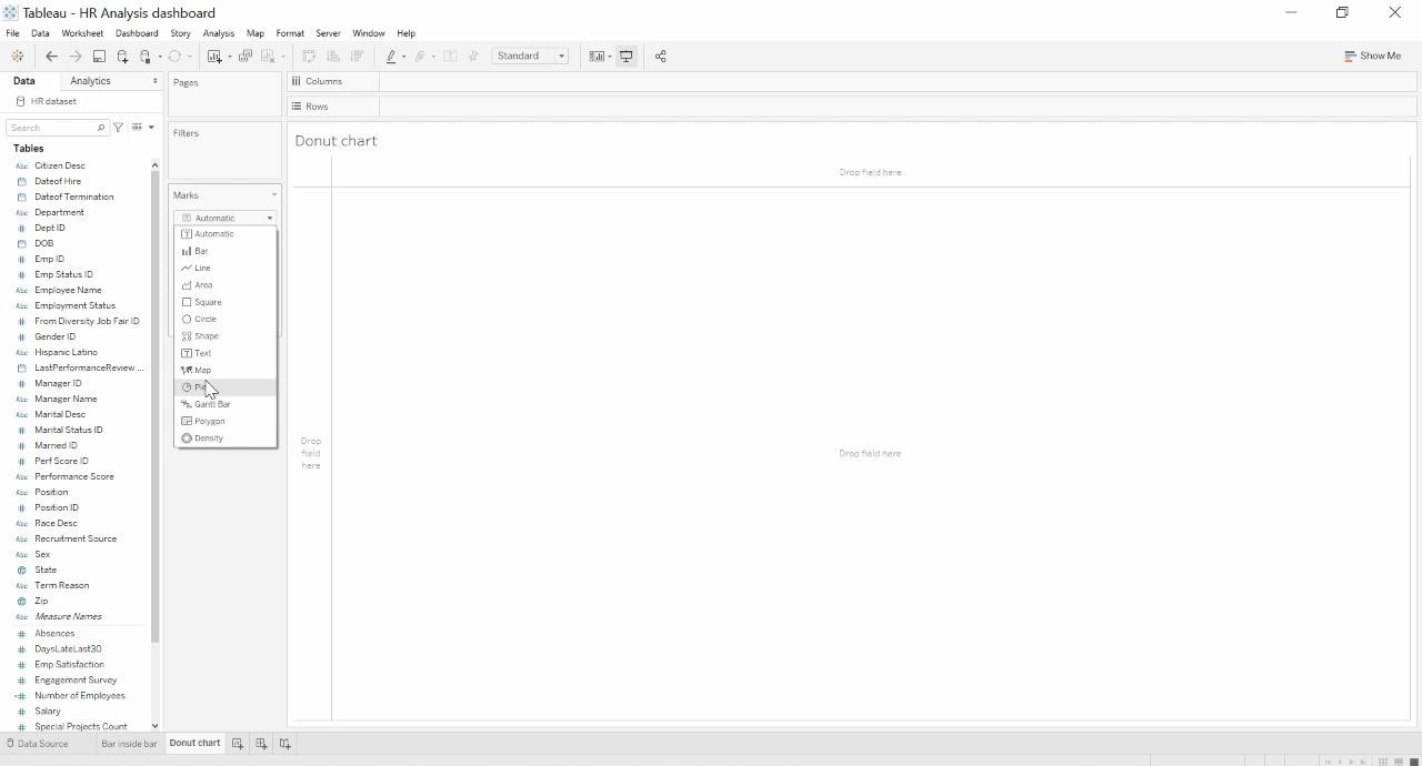
Click on the marks shelf and change it to pie.
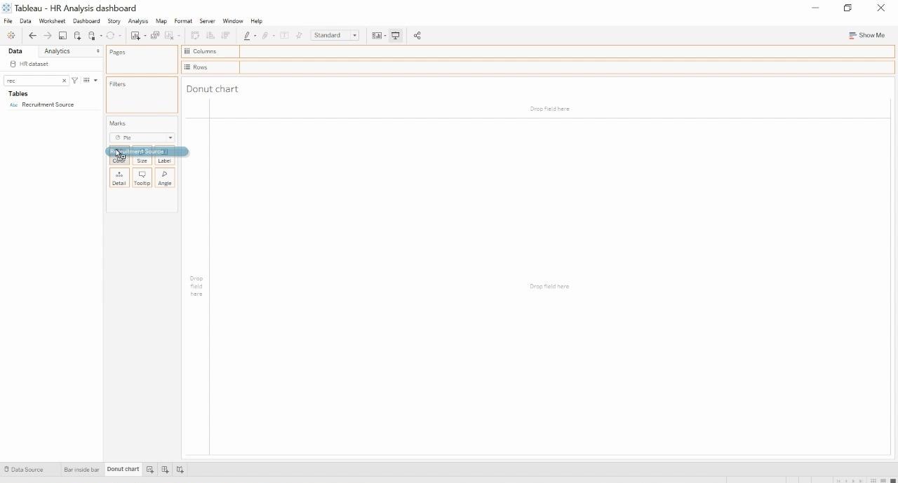
Drag the dimension you want to view the pie chart by and drop it on colors.
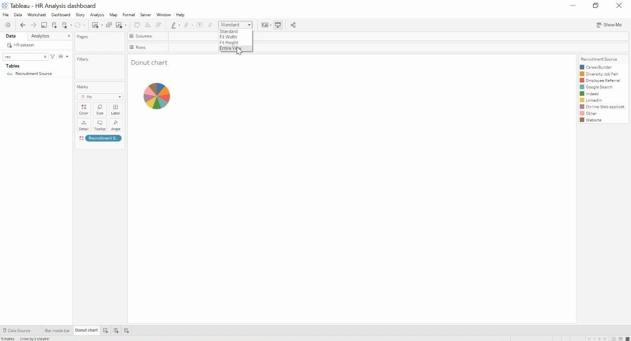
You should see a pie chart that is equally divided by the dimension selected. Now, click on “Entire View” to view the pie in full mode.
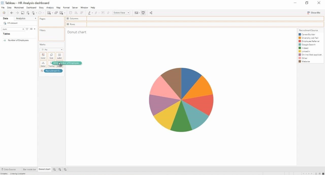
Now, select the measure you want to split the pie chart by and drop it on the “Angles” shelf in the marks shelf. You should see something like below. Also add the dimension to the text.
After the dimension is added, add the measure also to the text marks card.

Now, Create a dummy calculation called “MIN(1)” by double clicking on the rows shelf.
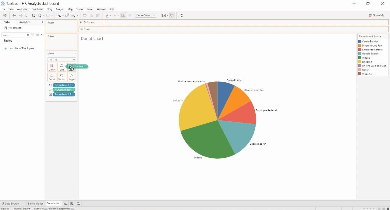
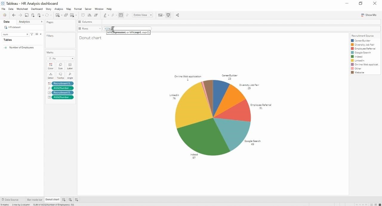
Click on the arrow found on the dummy calculation and change it to “AGG”. Now, Hold Ctrl+drag the same dummy calculation next to the created calculation to duplicate it.
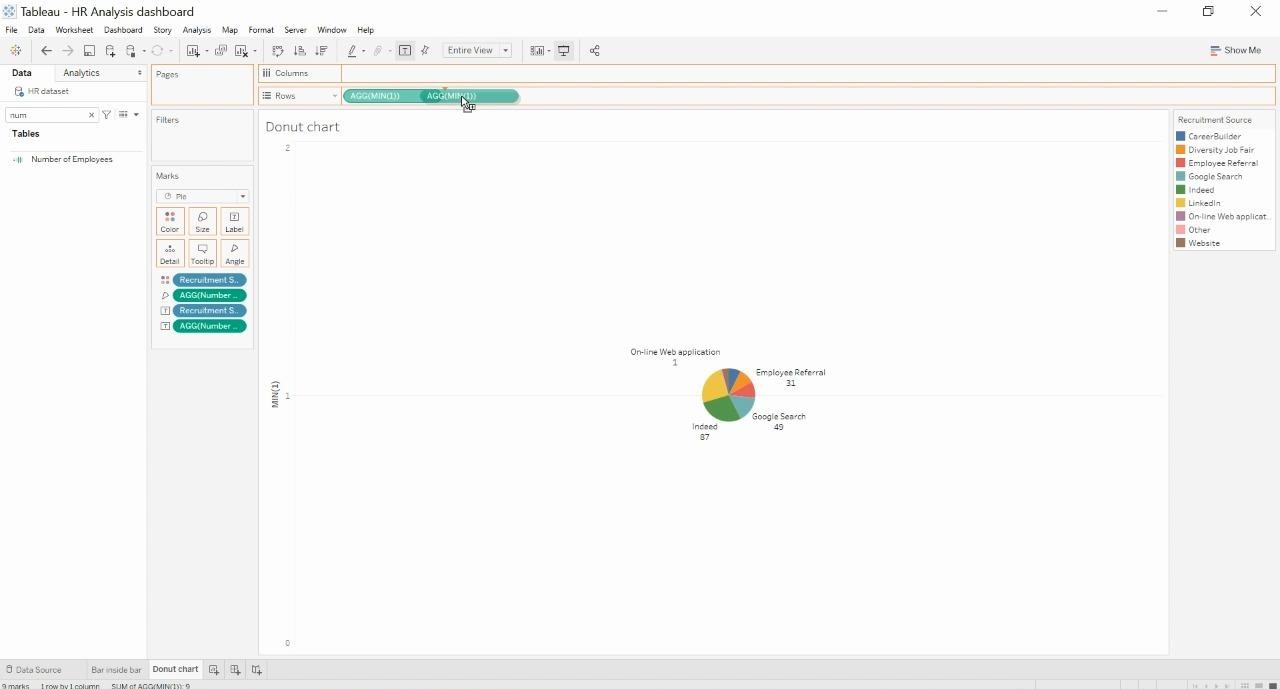
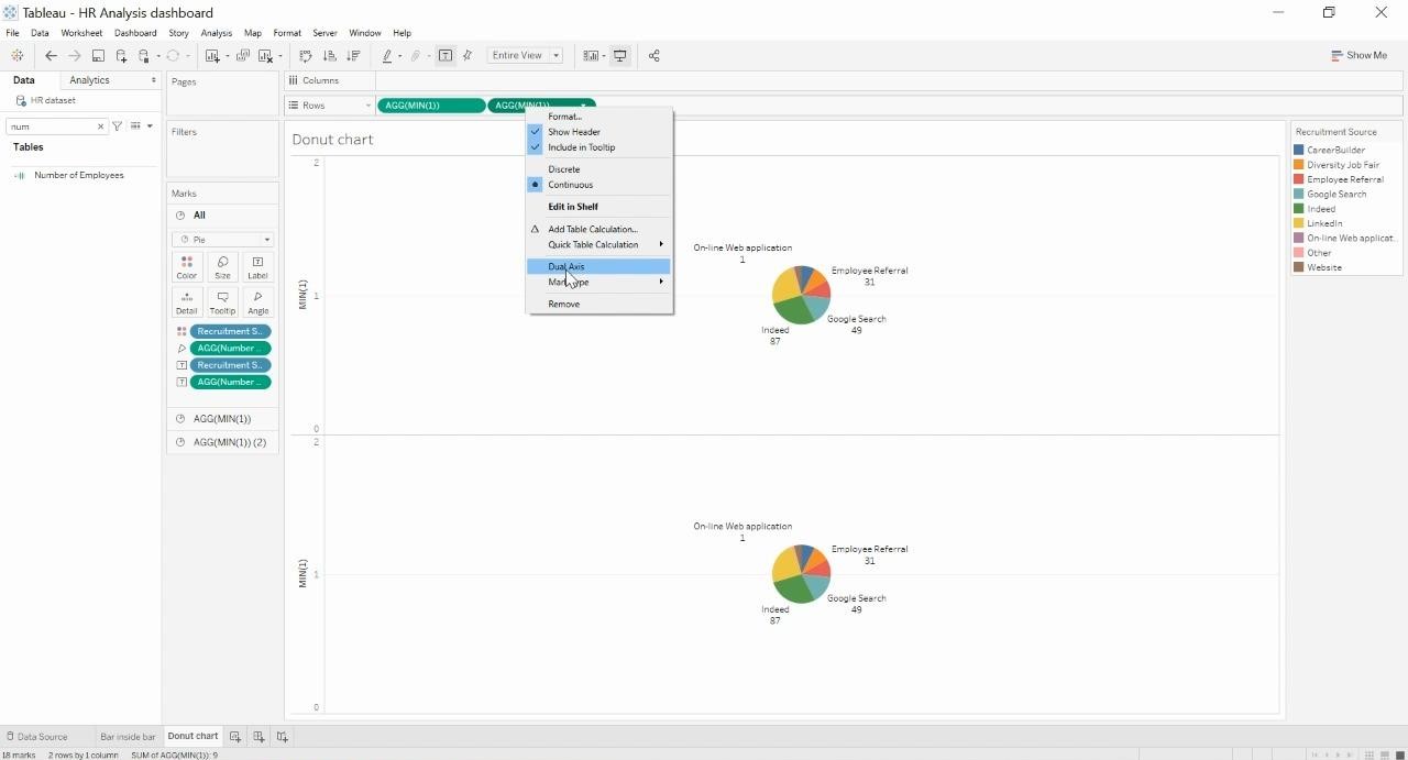
Click on the drop down found in the second dummy calculation and click “Dual Axis”. You should be able to see only one donut chart now as opposed to two which existed in the previous step.
Now, click on the first dummy calculation and play around with the size and the color options which will alter the look of the first donut chart.
Play around with the size of the first donut to create a pie of size you want to.
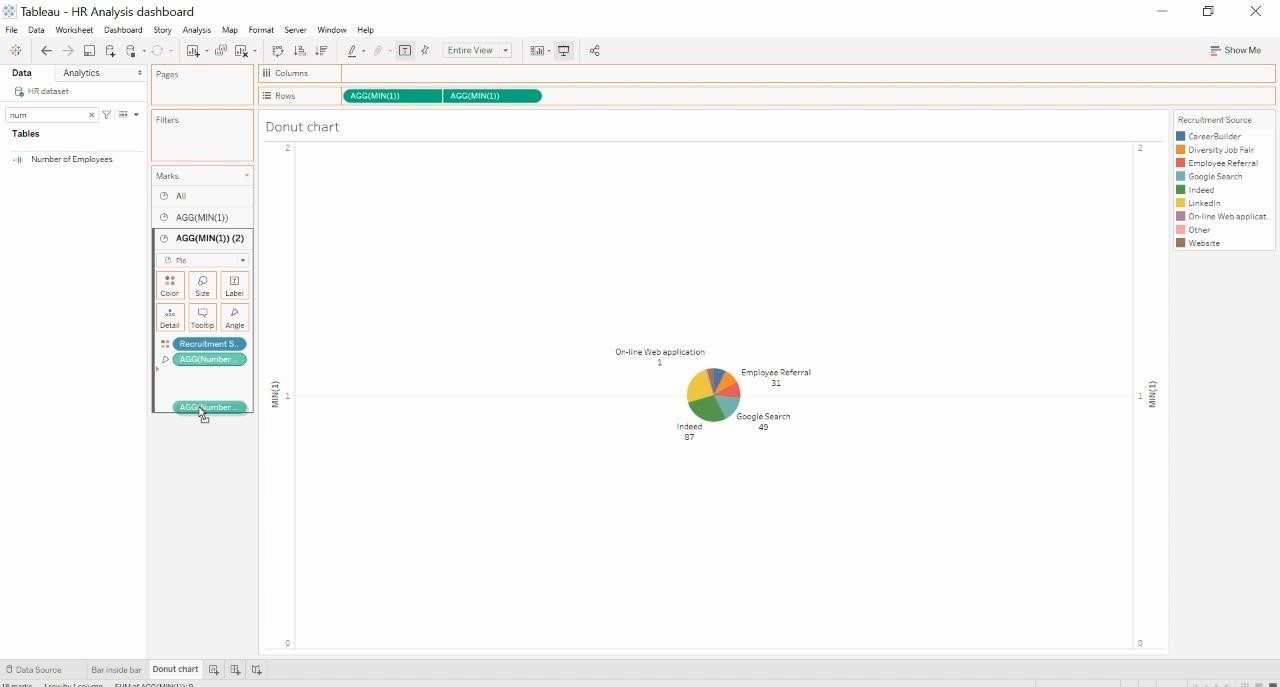
Click on the second donut chart and drag down all the marks card one by one to create an empty circle.
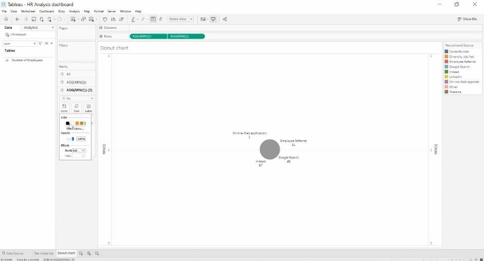
In the color marks card of the second pie, Change the color to the background color which is White in our case.
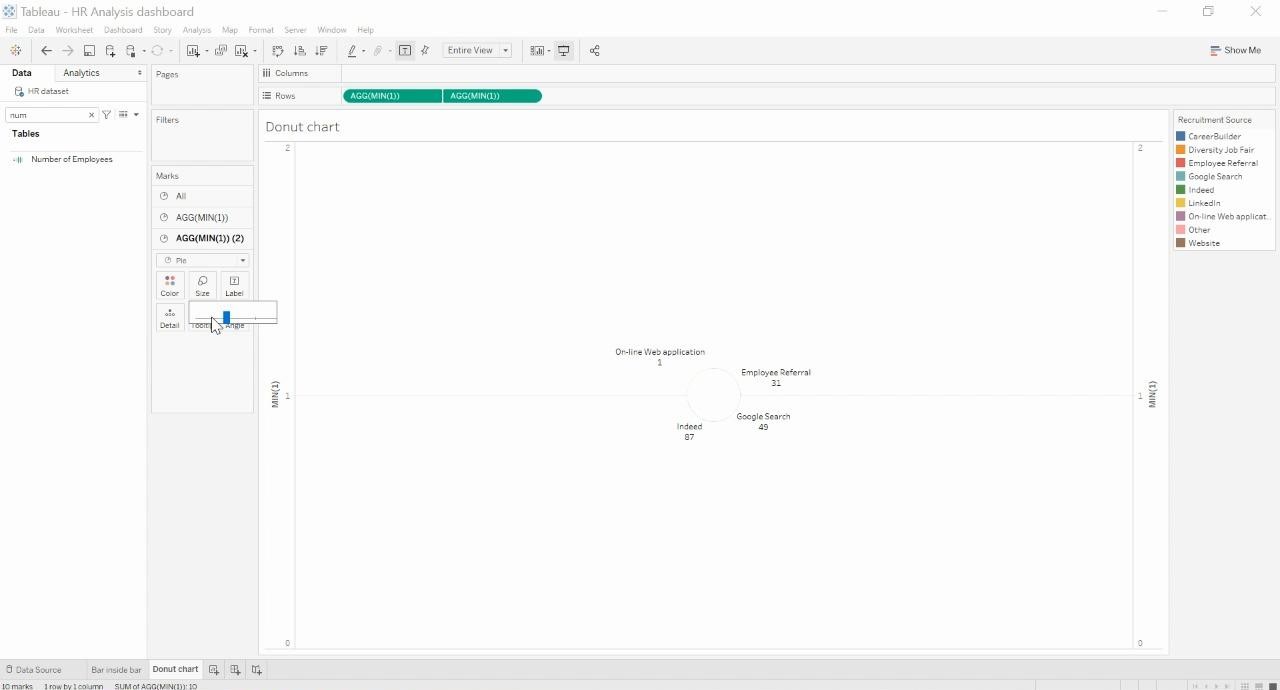
Now, adjust the size of the second pie which was made fully white in color. Make it as small as possible and then try increasing the size of the pie as you wish.
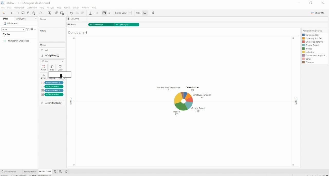
I made the size of the second donut very small and then made it bigger which yielded the following output.
Now, We will start working on the formatting and the text to be added to the pie to make it informative. Click on the second pie and then add the dimension and the measure to the label marks card.
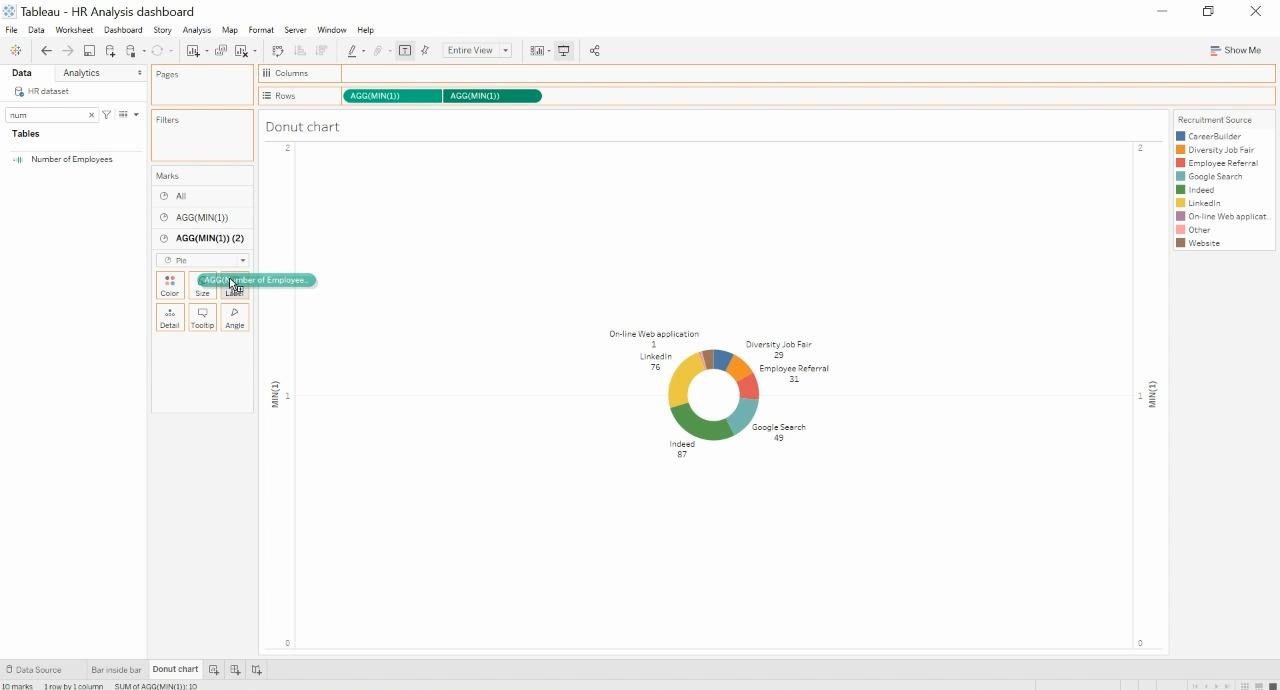
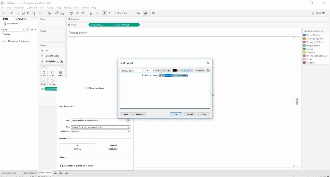
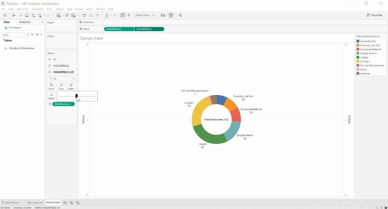
This should get the Major information inside the middle of the pie. Now, let us format the label which was recently added. Double click on the label and in the edit label window, add a text descriptive of what the measure stands for followed by a semi colon.
Finally, we have a donut chart which is ideally a pie inside a pie that is going to divide the information into various colors.


 Media Coverage
 Press Release
