Mastering Parent-Child Hierarchy Calculations in Tableau
Navigating Complex Data Relationships: Tableau Parent-Child Hierarchy Solutions
Effective Strategies for Handling Hierarchical Data in Tableau
The Top N functionality is a very popular and most widely requested feature on Tableau Dashboards. There are different ways to achieve the Top N through Rank, Filter, Sets, Calculations etc. Different examples of Top N have been discussed in few of the other blogs. Similarly, the Bar in Bar is a very powerful multi measure comparison chart which is discussed in a couple of other blogs.
https://www.useready.com/blog/create-bar-in-bar-chart-in-tableau-3-methods/
In this blog we are discussing a very special and complex use case. We have to give credit to the end users who came up with this requirement. It is a very complicated ask. It is also very difficult to provide a single line title to this blog. So, the tile is a little encrypted of sorts. The requirement was “There are two Dimension fields in a visualization. The fields have a standard 1-M hierarchy (Parent – Child relationship). The bar chart should display the total value of the Parent field and only the highest value of Child field within that Parent as a Bar in Bar chart. Along with that the Child Dimension also has to be displayed. Finally, the Percent of contribution of the Highest Child value to the Parent’s total value to be displayed”. HUH!!
Understanding Parent-Child Hierarchies in Tableau
Techniques for Managing Complex Calculations in Tableau Hierarchies
Best Practices for Visualizing Parent-Child Relationships in Tableau
Advanced Tips for Optimizing Parent-Child Hierarchy Performance in Tableau
As we can see the requirement seems a little overwhelming. We will break into small pieces using a simple data set.
Exploring the Challenges of Parent-Child Hierarchies in Tableau
Implementing Custom Calculations for Complex Hierarchical Data in Tableau
Enhancing Data Insights with Dynamic Parent-Child Hierarchy Visualization Techniques
Troubleshooting Common Issues in Handling Parent-Child Hierarchies in Tableau
There are two pieces to this use case: a Major goal and a Minor goal. The Major goal is the difficult part, so the focus will be on this. There is a small sample data set with 161 cities in USA with their 2010 population. We also have the State field and Region field in the data.
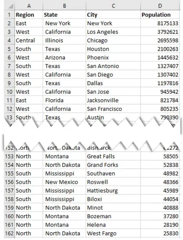
Major goal:
- Show all the States and their Population
- Show the Highest City population within each State (i.e the first Ranked City within the State)
- Display the name of the Top City (most difficult step).
- Convert into a Bar in Bar chart for better aesthetics.
Minor goal:
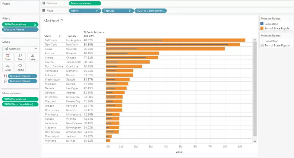
- Display the contribution of the Top City to the overall state population as a percentage.
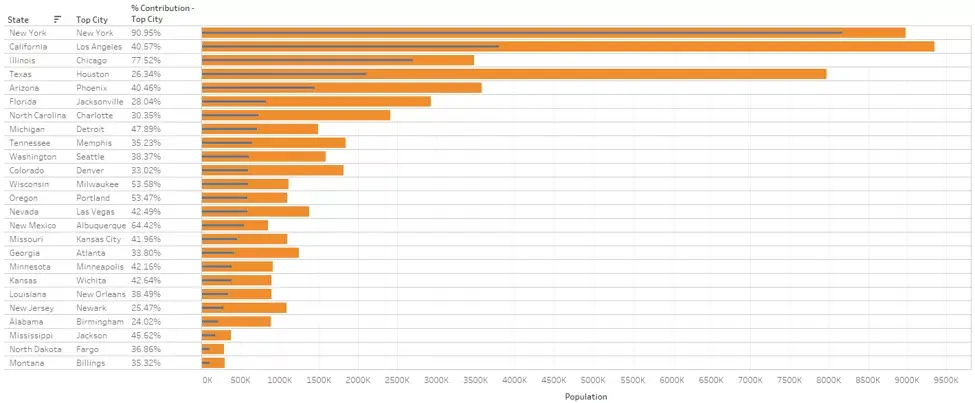
For example: The State of California has a population of 100 which is made of San Francisco 20, San Jose 25, Los Angeles 45, San Diego 10. So, the visualization should show California State, only Los Angeles as the Top City, 45% as the percentage contribution and Bar in Bar with 100 being the thick outer bar and 45 being the thin inner bar.
When the journey of this use case began, about 10 different approaches were tried. Finally, one solution that uses a complex Nested Level of Detail Calculation worked very well. But later on, after multiple rounds of testing, another simpler approach with Rank Table Calculation worked very well. This blog aims at demonstrating both the approaches.
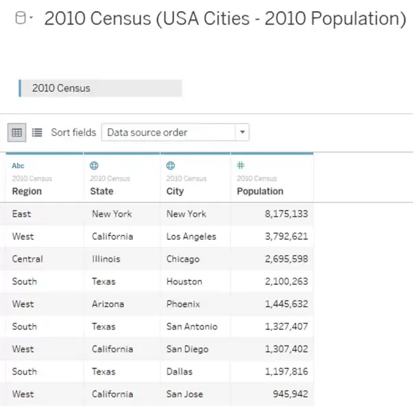
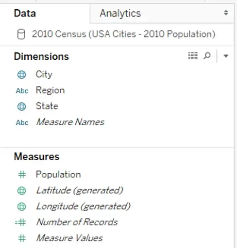
Tableau sometimes can recognize field names and geographic roles. So, a Hierarchy is created. For the purpose of this blog, we will remove the Hierarchy and treat them as individual fields.
Method 1
Let us start with the LOD approach. Though this is more complicated approach, it is good to know all the features used here as they will help in a lot of other examples.
1) First, we will create a copy of the City field and call it Top City. This way the end user will know they are looking at the Top City on the Dashboard.
We can use the existing City field too it will do the same function. This step is only for convenience.
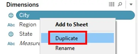
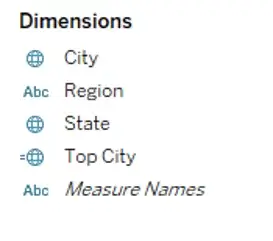
2) Let us build the visualization to see what we have to figure out the future steps.
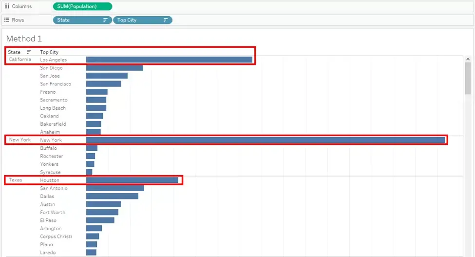
In this visualization, we can see the State field, the City (Top City) field sorted by the Population. Our goal for now is to restrict the visualization to show only the first value in each state.
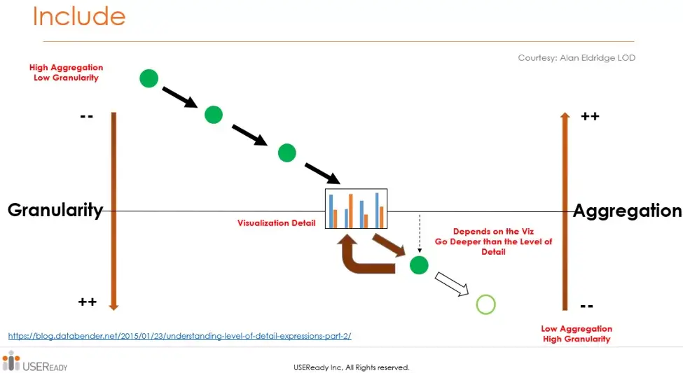
So, we need a calculation that looks at the inner granularity at City level while State field is still on the visualization. So, we need to group by the Cities within a State. The first thought that crosses our mind is, “Oh that’s easy. We can use FIXED LOD Calculation”. This will not work as expected it will go against the entire data irrespective of what is available on the visualization. In this case we need focus on the State and its inner granularity. In this case we have to go with the INCLUDE LOD Calculation.
As seen in the diagram, the INCLUDE calculation will go deeper that what is displayed on the visualization.
3) We will include at the granularity of City.

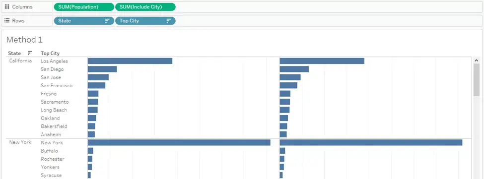
At this point, both measures provide the same value. There are some more steps needed.
In this Calculation, we asked Tableau to go deeper than State by assuming there is no City on the visualization. Now, we will do the reverse. We will use an EXCLUDE calculation to eliminate City. At the same time, we will use the MAX aggregation because we need the highest Value within the State.
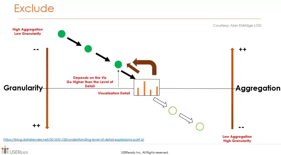
4) We will exclude City and bring the aggregation back to State level.

The Exclude will result in ATTR aggregation. We can use Max or Sum in most cases. They will give the same result.
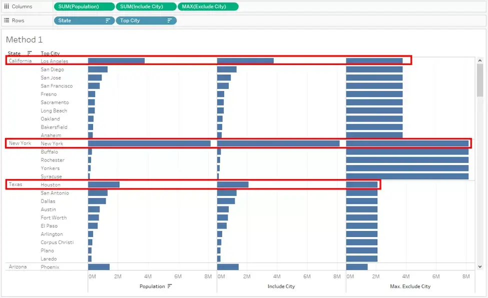
Now we have all that we need. Until now the last two steps were a little confusing. To keep it simple, let us understand this way. In the first Calculation, we told Tableau to look at all the Cities within a State and get their values. At the same time, there is an intermediate calculation that looks at the highest value among all the cities within that State group. In the second Calculation, we told Tableau to ignore all the cities and get only the max value available in the intermediate step. That is the reason that the values are duplicated for each city under a State group. When these calculations are used in actual use cases, they will start making more sense.
5) Now for the final step to only maintain the Top value and remove all the other value. It is a very simple True or False filter.

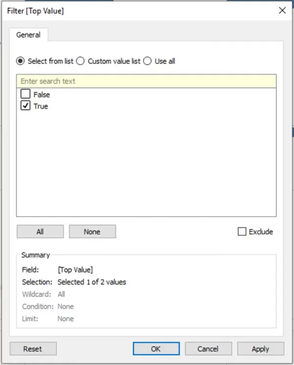
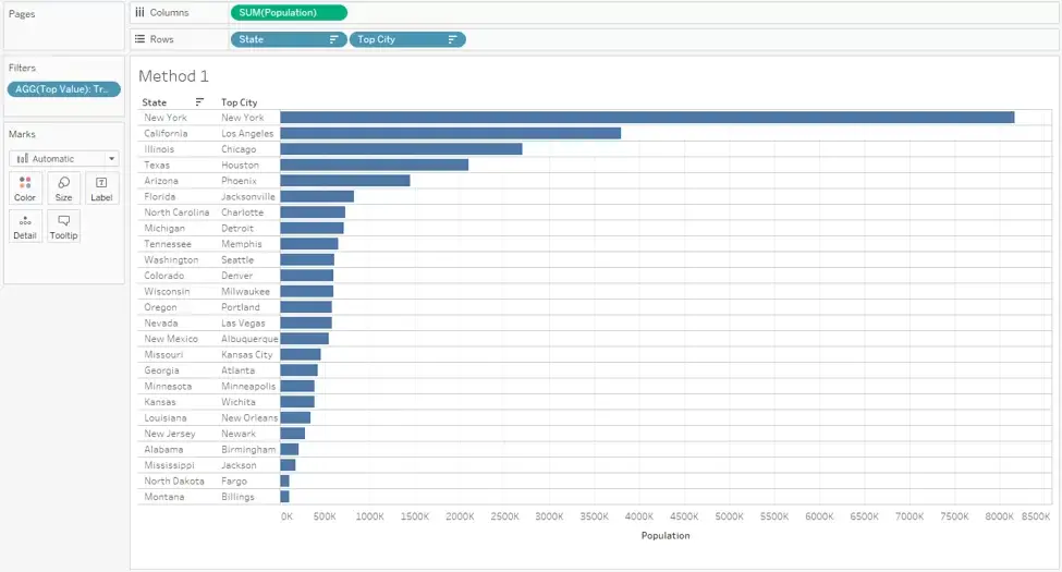
The major goal is accomplished. Now, for the simpler minor goal to create a Bar in Bar and the Percent contribution.
6) We can use the Exclude Calculation or the Fixed Calculation.

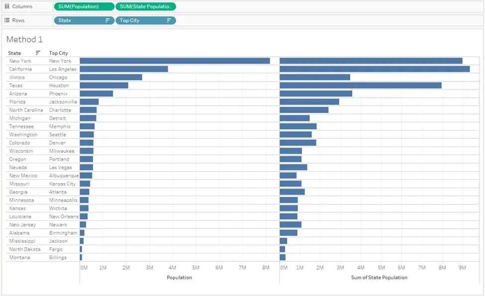
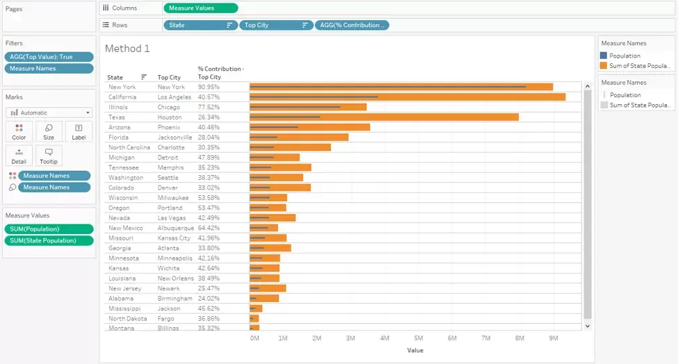
7) Now, we need to create a Bar in Bar. We can use either the Bar in Bar or the Dual Axis method as demonstrated in some of the other blogs.
- Using Measure Names on filter and selecting the required measures
- Using Measure Values on Columns
- Using a copy of Measure Names on Color card
- Using a copy of Measure Names on Size card
- Using the Analysis menu, “Switch OFF” the stack.
8) Final step to calculate the Percent of contribution of Top City and display the value as a discrete value (as a percentage) to the left of the Bar chart.

We can use a Nested sort if needed for the State. Here, the visualization is sorted by Top City.

That ends the entire use case.
There is another method that actually creates a Top City discrete field using 3 Nested LOD calculations. We would not want this blog to be that complicated, so we will stop here.
Method 2
This will be a much simpler and faster approach. Developers would typically go with this approach as it avoids the complex LODs.
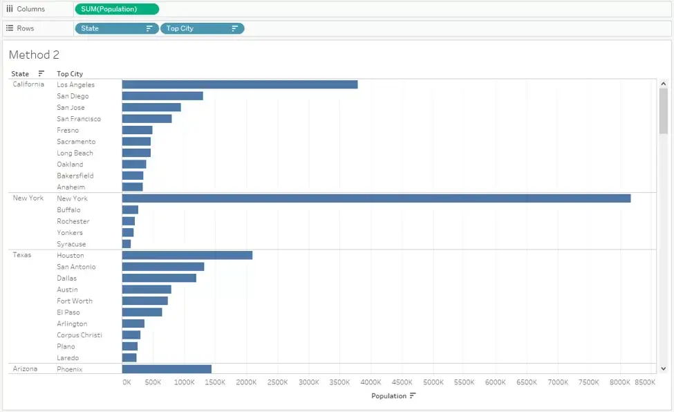
1) Again, we will start with base visualization as Method 1
2) Next, we will use the concept of Table Calculation. These concepts are thoroughly discussed in many of the other blogs.
https://www.useready.com/blog/nested-ranks-for-multiple-dimensions-in-tableau/
- Use a copy of Population with Sum aggregation on either the Detail card or the Label card.
- Convert the measure to Rank Quick Table Calculation. *At this point the Rank is for the entire visualization as the default computation is Table (Down). The table calculation needs a slight modification to calculation within each state. So, we need to change the Scope and Addressing (Partition and Direction)
- Change the Rank to computed by the City field. (State is the Partition and the Direction is Top to Bottom across each City)
- Use this Table Calculation on filter and restrict the filter to 1.
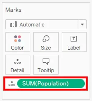
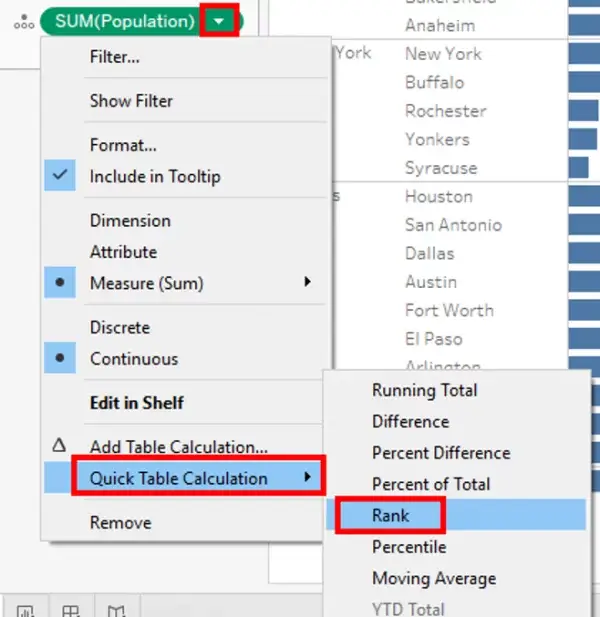
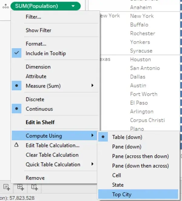
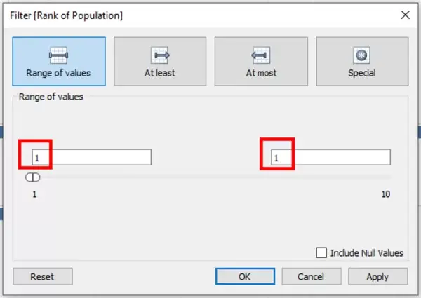
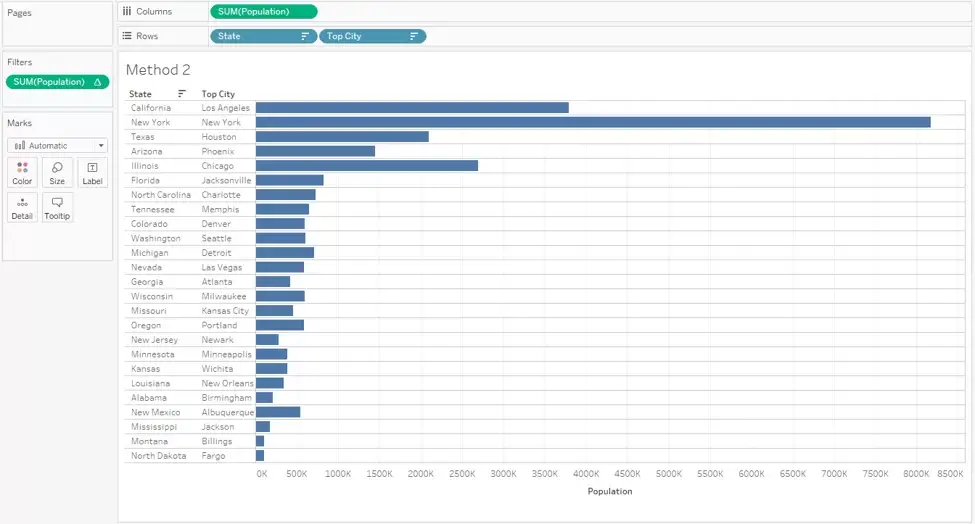
3) Next, we need the State population value and we will create a Bar in Bar chart using Measure Names and Measure Values.
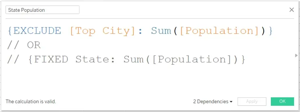
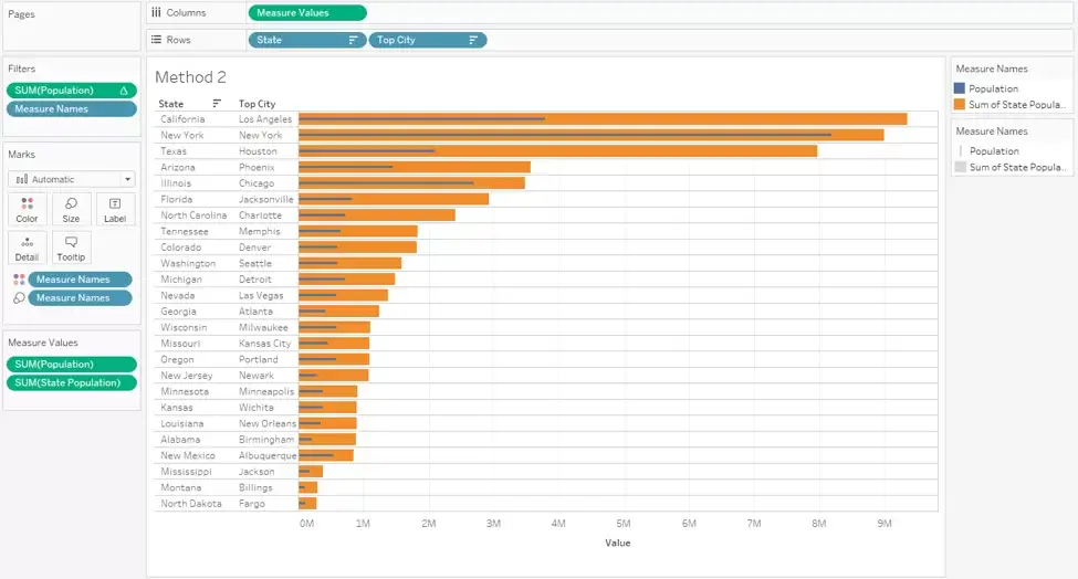
4) The last step is to calculate the Percent of contribution of Top City and display the value as a discrete value (as a percentage) to the left of the Bar chart.



 Media Coverage
 Press Release
