Crafting Insightful Donut Charts in Tableau: Top N and Total Display
Mastering Data Visualization: Creating Donut Charts with Top N and Total in Tableau
Visualizing Data Trends: Top N Categories and Total Representation in Tableau Donut Charts
The Pie chart is one of the most widely used charts in Tableau as well as other BI tools. Experts in the industry have often condemned using pie charts because of its disadvantages like Cannot show multiple members which makes it cluttered; Angles represented by the metric are tough to read/compare due to the absence in the common frame of reference; Cannot represent negative values clearly; Not suitable for trend analysis; Does not give a better understanding of Causes and Outcomes and so on. Also, some developers try to stay away from using a Pie chart and stick to alternate charts due to the Visual policing that happens around them.
Despite these drawbacks, an end-user may like a pie chart because it being around for a long time and its colorful & attractive nature. A pie chart when used in the right way can give really good results. It can be used to stand for a small population of data (about 4 to 5 members like Gender, Regions, Directions, Diversity, etc.); Can be used very effectively to represent Parts of Whole with % of Total; Especially in the case of Tableau, Pie charts act as good Dashboard Action filters (as a replacement for traditional filters).
This blog, however, is not written with the intent to discuss the Advantages and Disadvantages of a Pie chart. This blog aims to solve a special use case, most widely requested by end-users. In effect, the material presented here will try to solve the requirements using two methods. With an aim to learn, we are splitting it into two use cases because the approach for the two cases is completely different. The features that are used in the first use case will not completely satisfy the requirement of the second use case. In many ways, you can see a small improvement in the second use case shows over the first one. These are the use cases that are among the most commonly requested features in the BI world. We shall discuss different aspects/features as we take up the use cases to create a Donut Chart in Tableau.
Understanding Donut Charts in Tableau
Step-by-Step Guide to Adding Top N and Total in Tableau Donut Charts
Enhancing Data Insights with Donut Chart Customization in Tableau
Best Practices for Utilizing Top N and Total Display in Tableau Donut Charts
It is very difficult and exhaustive to explain this in the blog title. Therefore, the blog title is kept simple as more details are explained here.
Use Case 1
Requirements:
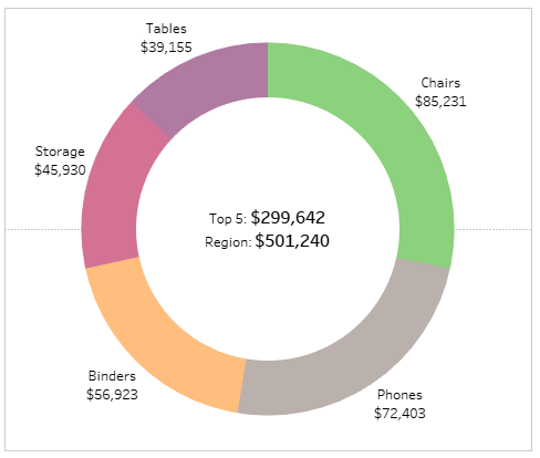
a) Need to build a Donut chart in Tableau (outer pie chart) to help showcase Top 5 selling Sub-Categories within a selected Region.
b) The inside part of the Donut chart to showcase the Total Sales for the Top 5 Sub-Categories. Also, to show the Total Sales for the selected Region.
Use Case 2
Requirements:
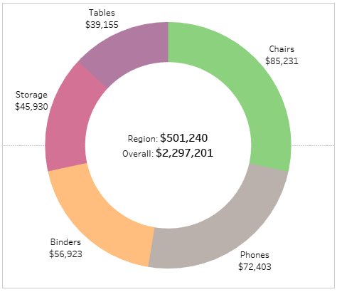
a) Need to build a Donut chart (outer pie chart) to show Top 5 selling Sub-Categories within a particular Region.
b) The inside part of the Donut chart in Tableau to help show the Total Sales for the required Region along with the Total Sales of the entire dataset (Sales across all Regions).
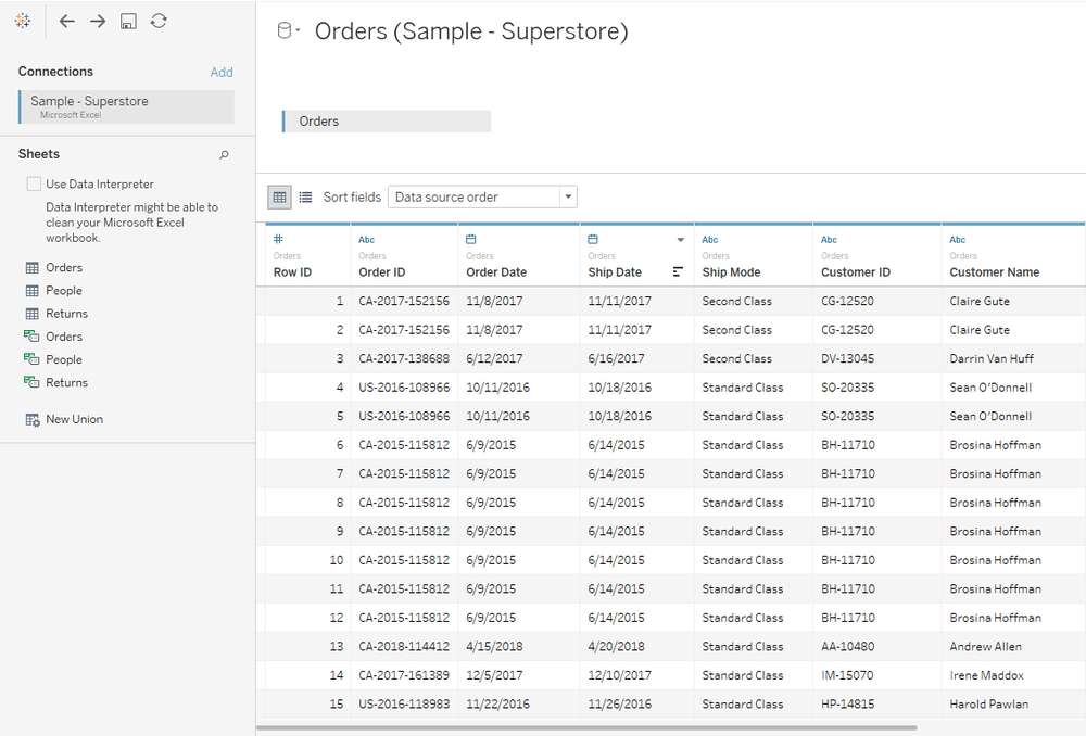
Let us start with the data. To keep things simple, we will use our favorite Sample – Superstore Data with the Orders table.
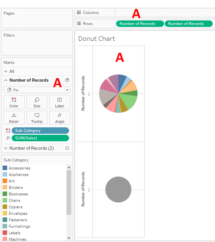
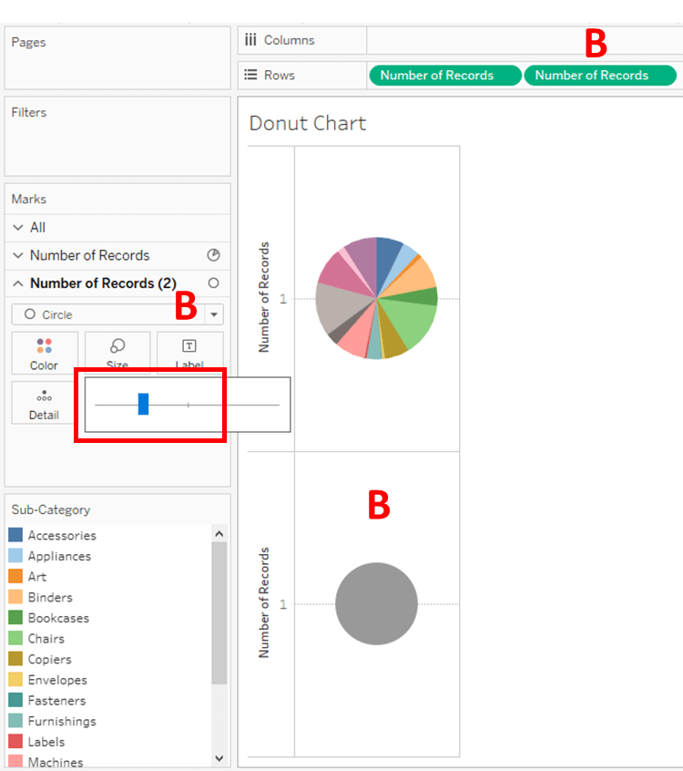
The primary steps are to create a Donut chart by using Sub-Category and Sales. There are many blogs and community posts that help explain how to build one. To keep it quick, the steps are:
a) Convert Marks to Pie
b) Use Number of Records (either as Dimension or Min or Max) on Columns or Rows Donut Chart in Tableau
c) You need to use a copy of the field on the same shelf (i.e., one more Number of Records field on Columns or Rows. It has to be placed on the same shelf, not the opposite shelf)
** At this stage, the Marks shelf splits into 3 pieces (or segments), one for each of the Number of Records fields and one called All (which controls the entire visualization)
d) To use the Sub-Category field on the first segment (let’s call it A) of the Number of Records on Marks shelf. This has to be made use of on the Color card.
e) To use the Sales field as SUM aggregation. This, within the A segment on the Angle card (Size card also works).
f) To increase the visual size a little, by using the Size card of the A segment to represent the outer part of the Donut Chart.
g) No changes required on the second segment (we shall call it B) of Number of Records. What is only required is to change the color to the desired color, preferably White. If required, the type of visual can be a circle.
h) In the last step, we will have to Create a Dual Axis of the 2 measures.
** If needed, we can play around with the size of the pie, visual, sorting, color, etc. to suit our needs.
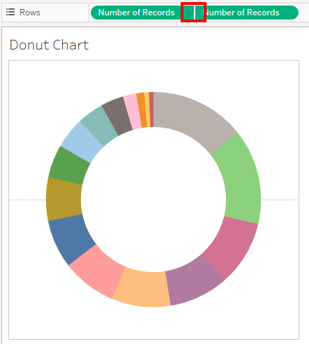
Having the Donut chart ready, now let us start with Use Case 1.
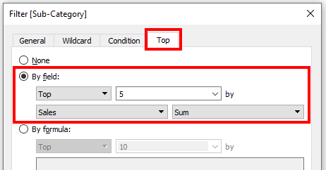
1) As needed, the first step will be to show the Top 5 selling Sub-Categories in the Pie. So, we create a Top 5 conditional Dimensional filter based on Sum of Sales.
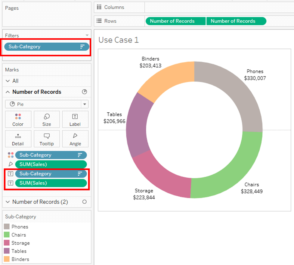
Adding some formatted labels for better understanding.
2) Next, we need the Region filter with a single value selector (without the ‘All’ option). As per the requirement, we need to show the Top 5 within a particular region.
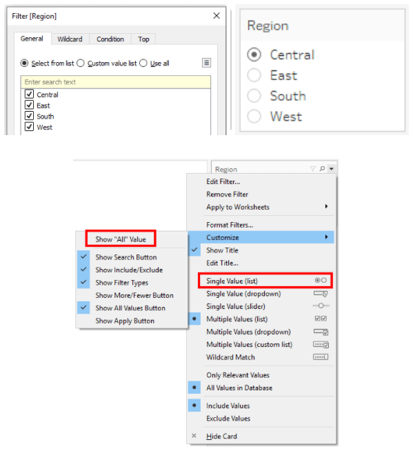
Before going further to the next step, we need to verify the numbers for each Region selection for the Top 5 Sub-Categories.
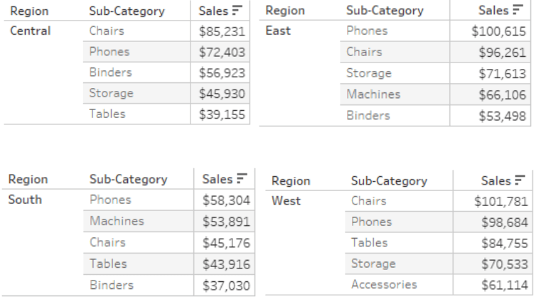
It is noticeable that the values are not representing the correct Top 5 based on the Region selection. This is because of the Order of filter operations. Different blogs have different diagrams showing the Order of Operations. A simpler version is here.
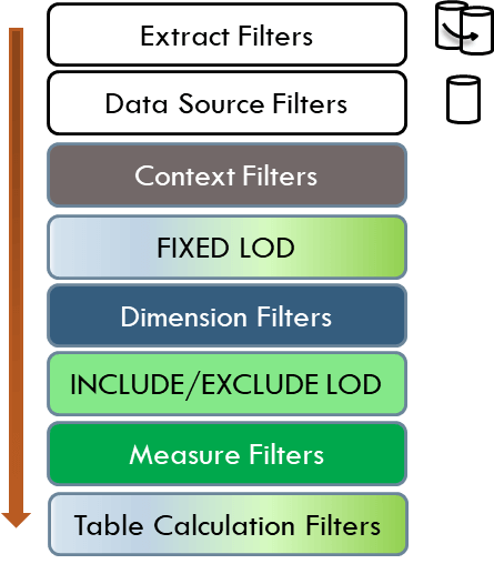
According to the diagram, filters on Top have more priority than the ones at the bottom.
By our example, the TOP N is Conditional Dimensional filter and the Region is also a Dimensional filter. Therefore, they in a way both compete for the higher priority. Often, the Top N will execute before the Region filter (the Top N by default applies to the entire data). However, we need to ensure that the Region is executed first.
Importantly, it should read: If a single Region is selected, then show the Top 5 within that Region.
The Top N has a Blue color Dimension filter. Going to the Order of Operations again, the filters above are Extract Filters, Data Source Filters, and Context Filters. Since we need the Region filter to be accessed by End-user, we will convert it to a Context Filter (Grey in color).
Context, in this case, means exactly the same here in Tableau. With Respect to a particular Event that precedes another Event.
** Context filter here works better if it is a Single value filter (which is taken care of in the previous steps)
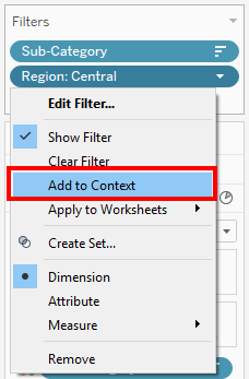
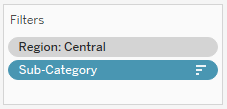
Just as the filter is added to Context, it becomes Grey and jumps to the Top thereby abiding by our Order of Operations principle. Now the Top 5 values here are rendered for every Region.
3) The next step here will be to add the total for the Top 5 values within the Donut. Very straightforward and simple. Because the complete visualization is pre-filtered for Region and Top 5, we can add SUM of Sales to the Label card of segment B.
Adjusting the labels, format, and alignment.
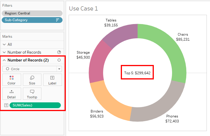
4) Moving on to the next step. We require to show the Total Sales for the Selected Region. This is a trickier one. This can be solved with the help of a FIXED LOD calculation.
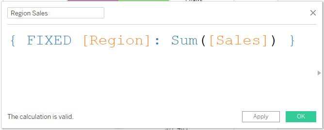
The purpose of using fixed is again attributed to the Order of Operations. Fixed LOD is estimated after the Context, before the Top N i.e. when you select Region, only the Region information is passed to the Calculated field.
By making use of the field on the Label card of Segment B of Donut.
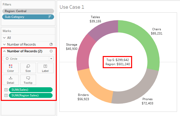
This solves our entire Use Case 1.
Now moving onto Use Case 2. As mentioned before this will be a different approach to solve some of the same questions. The Donut Chart in Tableau is ready. Let us move into the steps.
1) The requirement is to create a Top 5 selling Sub-Categories chart. Rather than using a Top N Dimensional filter, we will use a Table Calculation. There is a major reason for using this calculation. We can create a Table Calculation and add it to the filter. However, here we will use a Boolean Calculation for Top 5.
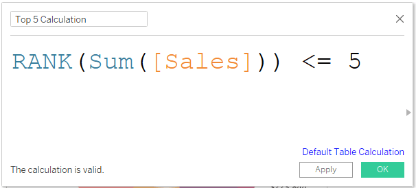

Because none of the Dimensions are used on the Rows or Columns, we will have to specify the Scope of the Computation. It has to be for the Sub-Category.
To simplify, the Calculation says: Arrange all the Subcategories by their Sales and pick the first 5 Ranks.
Adding some formatted labels for better understanding.
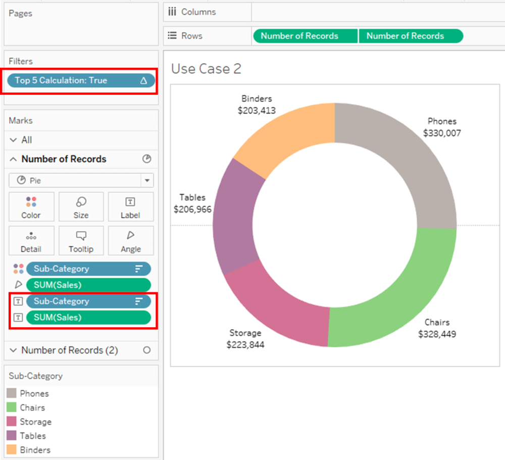
2) Next step, we will require the Region filter as a Single selection filter.
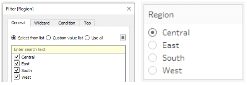
Now to verify the values. We can observe here that the Top 5 are correct for each Region.
If we briefly look at Use Case 1, we did an additional step of converting the Region to context to make sure the Top 5 is filtered properly.
That is the main difference in this method. Taking a look at the Order of Operations, the Top 5 is Table Calculation is executed after the Region Dimension filter (The Dimension is high above in the list). Therefore, there is no need of converting the Region to context.

3) The next step here will be to show the Total Sales for the selected Region. This is simple. We just add Sum of Sales to the Label card on Segment B of the Donut Chart in Tableau.
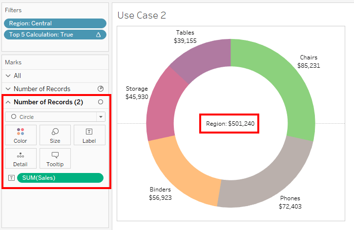
The question here is, why does the Sales Value not filter to Top 5. According to the Order of Operations, Measures are executed before Table Calculations filters.
Comparing to Use Case 1, where Top 5 total was required. In this visualization, we cannot achieve that. In order to achieve that, we will have to create a couple of more Calculations and make few changes to the visualization which makes this use more complex.
4) Moving on to the next step. We require to show the Total Sales of the entire data set. For this, we need a Fixed Calculation. Observing the Order of Operations, FIXED is executed before the Dimension filter. It will avoid the Region selection find the number.
** This step is impossible as per Use Case 1 since Context filter is the highest. The sole way to achieve that would be to manipulating the underlying source.
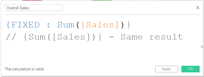
When FIXED is being used without a Dimension, it goes against the whole underlying data ignoring all Dimensions.
Exploring the Benefits of Top N and Total Display in Donut Charts
Optimizing Donut Chart Layout for Effective Data Communication
Analyzing Data Trends with Top N and Total Visualization Techniques
Troubleshooting Common Issues in Creating Donut Charts with Top N and Total in Tableau
Using the field on the Label card of Segment B of Donut.
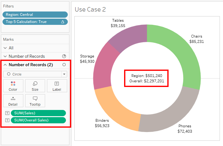
This solves our entire Use Case 2


 Media Coverage
 Press Release
