Mastering Totals in Tableau: Customization Techniques for Advanced Analytics
Enhancing Data Visualizations: Customizing Totals in Tableau for Deeper Insights
Unlocking the Power of Totals: Advanced Techniques in Tableau for Subtotal Customization
Spreadsheets, otherwise known as text-tables or crosstabs, are the inevitable “visualization” that is included in countless dashboards and reports. Stakeholders love seeing their data in spreadsheet format because they either want to download it in the raw format to perform their own analysis or because they are comfortable with them and there is no learning curve needed. The reason why I put “visualization” in quotes is because I do not like to count it as a visualization of data; crosstabs do not leverage any pre-attentive attributes like color, shape, size, etc. but nevertheless, they are a very frequently requested component of any dashboard.
Understanding Totals in Tableau: A Comprehensive Overview
Advanced Techniques for Customizing Totals in Tableau
Leveraging Subtotals for Deeper Insights: Best Practices in Tableau
Practical Examples and Use Cases: Customizing Totals to Meet Analytical Needs
If you cannot get away from using a crosstab, you might as well try to enhance it in any way possible. There are many ways to format crosstabs using different tips and tricks. To give you an example, I am going to go over how to customize the Grand Total/Subtotals to display a different value than that of the main table.
Exploring Total Customization Options in Tableau: Subtotals, Grand Totals, and More
Tips and Tricks for Effective Total Customization in Tableau Dashboards
Customizing Totals with Calculated Fields: Harnessing the Full Power of Tableau
Best Practices for Presenting Totals in Tableau: Maximizing Visual Impact and Clarity
Let us say you are presented with the following from a stakeholder:
I want to see how our sales have changed from the previous month to this month along with the previous six months of sales. I also want this in a text-table format because that is what our end-users are comfortable with.
You want to keep the development as simple as possible without having to create too many sheets, but you also want to leverage at least one pre-attentive attribute so you can gather insights quickly from the view without having to scan every row/column. Therefore, we are going to incorporate the following:
- Dynamically returning the last six months of data (last six available in dataset)
- Customizing the total to show percent change from previous to current month
- Adding ▲,▼ indicators to total to easily identify positive or negative percent changes
STEP 1: Create the Crosstab
We start off with a basic crosstab view showing SUM([Sales]) by Region, Segment, and Category for each MONTH([Order Date]).
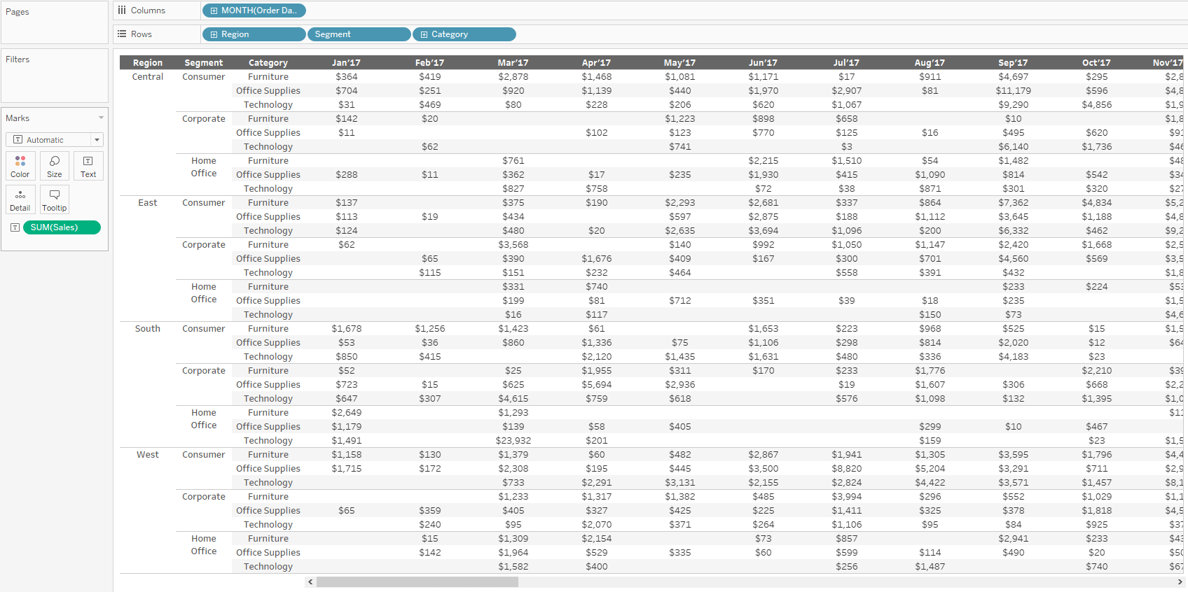
STEP 2: Only Most Recent 6 Months
Create a calculated field that return TRUE for the most recent 6 months. We are going to leverage the LAST() function here.
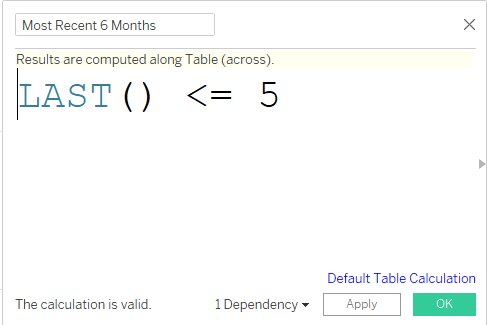
Drag this calculated field to the Filters shelf and select “True”.
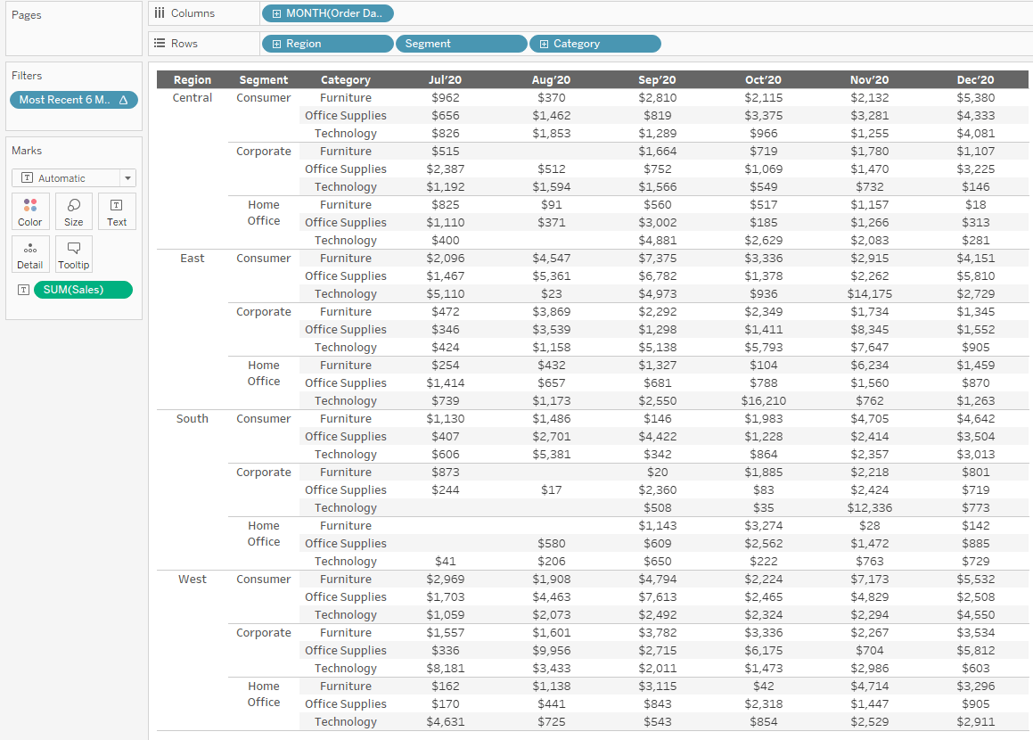
STEP 3: Add Row Grand Totals (Analysis > Totals > Show Row Grand Totals)
Now that we have the Grand Totals column showing, we want to customize it so that it is not showing SUM([Sales]) but rather the difference between the final two months in the dataset.
To pinpoint the sales for each of the final two months, we are going to create two new calculations.
STEP 4: Create [Max Month] & [Max Month – 1] calculated fields
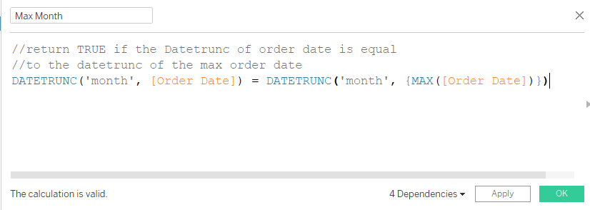

Now we can use these two new fields in our [% Diff] calculation.
STEP 5: Create [% Diff] calculation

Now that we have our calculated fields set up, we can control what we see in the Grand Totals versus what we see in the rest of the crosstab view. We can accomplish this by using the SIZE() function. The function SIZE() will return the number of rows in a part of the view. The Grand Total will only have one row, so SIZE() will always return 1 for the Grand Total. For the other parts of the view, SIZE() will change depending on how many rows are in the view.
We can leverage this logic in our following calculation that will be used to replace SUM([Sales]) that we currently have on the Text marks card.
STEP 6: Create the [Sales_%Diff] calculation
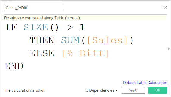
**Note: [% Diff] does not need an aggregation here because the underlying calculated field is already returning an aggregate.
Once we have the [Sales_%Diff] calculation created, you can replace the SUM([Sales]) that is on the Text marks card with the [Sales_%Diff] field.
**Note: Your Grand Total column might look odd at first but that is because we have not yet formatted the Grand Total separate from the Default pane area.
STEP 7: Right-click on the [Sales_%Diff] pill on the Text marks card and select “Format”.
First, change the Default Number format to Currency.
Second, change the Grand Totals Number format to Percentage.
(*Note: I have chosen 0 decimal places for both.)
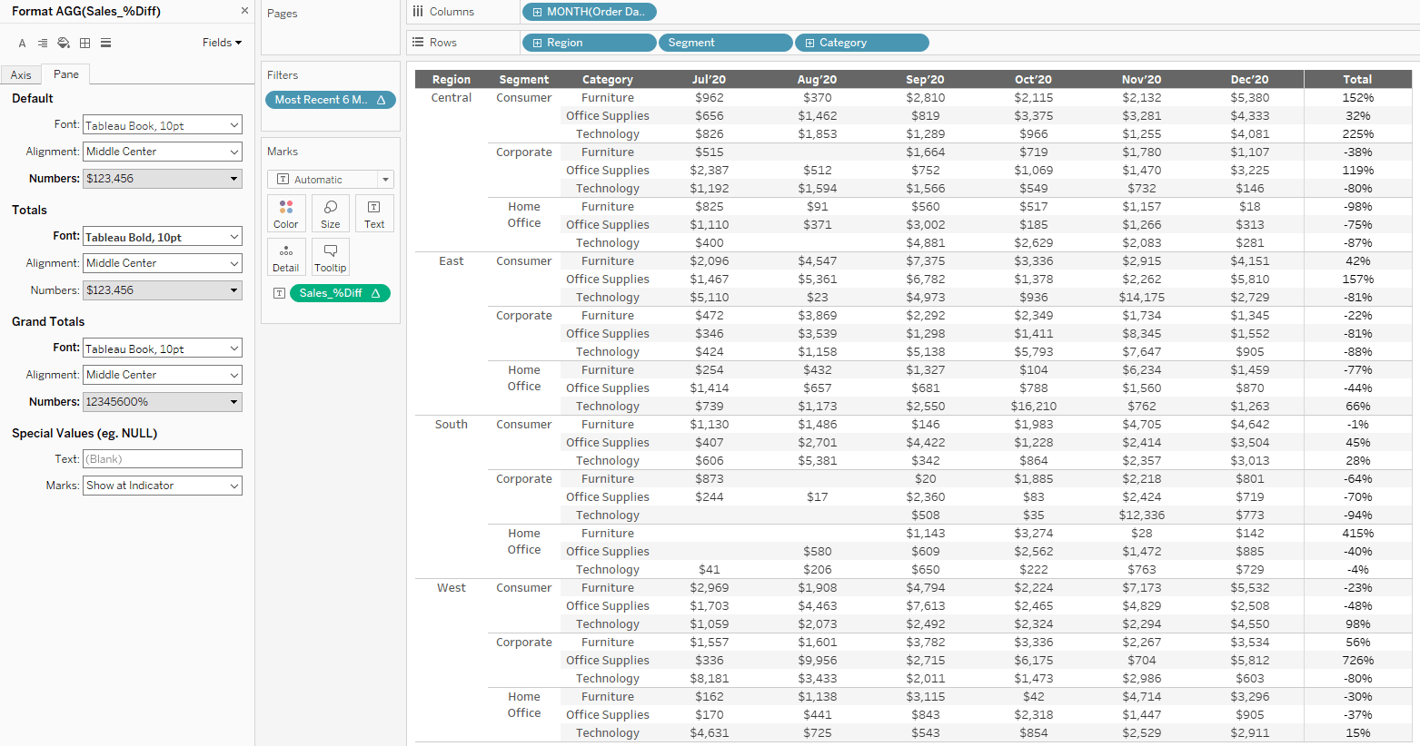
STEP 8: Add some indicators to easily spot positive and negative change.
We can do this easily by changing the number formatting for the Grand Totals to Custom and adding in ▲,▼ for positive and negative change.
Another great way to easily spot positive/negative change is with the utilization of color.
To do that, I have created two new fields; one will return “▲” when the % Diff is positive, the other returning “▼” when the % Diff is negative.
STEP 9: Create [Most Recent %Δ – [POSITIVE] & [Most Recent %Δ – NEGATIVE] calculated fields
**Note: Adding the “IF” condition in the below calculations will ensure we only show ▲,▼ indicators in the Grand Total column.
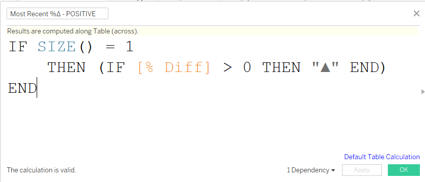
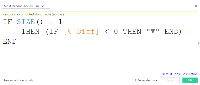
Drag both above calculations to the Text marks card and format your label as such (the order in which the positive & negative fields appear in the label does not matter, only one will show at a time anyway):
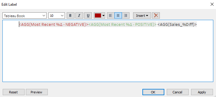
**Note: I typically stay away from using reds and greens together in one visualization due to the fact they are not color-deficient friendly colors. If that were the only pre-attentive attribute being used to denote positive versus negative, I would have chosen different colors but since the positives/negatives are also shown with a ▲ or ▼ indicator, we have the pre-attentive attribute of shape to rely on as well.
STEP 10: Change the title of the Grand Total column.
Obviously, you do not want the title of the %Diff column to read “Grand Total” or “Total”. Within the formatting menu, you can adjust the Label that is shown for the “Grand Total” without changing the rest of the columns:
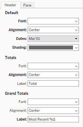
With the addition of some other minor formatting tweaks (shading, font, alignment, etc.), you can really make a boring crosstab come to life.
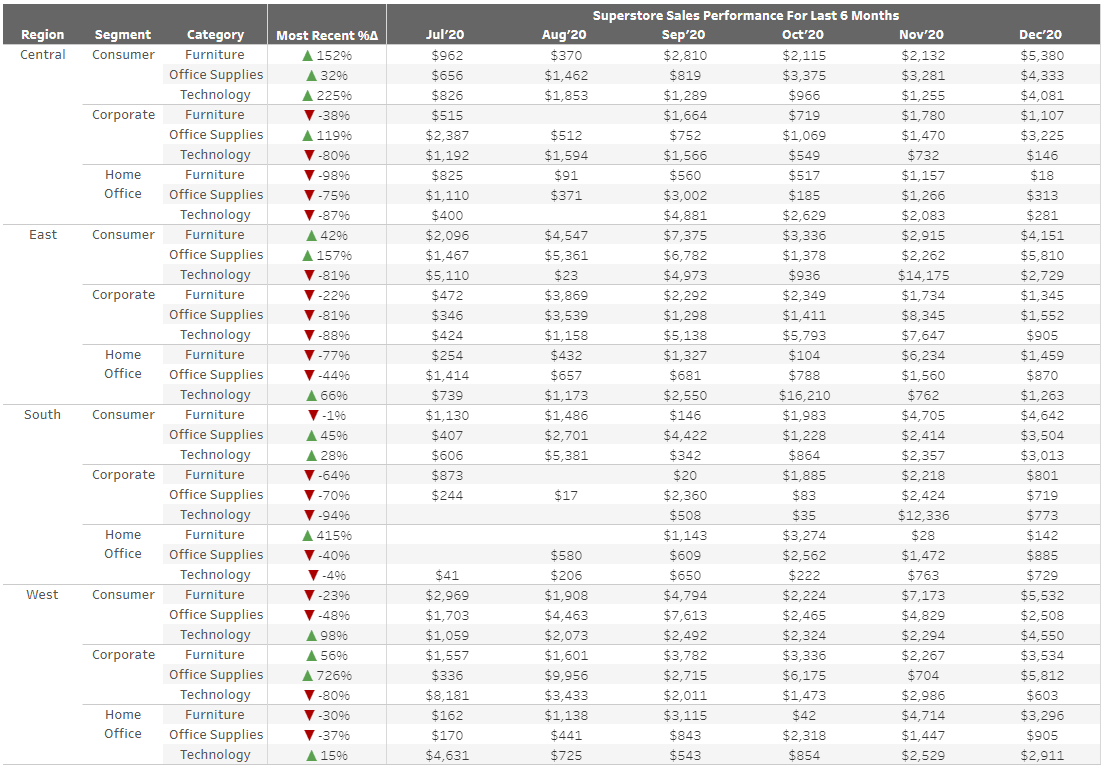
Feel free to check out and download this workbook to test out customizing totals.


 Media Coverage
 Press Release
