Mastering Custom Color Palettes: Elevate Your Tableau Visualizations
Tips and Tricks for Effective Dashboard Design with Custom Color Palettes
Enhance Your Tableau Reports with Custom Color Palette Techniques
There’s a world of blogs and articles out there that will guide you, step-by-step, through the process of how to add custom color palettes into Tableau. There are even resources that guide users on best practices when it comes to color selection, what colors work best together, how to use colors intentionally, etc. What I have often struggled to find are resources that show you all the fun and unique ways to implement your custom colors.
It is more than just fixing your colors to fit your company’s brand/color scheme or to get the absolute perfect shade of red to be used for indicating negative changes in profit. There must be other ways custom colors can be leveraged.
Understanding the Power of Custom Color Palettes in Tableau
Design Principles for Creating Visually Appealing Tableau Dashboards
As a Tableau consultant, I have had various requests from clients that are needless to say, not straightforward to implement from a developer’s point of view. Most of the requests that I get have to do with wanting formatting of a visualization/crosstab to be a certain type of way. What this blog is going to do is provide three tips/tricks that I have found to be solutions to some common problems.
Implementing Custom Color Palettes: Best Practices and Techniques
Optimizing Data Visualization with Custom Color Palette Strategies
*Note: All options that are outlined below use calculations that result in a continuous result. This is intentional. Even though each scenario can be quickly resolved by using a discrete field on the color shelf, what I’ve seen frustrate users the most is when they are trying to call out certain cells in a crosstab and they use a square mark type to create a highlight table. When using a discrete field on color with a square mark type, the background color of each cell in the text table view is not uniformly filled. Then, when trying to adjust the size of the mark, marks overlap their cell borders, potentially skewing the colors of other cells in the view. Resizing can also lead to extra whitespace in the view. This is because square mark types will only uniformly fill the background color of a text table if a continuous field is used on color.
Creating Custom Color Palettes: Step-by-Step Guide
Utilizing Color Theory to Enhance Tableau Visualizations
If you want to recreate the same solutions on your end or follow along, below is the XML code for each custom color palette that has been added to the preferences file and here is the complete workbook.
<?xml version='1.0'?>
<workbook>
<preferences>
<color-palette name="3-Step Rating" type="ordered-sequential">
	<color>#ffffff</color> <!--> Use for any condition not met -->
	<color>#69beeb</color> <!--> Lowest Rating -->
	<color>#fabe0f</color>
	<color>#ff0000</color> <!--> Highest Rating -->
</color-palette>

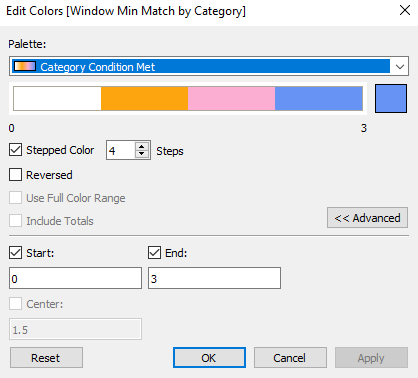
<color-palette name="Category Condition Met" type="ordered-sequential">
	<color>#ffffff</color> <!--> Use for any condition not met -->
	<color>#fda50f</color> <!-- Use for Furniture -->
	<color>#fbaed2</color> <!-- Use for Office Supplies -->
	<color>#6793f4</color> <!-- Use for Technology -->
</color-palette>

<color-palette name="Min/Max Condition" type="ordered-sequential">
	<color>#ffffff</color> <!--> Use for any condition not met -->
	<color>#ff0000</color> <!--> Min -->
	<color>#00aa00</color> <!--> Max -->
</color-palette>
</preferences>
</workbook>
Best Practices for Applying Custom Color Palettes in Tableau
Troubleshooting Common Issues with Custom Color Palettes
Scenario 1: How to color by 3-or-more statuses/ratings
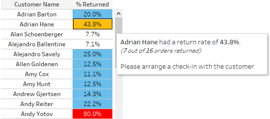
Let’s say that you have the following crosstab showing customers and their percentage of orders returned:
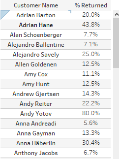
What you want to do is color/categorize customers based on how many orders they have returned. You define the following rules:
Anything above 50% means a customer should be contacted ASAP.
Anything between 25% – 50% means you should check-in with the customer.
Anything between 10%-25% means you should keep an eye on this customer.
Your first thought would be to create a calculation that resulted in discrete categorical values like so:

You would then drag that onto the color shelf but run into the issue of the square mark not filling the entire cell uniformly:
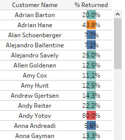
Now, there are other ways to fix this (like changing the mark type to bar and using a “fake” axis to fill out the bar from 0 to 1), but I can leverage custom colors here.
Let’s create two new calculated fields that will help to color the cells easily and add some context to the tooltip.
% Returned Coloring

By giving values from 0-3 based on what condition is met, I can then use a custom sequential color palette.
% Returned Tooltip Text

Above calculation will add value to the tooltip.
Once those are done, you can add the [% Returned Coloring] field to the Color shelf and the [% Returned Tooltip Text] to the Tooltip shelf.
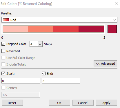
I want to make sure there are 4 steps and that the palette starts and ends with 0 and 3 respectively. Now, if I had used a normal sequential color palette, I wouldn’t have been able to control the color for each of my steps. It would just result in a varying shade of the one color I specify. In the case below, varying shades of red.
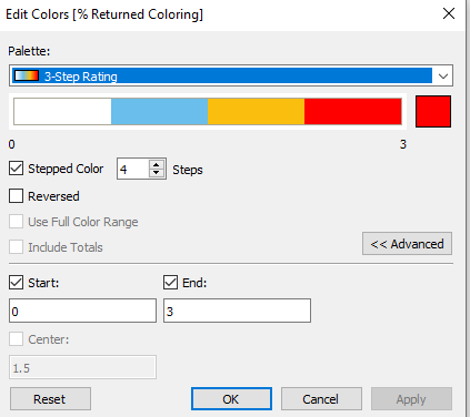
By utilizing my custom sequential color palette, I can control the color of each step/rating.
Scenario 2: How to give a unique color to a dimension value when a condition is met
Recently, I had a client who had questions around formatting the color of the cell in a highlight table that she had developed. To keep things simple, I will translate her use-case into one using Sample-Superstore.
What she had was a crosstab showing [Profit Ratio] broken out by [Date], [Ship Mode], and [Category]. She was able to highlight the MIN([Profit Ratio]) per each column ([Ship Mode]/[Category]) like so:
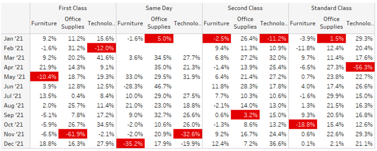
The ask: “I want to give a unique color for each category. Instead of all the minimum profit ratios being in red, I want to have three unique colors, one for each category.”
In order to accomplish this, I have to assign a unique value to the MIN([Profit Ratio]) for each [Category]:
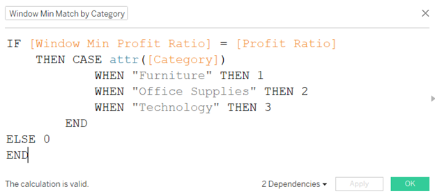
I can then use this calculation on the Color shelf and assign my custom palette:
The result is a color-coded highlight table:
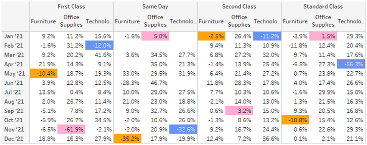
Doing this also allows the end-user to easily compare a single [Category] across different [Ship Mode].
Scenario 3: How to give unique color to each dynamic metric
The last tip/trick has to do with dynamically coloring cells in a highlight table based on the metric used to check the condition. In other words, I want to show red cells when viewing the window minimum profit ratios and green cells when viewing the window maximum.
Again, to make sure that the cells are filled in completely, I want to have the calculation used in a continuous manner. I could also technically just use multiple sheets and use a sheet swap to get the same result, but I want to implement a solution where I don’t need to do that.
To start off, let’s just call out either the window minimum or window maximum and have other cells not be highlighted. To do that, I created the following parameter and calculation:
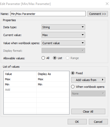

*Note – the fields [Window Max Profit Ratio] and [Window Min Profit Ratio] are calculated fields that are just use the window functions.
I could then use this [Min/Max Highlight] field on color and adjust the settings as so:
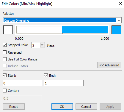
The problem with this is that both minimum and maximum conditions have the same blue color assigned here:
Optimally, I want to assign one color to maximum, one color to minimum, and leave the other cells white. So I need three distinct colors – but I can only control two in the standard color palette options. This is another example of the benefits of using a custom color palette.
First, I need to adjust my calculation so I can get unique values for min and max:

Next, with this calculation on color, let’s adjust the color settings:
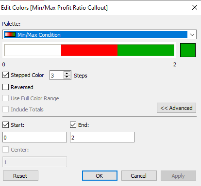
The result:

The best feature of using custom sequential palettes is that you have the ability to scale this without giving up any control of the colors. You want to color by a 10-scale rating? By a dimension that has 15 different domain members? Color various unique metrics by whether a condition was met or not? All you need to do is add additional lines to the preferences file.
I hope that this has helped you see the various ways you can implement custom color palettes and I am sure there are many more.


