Mastering Dynamic and Synchronized Axes in Tableau
Enhancing Visualizations with Dynamic and Synchronized Axes
Techniques for Creating Dynamic and Synchronized Axes in Tableau
Tableau allows developers to have creativity and flexibility in their design of dashboards and visualizations but while the beautiful charts and graphs may grab our attention, the reason why we are creating these visualizations is to gain insights about our data. Data is one of the most, if not the most, valuable asset on earth. So how we present that data is of the utmost importance. “With great power [that data gives you] comes great responsibility [to represent that data accurately]”. The accurate representation of data is critical; if you rely on data to guide business decisions and that data is misrepresentative of reality in any way, it can have a negative effect.
Many times, we find ourselves comparing data values or trying to understand how data interrelates. In Tableau, we tend to use our visualizations to do so because leveraging our pre-attentive attributes is key to gaining quicker insight. Thus, we need to be aware of how we are representing data and we need to compare values in the same “light”.
In this blog, we will be going over two use-cases in which the use of an invisible reference line can help accurately depict relative sizing of data. Reference lines are typically implemented in charts to add context, however that does not mean that they must be visible!
Understanding the Importance of Dynamic Axes
Techniques for Creating Dynamic Axes in Tableau
Synchronizing Axes Across Multiple Charts
Best Practices for Dynamic and Synchronized Axes in Tableau
First Use-Case: Synching Wings of a Butterfly Chart
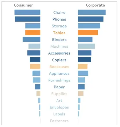
A Butterfly Chart is a type of visualization that we can create in Tableau where two sets of data series are displayed side by side allowing an end user to quickly compare the two sets. The structure of this chart ensures that each set is built on a separate axis.
Let us take the example to the right that shows sales for each sub-category with the Consumer Segment on the left and Corporate Segment on the right.
Sub-Categories are sorted in descending order by total sales and each bar is colored by total profit (Orange = negative, Blue = positive).
While I can initially gain a great deal of insight from this chart, I might assume that both segments performed similarly in sales because the bars seem to be equal in length.
If
I were to add labels to these marks, I would see that the values are, in fact,
very different when it comes to Consumer vs Corporate.
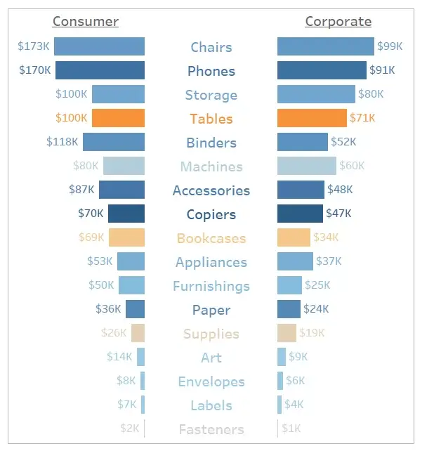
Unfortunately, this is extremely hard to see when the axes used in this chart are not synchronized and thus can lead to misinterpretation of data.
To compare these two segments in the same “light”, it is in our best interest to synchronize these axes. When we build a dual axis chart in Tableau, we have that luxury of turning synchronized axes on or off, but the Butterfly Chart is not a dual axis. Therefore, we will need to “synchronize” these axes in a different way.
Adjusting Axes Dynamically Based on Data Changes
Ensuring Synchronization Across Multiple Charts
Advanced Techniques for Dynamic and Synchronized Axes
Tips for Optimizing Visualizations with Dynamic Axes
One quick and easy fix to this is to set a reference line to a specific constant maximum. This approach may not prove to be a long-term solution seeing as that is not going to be dynamic. As your data changes, your maximums change, and your data might exceed the maximum you set in the beginning. To avoid this issue, we can use a LOD (level of detail) calculation to set a dynamic “max”.

Invisible Reference Line
Now that we have a single calculated field that gives us the maximum sales across all sub-categories and segment combinations, we can drop this field onto the detail card and create a reference line:
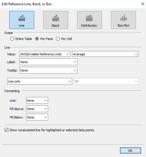
**Note: Update the formatting so that both the labels and tooltips are turned off, and the line has no color, therefore making it “invisible”.
Once you have added the reference line to both the axes in question, the reference line will keep both axes synchronized and will update as the data changes.
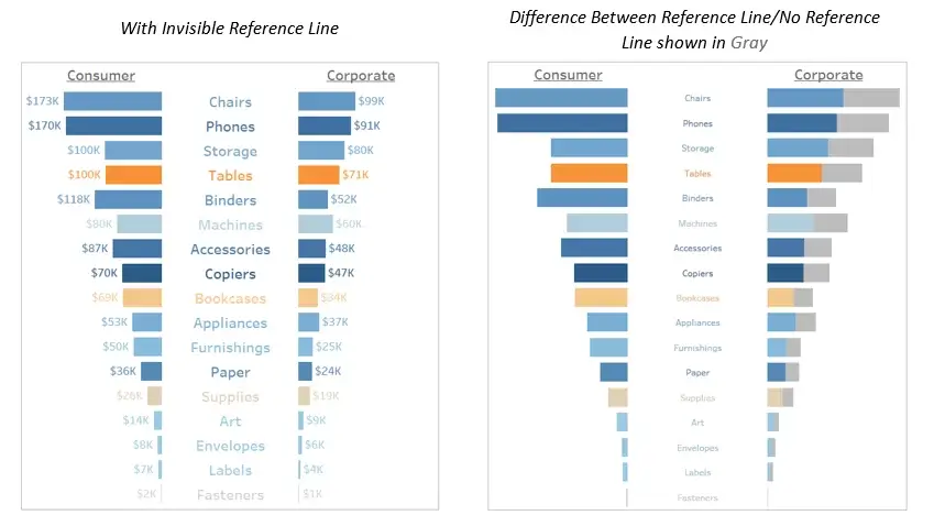
Second Use-Case: Anchoring the Start of a Timeline
Another great example of where we can utilize an invisible reference line is when we develop a dashboard that is made up of multiple charts that display the same data but just for different dimensions.
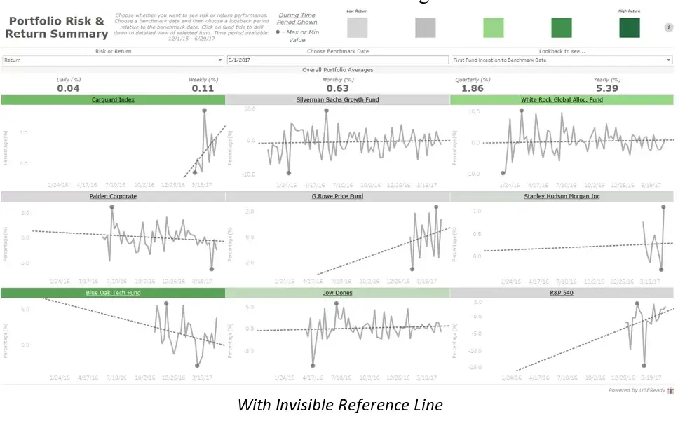
For example, this Portfolio Risk and Return Summary dashboard is used to evaluate funds in a portfolio based on their risk and return. Each fund has a timeline allowing us to see historical performance. The use of an invisible reference line here allows us to “start” each timeline at the same point in history so we can visually compare funds against one another without having to rely on reading each date axis on each individual chart.
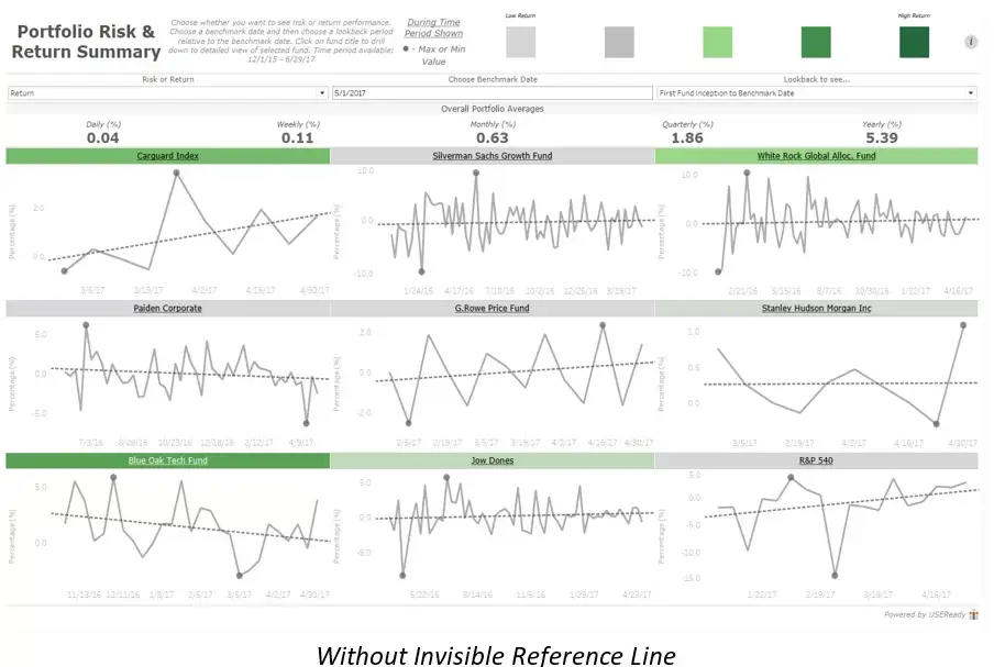
Without the invisible reference line in place, it makes it harder to compare relative time across funds.
Therefore, the addition of an invisible reference line will be extremely beneficial.
This reference line is slightly different than the first use-case in that it changes dynamically not only based on the minimum date across all funds, but also depending on the parameter option chosen by the end-user.

Reference Line for Axis
One main question an end-user might have while using this dashboard is, “how are my funds performing over time?”. Therefore, the time scale is critical. Using the calculation above an end-user can dynamically change a reference line’s position on a chart to ensure that the fund timelines are “anchored” at the same date making it easier to compare the funds over time.
Please feel free to interact with and download this dashboard at this link!
The examples I have walked through above are just two of the many different use cases in which you can utilize an invisible reference line.
I hope you have found these two examples helpful and I would love to hear how you are leveraging invisible reference lines in your projects!
Thanks for reading,


 Media Coverage
 Press Release
