 Media Coverage
 Press Release
Step-by-Step Guide to Building a Sunburst Chart
Enhancing Tableau Visualizations with Sunburst Charts
Best Practices for Using Sunburst Charts in Tableau
Understanding Sunburst Charts and Their Use Cases
Preparing Your Data for Sunburst Visualization
Step-by-Step Instructions for Building a Sunburst Chart in Tableau
Customizing and Optimizing Your Sunburst Chart
What Makes Sunburst Charts Unique?
Formatting Tips for Better Data Representation
Avoiding Common Mistakes in Tableau Sunburst Charts
Exporting and Sharing Your Sunburst Chart
Sunburst charts transform layered data into intuitive, nested circular diagrams. Ideal for showcasing relationships across categories, subcategories, and individual metrics, these charts empower users to uncover trends, identify performance gaps, and allocate resources strategically—quickly and effectively.
While Tableau doesn’t offer a built-in sunburst chart, its flexibility allows users to craft one using creative combinations of pie charts and calculated fields. In this guide, we’ll walk through how to build a sunburst chart step-by-step, using a practical sales breakdown scenario.
Scenario: Sales breakdown by Region, Category, and Subcategory
Let’s say a business user wants to analyse sales breakdown by Region, Category, and Subcategory. Here a sunburst chart can show sales data across different region, product categories and subcategories that help him quickly pinpoint areas of strong and weak performance and support business decisions in areas such as inventory management and marketing.
Steps for Creating Sunburst Chart
Step 1
Organize Your Data
First, the user needs to make sure that his data is organized in a hierarchical structure. To represent the hierarchy, the user needs a minimum of three levels of dimensions (e.g., Category, Subcategory, and Product).
Step 2
Connect to Your Data
Launch Tableau Desktop and link it to your dataset.
Step 3
Build a Hierarchy
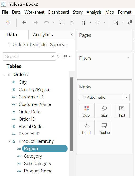
- Go to the Data pane, right-click on the dimension the user wants to start with (e.g., Category or Subcategory).
- Select Create Hierarchy and provide a relevant name to it.
- Add other dimensions into newly created hierarchy.
Step 4
Create a Calculated Field with Expression
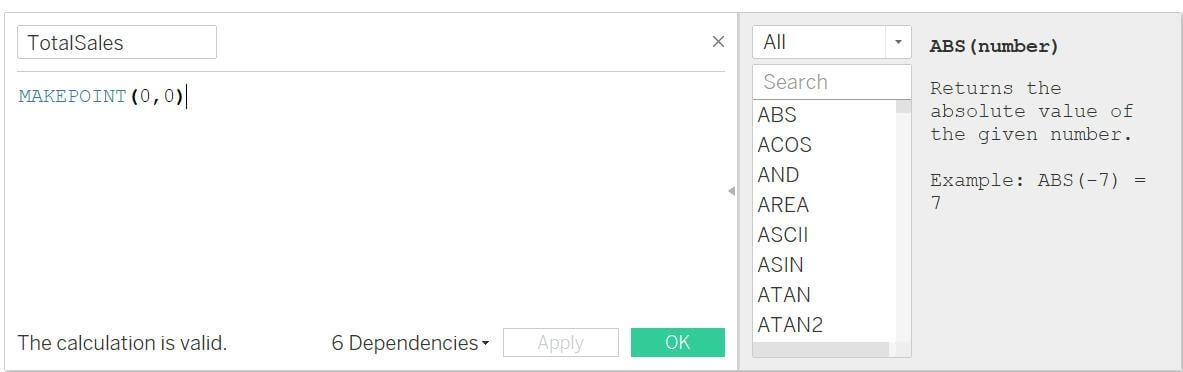
- Double-click the Calculated field; it will add in column and rows.
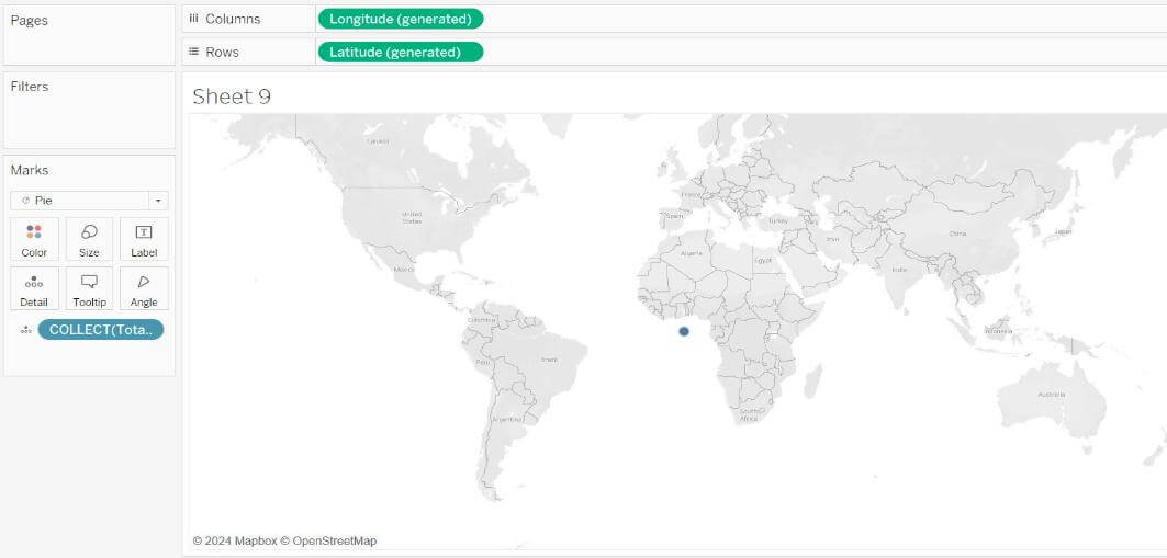
- The user will see the map with dot.
- Change the Marks from Automatic to Pie and adjust the size of the pie segments.
Step 5
Add Dimensions
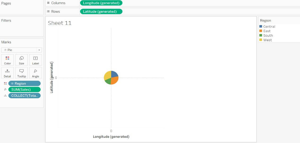
- Add first dimension to the Detail pane.
- And measure to the Angle pane.
- From the Map menu, navigate to Background Map and select None.
Step 6
Create Another Layer of Chart
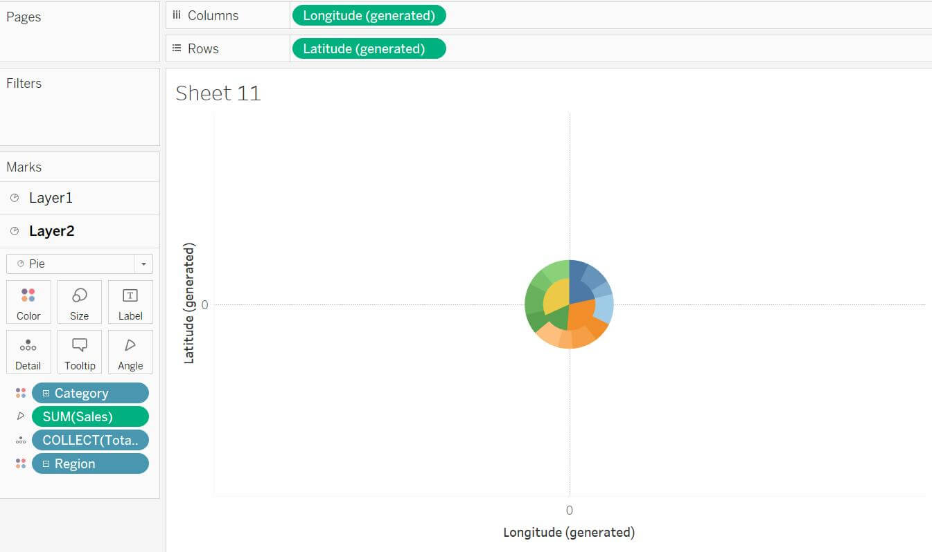
- Drag and drop the calculated Field to Marks Layer of the sheet.
- Another Marks card will appear on the left side of the pane; change it to Pie.
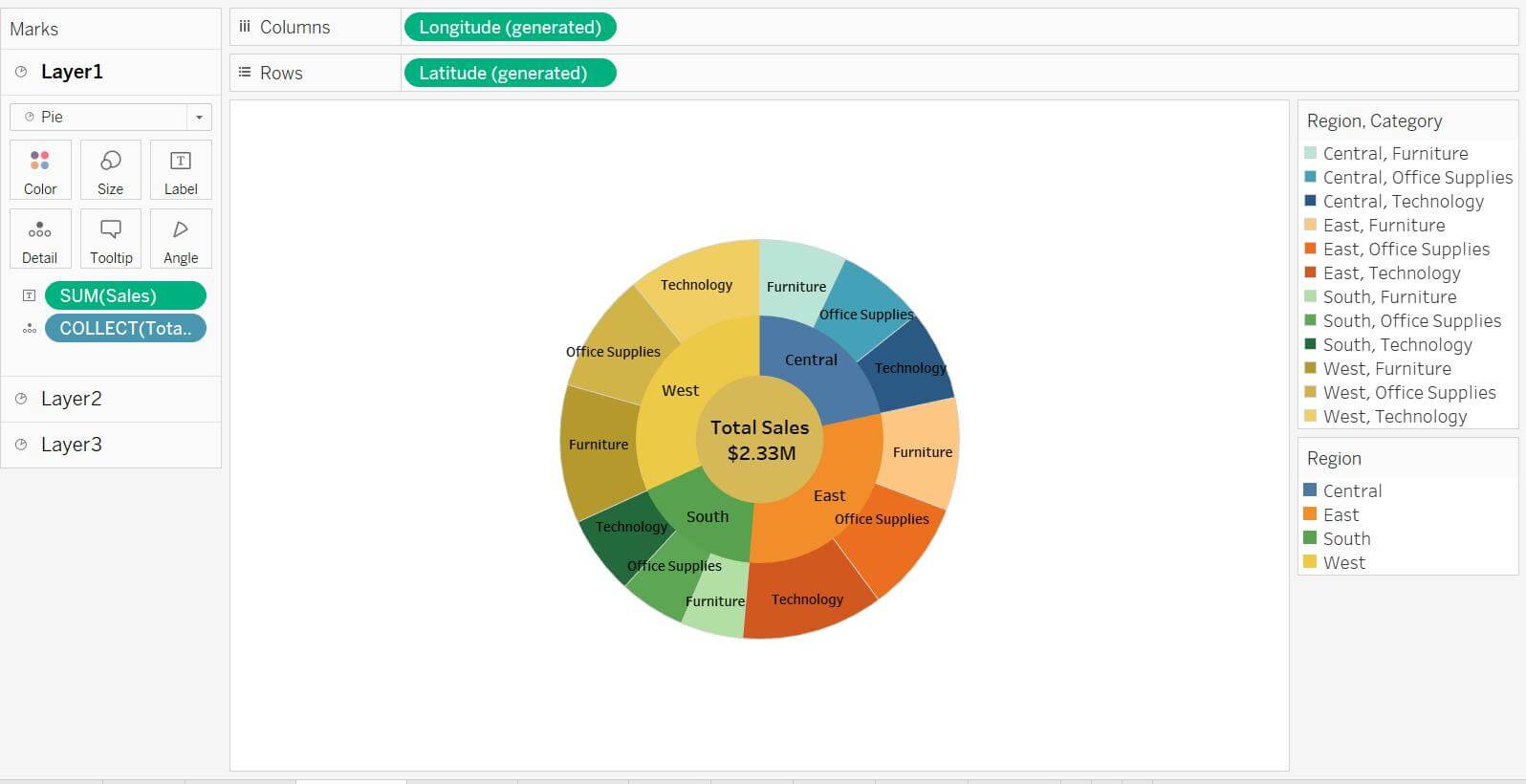
- Now add other dimension “Category” from hierarchy to Color pane, measure to Angle pane and first dimension “Region” to Detail pane and change it to Color. The user will find a chart like the below.
Step 7
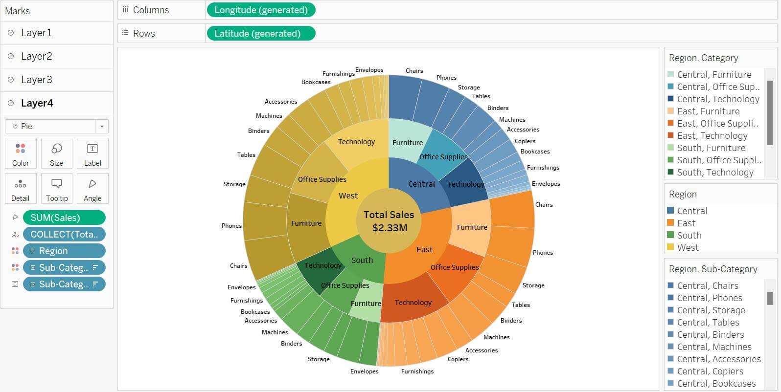
Repeat this for the other layers of chart
- Repeat this task to create other layers of the chart and adjust the layers for more clarifications, user can add dimension and measures to the Label to see more detail.
Step 8
Chart Format
- Adjust the colour, labels, and tooltips for clarity and for cosmetic changes.
Step 9
Enhance Interactivity
- User can use filters or actions to enhance interactivity, that allow him to look at different layers of the hierarchy.
- User can also ensure titles, legends, and any annotations are clear for better understanding.
Sunburst charts in Tableau are a powerful way of visualizing multi-layered data and make it easier to communicate complex hierarchies to stakeholders. By following the steps above, you can leverage Tableau’s tools to create a chart that’s both informative and visually engaging. While Tableau requires a workaround to build Sunburst charts, the result is well worth the effort. With this type of chart, you get:
- Clarity in Complexity: Sunburst charts simplify intricate data relationships, helping teams spot trends and outliers effortlessly.
- Strategic Decision-Making: Color-coded segments and proportional sizing provide instant performance snapshots, ideal for refining sales strategies or inventory planning.
- Dashboard Impact: Their eye-catching design enhances reports and presentations, ensuring your insights stand out.
For even quicker implementation, explore Tableau’s extension gallery for pre-built sunburst options.