Creating a K Chart in Tableau: Step-by-Step Guide
Mastering K Chart Visualization in Tableau
Understanding K Charts: A Comprehensive Guide for Tableau Users
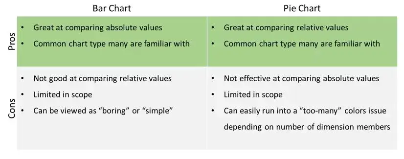
Often, dashboard developers are tasked with creating a single dashboard that answers each and every one of the end user’s questions. This can lead to cluttered and overwhelming dashboards that make it difficult to quickly gather insight. To get around this, dashboard developers try to find ways to combine charts/visualizations that serve more than one purpose without overwhelming the end user.Two of the most popular chart types that, from my experience, end users love are bar charts and pie charts. Bar charts are a simple, yet effective visualization that are great for comparing values across dimension members but, they are not great at comparing relative values. Pie charts on the other hand are just the opposite. The bar chart and pie chart compliment one another in this way but each have their drawbacks as well:

What would be perfect is if there was a chart type that combined the best of both charts into one allowing for developers to save (precious) real-estate space on the dashboard.
Introduction to K Charts and Their Importance
Step-by-Step Guide to Creating K Charts in Tableau
Different Methods for Visualizing K Charts in Tableau
Analyzing Key Performance Indicators (KPIs) with K Charts
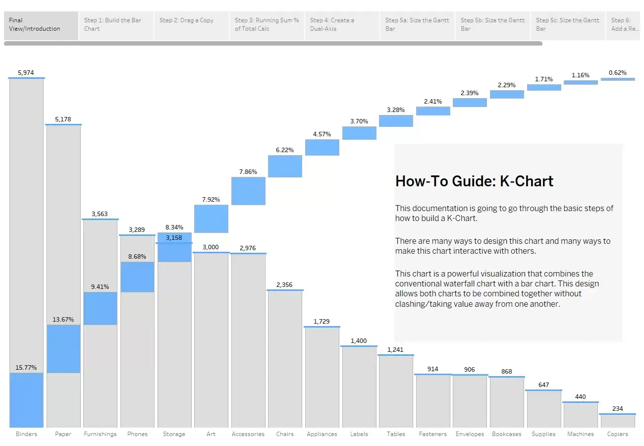
Enter the K-Chart!
Now, I will not take credit for the creation of this chart as there is already a wonderfully detailed blog series by Ismael Chang Ghalimi that was posted back in December of 2019 that explains why the K-Chart is a great option when trying to compare both absolute and relative values across dimension members. The reason for this blog is to outline the steps needed in order to recreate this visualization in Tableau. I have created a step-by-step guide on how to create a basic K-Chart using Sample-Superstore data

Please feel free to interact with and download this workbook at this link.
Exploring the Benefits of Using K Charts in Data Analysis
Tips and Tricks for Effective K Chart Visualization
Case Studies: Real-World Applications of K Charts in Tableau
Advanced Techniques for Customizing K Charts in Tableau
The example I have walked through in the workbook is just the beginning of what you can do with a K-Chart in Tableau. You can add filtering functionality to the worksheet or have the K-Chart interact with other views using Dashboard Actions. The possibilities are endless!
I hope you have found this step-by-step guide helpful and I would love to hear how you are leveraging the K-Chart in your projects.
Click here to download twbx file
Thanks for reading
References
Additionally, be sure to check out Ismael’s blog series:


