Bump Chart vs. Concentric Chart: Understanding the Differences
Data Visualization Showdown: Bump Chart vs. Concentric Chart in Tableau
Mastering Visualizations: How to Create Bump and Concentric Charts in Tableau
Rank is a powerful feature for any visualization. It is very effective to understand how each of the categorical members perform against the same measure with a sorted Rank chart. Also for best practices it is convenient for the end user to make quicker decisions with well sorted-ranked charts.
The easiest and the most widely used Rank chart (using Table Calculation) in Tableau would be a Horizontal Bar chart (Values arranged Top to Bottom). But the bar chart would not be able to convey information if multiple members are shown on columns when slicing and dicing the existing measure. (Eg: Showing the Time series trend of Revenue across months for different Companies. In this example, Date Dimension will be on Columns and Company Dimension will be on Rows. Providing a Rank for this visualization with sort feature is a little difficult)
So a powerful alternative would be a Slope Chart or an improvised Bump chart that shows variation or fluctuation of values across time.
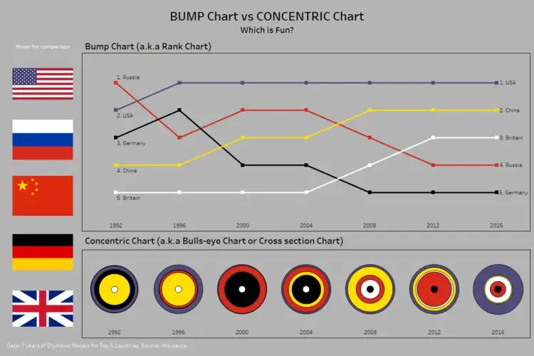
In this example, a very small data set is used. The data consists of the Top 5 Countries based on their overall medal tally for the last 7 Summer Olympics.
Exploring Bump Charts: What They Are and When to Use Them
Understanding Concentric Charts: Benefits and Use Cases
Creating Bump Charts: Step-by-Step Guide for Tableau Users
Building Concentric Charts: Techniques and Best Practices for Effective Visualization
Starting off with a typical Bump chart with Rank Calculation across Years for the Countries.
Juts for fun and to try something different, the same data is represented on multiple sheets as a concentric or bulls-eye chart or cross section chart (The name cross section because it looks like the layers of earth – Crust, Mantle, Core). Though it does not show rank, it shows how each Dimension member has performed in comparison to others. Also if we observe carefully, it is a modified version of Bubble chart.
Reading the Concentric chart can be a little challenging. For this example, the innermost circle represents the lowest number of medals and as the size of the circle increases, the number of medals increases in the same year (not across years). Though the sizes across years look same, the size is the factor of the sheet and not the number of medals overall. (For Eg. in the year 1992, Britain has the lowest value and Russia has the highest value thus the circle size increases from inside to outside. Now comparing between years. For the years 1992, 1996 and 2000, though the size of circle for Britain is exactly same, it does not mean Britain won exactly same number of medals in all these Olympics. The size of the circle is determined by the highest and lowest values in that year alone)
Building these charts will be taken up in a different post.
Bump vs. Concentric: Choosing the Right Chart for Your Data Analysis Needs
Step-by-Step Tutorial: How to Build Bump Charts in Tableau
Concentric Chart Essentials: Tips and Tricks for Creating Impactful Visualizations
Best Practices: Leveraging Bump and Concentric Charts for Enhanced Data Insights
A Tableau public profile link is provided at the bottom.
Which looks good? Which is fancier? All of these are open to debate and up to one’s own interpretation and interests!!


 Media Coverage
 Press Release
